
Revamp Side Bar
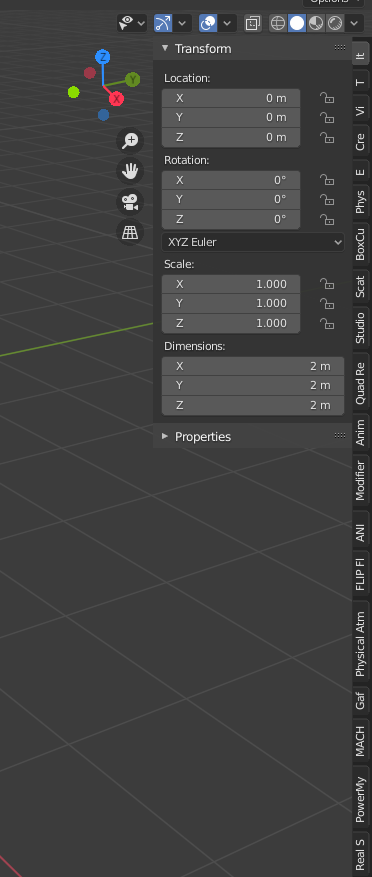
Blender is a software made by the community, for the community. Because of that, it's expected it has a strong user-base of addon developers. Addons are the core of blender, and even so, having more than 10 can be enough to become a pain to deal with.
Blender currently just cuts off the names of the addons, making them smaller buttons. This is not practical, at all. My suggestion is as simple as adding a scroll bar for this, so we can actually see the names of the individual addons.
5 Comments
Agreed. But the real solution to this problem is that addon devs need to stop putting every addon into that area of blender. It should be easier for them to make real editor panels that can be placed in their own panel area instead of overlaying the 3d viewport.
Did you try in the tool options to check the filter addon option ? I'ts available for workspaces...Some of them (sculpting or ..)do not need some particular addons not design for that purpose, so you can uncheck them afterwards, so the right side is "less" full to find those you need. And be sure afterwards to save your startup file.
Another solution: addons using the sidebar should let the user choose the target tab. Right now it's possible only if the addon's dev program it manually, and it's a pain in the butter for the dev.
I REEEAAALLY missed left side panel.
It depends a lot on what addons you use, and do you really need them all ???? For some a seperte bar is fine, others i have wished to be elsewhere. If it would be customizable, that be nice (So a user could say you go in ''custom title'' on the otherhand however if people create instructional videos, it shouldnt confused to have non default names.... its a dillema i think, you cannt serve all.
Perhaps have an option to which one you want to show per viewport (as viewport options)