
Improve even more the "mini" timeline!
I feel this one is for Pablo Vasquez since he made me aware of it.
Blender timeline (and other UIs) are more snappy so you can resize it even smaller, and the scrollbar gets hidden. However! There's still extra information that is not needed, the "Search Channel", and if you love to hide the header, like I do it's becomes really unclean.
Here's what I want to hide
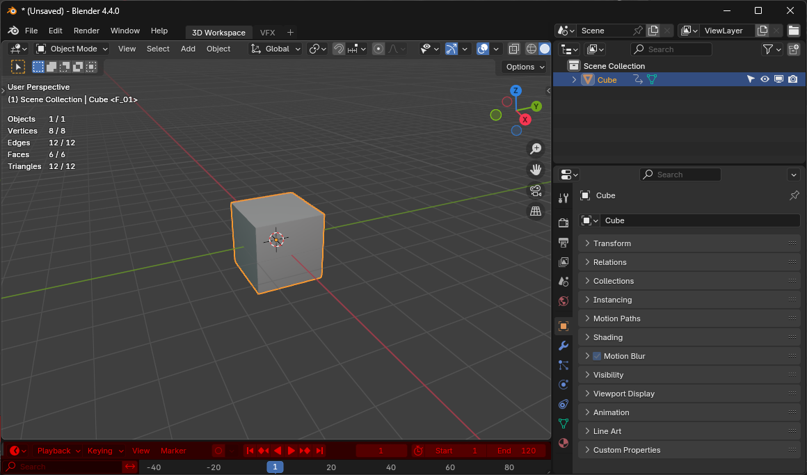
Here's what happens when you hide the header in 4.4, scrollbar is back 🤢
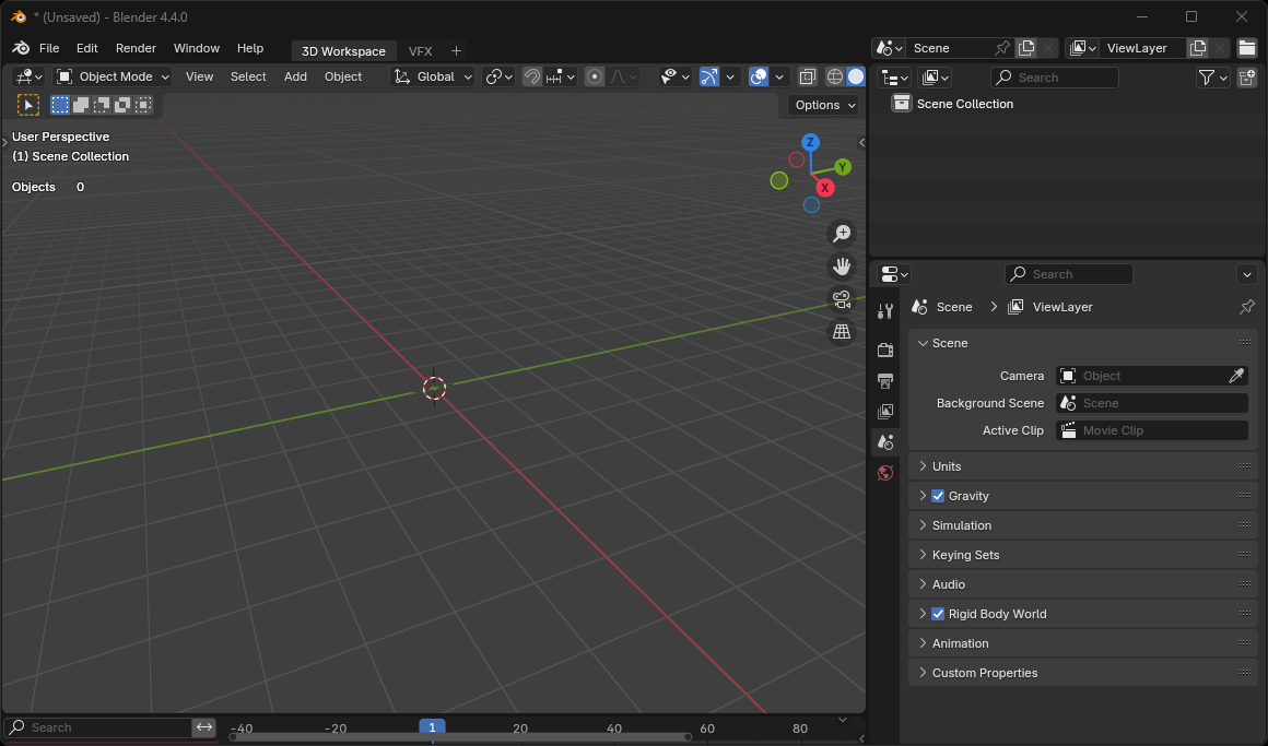
Here's the suggestion how it COULD be ✨ Now I added markers just as a test but I think they are not needed. Also notice that you can see the are of negative frames (or any frames that are not "in the scene" gets darken!
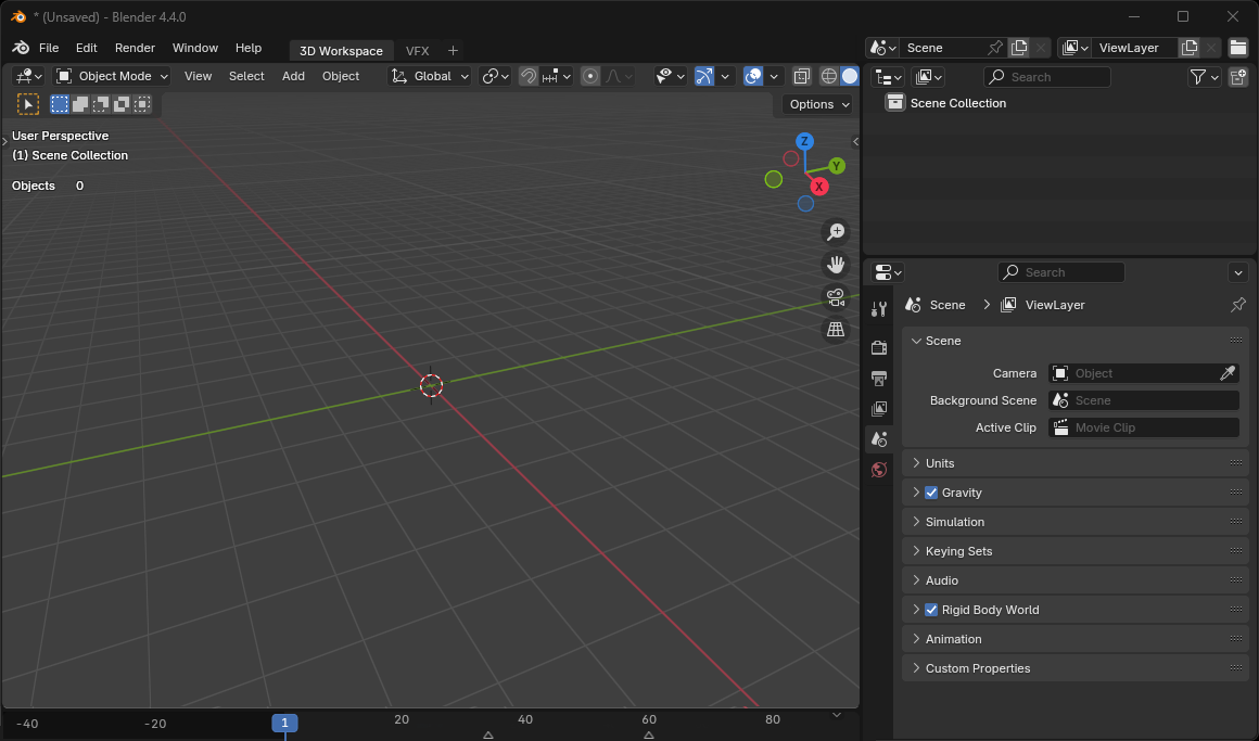
I just want small timeline that doesn't take a lot of screen space ...
1 Comment
You can drag the edge of the channel sidebar until it is gone:
However, the hit box of the button to show it again seem to conflict with the area management hit box, so you need to make the area bigger before being able to hit it again.