
Improve Scene Collection Highlighting for Selected Objects
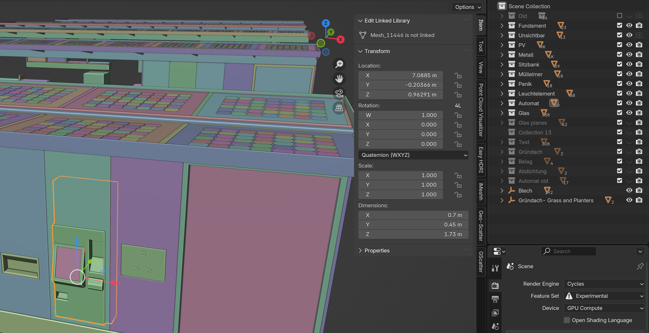
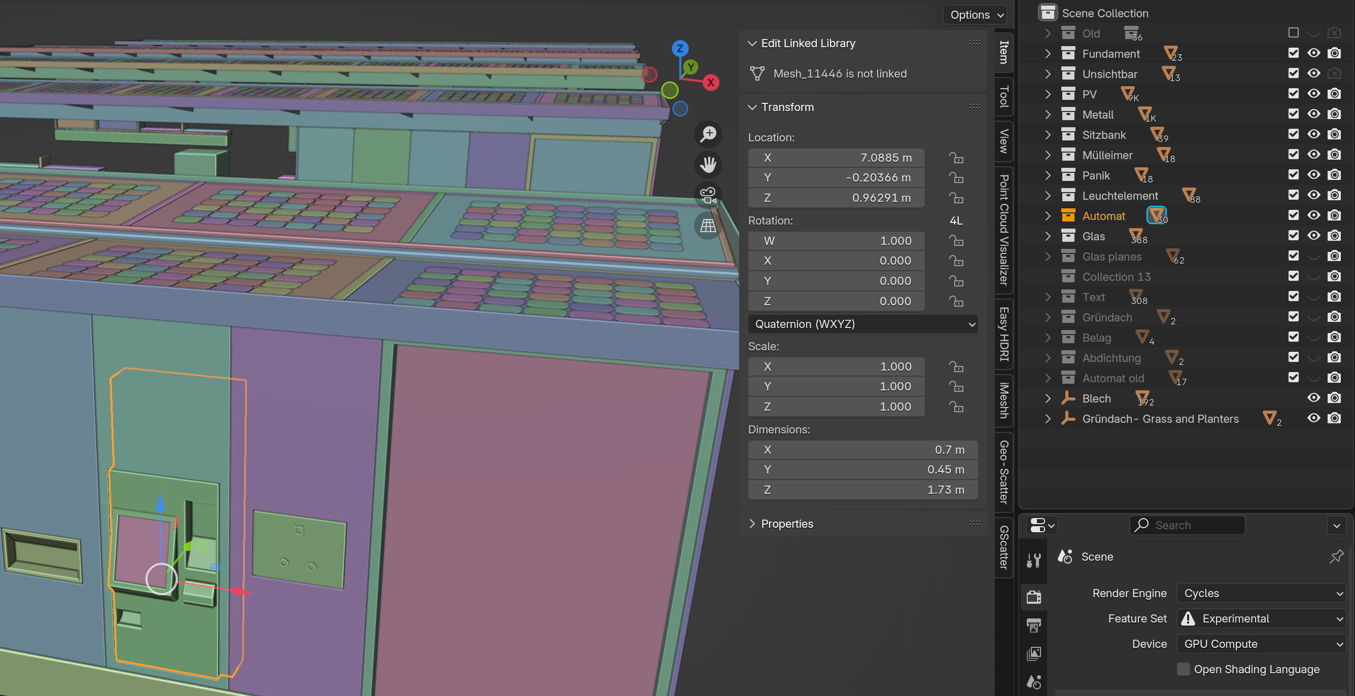
When an object is selected in the viewport in Blender, the light grey highlight next to its collection in the Scene Collection is too subtle and can be difficult to notice. This is especially challenging in large, complex scenes with many collections, such as those used in architectural visualization, where locating an object becomes time-consuming.
Proposal: Enhance the visibility of selected objects in the Scene Collection by introducing a stronger visual highlight for their parent collection(s), such as changing the text color (similar to when selecting the object itself) or adding a bold outline.
When an object is selected in the viewport:
• The corresponding collection(s) in the Scene Collection should be clearly highlighted (e.g., with a color change, bold text, or a more visible outline).
• This feature would allow users to quickly identify which collection(s) an object belongs to without needing to expand or navigate through the hierarchy.
Why This Matters:
• Archviz and similar workflows often require organizing large scenes with deeply nested collections, making it difficult to locate or verify an object’s placement.
• While the
(.) shortcut
jumps directly to the object in the Scene Collection, there are situations where it’s only important to know which collection the object belongs to, not its exact position.
This improvement would provide better visual feedback, streamline workflows, and make Scene Collection navigation far more intuitive.
1 Comment
hey john, this is something i remarked for cameras in an older wish....the colour behind is not to screw...and you cant really perceive it
blender.community/c/rightclickselect/q2Wr/