
The Blender UI: Blender is good. Let's make it even better.
Hello, new user here! You're going to think that I'm crazy for making such a long post. But I think it's worth it.
I got into game design about a year ago. Artwork and animation has always been the thing that has terrified me the most. Thankfully, the Blender community has been awesome. I don't know what I would do without blender. The fact that it's a non-profit is mind-blowing. I deeply appreciate the selfless volunteer work that the staff here do for people like me.
Blender is good. Some might say that it's good enough. However, I say that it can be even better . Specifically, there is room for improvement in the design of its user interface (UI). I am currently reading the classic educational book on design, "The Design of Everyday Things" by Don Normon. As I use the Blender UI, it is irresistible to analyze Blender using the insights I learned from that. I write this post because these insights, as useful as they have been to me in designing my game, may also be useful to the Blender community and dev team as they continue to patch and update Blender.
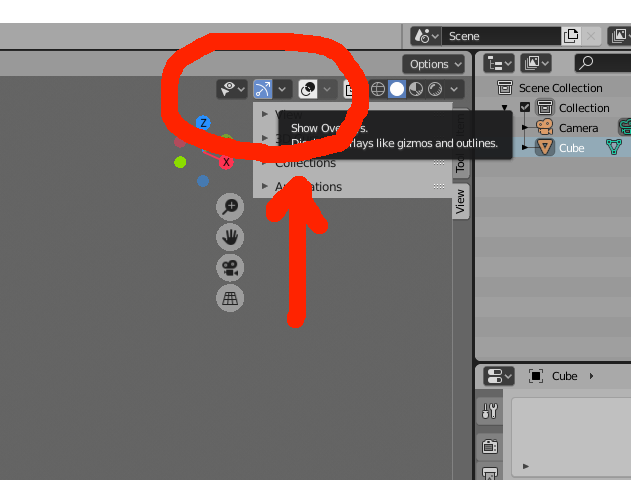
Earlier today, I spend around 15 minutes wrestling with a button. Somehow, I accidentally turned off that orange border that appears when I click on an object. Attached is the button that I was needing to press. Although I did not know this at the time, in the Blenderville native tongue, a white, opaque button is loosely translated as "unpressed". Huh...

Let's take a closer look at the white "show overlay" button in the image. Here are a few design considerations in order from least impactful to most impactful.
1). The word "overlay" is an ambiguously defined term, and there are few design elements that might help users to map the word "overlay" to "3D viewport overlay", which is what the term is actually referring to.
2). The button is located a bit too close to an unrelated UI feature. Specifically, I am talking about the "item/tool/view" tabs that sometimes appear next to our button. In general UI design, users expect that that two dissimilar UI features will not appear close to each other. Therefore, perhaps the item/tool/view tabs and the overlay/gizmos/viewport tabs should not be so close to each other?
3). Let's talk about the way the button looks. Although they say not to judge a button by its looks, this time it may be justifiable. Look at the other tabs and buttons next to this button. Look at their colors. Most have grey backgrounds with white images. They have a low contrast with the empty, grey viewport surrounding them. This suggests that they are "empty", or inactivated. Now, look at the shading tabs to the right. They are grey and white. Not only does this confirm the players belief that "grey" is "unpressed", but it also suggests that all unpressed buttons are grey since the user is expecting the UI to be consistent about what is pressed and unpressed. Also, if the "unpressed" button is darker, then the user will expect the "pressed" button to be lighter. In this case, the lighter buttons are the white and blue ones.
Sadly, in Blender, the white buttons are unpressed. From the user's point of view, this is mind-blowingly counter-intuitive, perhaps even bizarre.
The Blender apologists I've read online often respond to these types of criticisms by claiming this: although the Blender UI doubtlessly feels alien to new users, it is, nonetheless, perfectly fine. They might say that the standard practice UI conventions used in the other software are not innately "good". Their "goodness" is nothing more than a cultural convention, and is no better or worse than Blender's.
In response, this argument relies on a false premise: software UI is not entirely a cultural convention. Instead, it is partially a cultural convention, and the aspects that are not cultural are a) Gestalt perception, and b) the ability of a design to clearly convey an accurate mental representation of how a design works using design elements such as feedback, signifiers, etc. But even if UI design were entirely culturally based, that would not stop some designs from being objectively less frustrating to use than others for individuals who live in the culture the product was designed for since some designs better resonate with cultural conventions more than others.
From what I've heard, the changes in 2.8 improved Blender's design. That's great! However, we can make it even better . Maybe we can start with a simple button.
- John
1 Comment
Could you describe in short, plz?)