
Cleaning up TOOL properties
Here's how the Tool properties could be cleaned up, and the reasoning behind it:
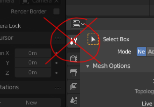
 RED - Areas that will no longer be there.
GREEN - New. Notice how the green barely takes any space on this image, and red is like 20% of the screen. Both display the same amount of information.
RED - Areas that will no longer be there.
GREEN - New. Notice how the green barely takes any space on this image, and red is like 20% of the screen. Both display the same amount of information.
Problems with the current design:
- Tools from different editors fight for this space and replace one another. You can't see the properties of two tools at once.
You may want to see the properties of the image editor tool, but it's displaying the properties of the 3D view tool. So you always have to click the tool again.
- The tool properties are too far away from the tool you've selected. It's on a whole another editor that otherwise has nothing to do with tools. So, the poorly designed top bar to patch this issue exists. Whilst the top tool properties bar helps, it cannot comfortably display properties of complex tools. Also, it disappears when you open an editor in a new window. Also, it only helps if the editor you are using the tool in is right under it. Tool properties of different editors fighting for space also applies here.
- All tools for object and edit modes don't have any properties, or have only a few. Dedicating a whole properties tab to display a single checkbox and a whole lot of nothing is an overkill.
- You cannot see the full tool properties if you have an editor maximized. You may want to maximize the 3D editor when sculpting, but that means you can't see any properties of the tools you use.
- Tool properties are duplicated. It's in two places. Global top bar and the properties editor. One is better than two.
- Having some editor instance specific properties outside of the editors they apply to is inconsistant.
- Having tool properties of all editors in an editor that only deals with properties of the 3D view data is inconsistant.
- The less unnecesary stuff we have in the properties editor, the easier it is to read.
Solution 1: Move all properties of the tool, next to the tool palette of each editor:
- The tool properties will appear at the most intuitive location. Where they are expected and easiest to reach.
- At first, the idea may remind you of the mess that was the "T" shelf in blender 2.7. But in case of active tools, the "T" shelf was doing it right.
- Con: Considering that all tools of object and edit mode have one or only a few properties, the properties will not take up much space or obscure anything. Could even be hideable when not needed. A bit more complicated for drawing modes, as they have a lot of properties. However, it could just display the ones you need 90% of the time by default (Brush size, strength...), and have an "Advanced" checkbox at the bottom to display more. A lot of panels in drawing tool properties don't actually belong there, so a cleanup will help a lot.
Solution 2: The "N" shelf could have two tabs. One for editor options (as is), and the other for tool properties.
- This solution does not bite off additional space from the 3D view.
- Con: You can't see viewport properties ant tool properties at the same time.
- Con: The properties are not perfectly close to the Tool.
3 Comments
hm. People are down-voting this. No idea why. Any comments? I believe I can fully defend my position on this.
* @visprotis * I think it's mostly because the image is showing getting rid of the tool options but no visual mockup of the alternative. The N panel is obscuring the view as it is so putting it there might take away space no matter what - not sure about others but m N panel is constantly off when I don't need it. Putting it in the tool palette might need more space as well, brush texture preview, falloff curves etc take more space than icons.
Personally I don't have issues with the current layout but I have to add I only use the tool properties for sculpting, texturing and weight and hair painting - there might be other implications. Again, it's a personal preference, but I'm usually only interested in the active tool settings, one at a time.
Also, I'm not a long time blender user, so other opinions might be more relevant.
On that subject, it would be pretty cool if the sidebar would remember what was used on an object level - if I'm adjusting shape keys on one object and materials on another I need to switch between properties back and forth every time I select the the object.
* @3dddan * Well, that image was for a better mockup was there... Now it isn't... Fixed it.