
Artist-friendly weight painting visualization, in the Softimage style
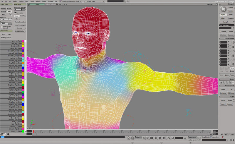
My friend is using Softimage 2015 (and XSI Mod Tool for Source engine stuff), but he praises their weight painting tools. Basically because they have "multi-color feedback" for each bone simultaneously. And you can paint by replacing influences from neighbour bones with a selected bone's color and smooth between influences.
With Blender's current weight painting visualization it's just confusing as hell. Think about how much easier time you'd have skinning your character to a rig and pose it for your portfolio. With this kind of multi-color feedback, it would actually make weight painting FUN and a lot easier for character artists.
Weight painting in Softimage looks like this, and it definitely looks REALLY artist-friendly being visually so much easier to see where your weights are distributed across the mesh.
Requested deeper extra explanation:
-
You have a character mesh.
-
You have an armature made from bones.
-
Each bone has a unique color ID for their influences, and the user can change their colors however they like. You can see all the weights on the mesh even if you don't have any of the bones selected.
-
The color of a zero weight is black, and it is seen when the vertex isn't assigned to any vertex group.
-
For example in the image below, left upper arm's bone influence color ID is yellow, and left clavicle's bone influence color is light blue. Their amount of weight goes from "alpha to full color id", like left upper arm's bone unique influence ID color goes from "alpha to full yellow", for example.
-
When you're on the selected bone, you'll paint its unique influence color ID to the mesh's vertices.
-
If you encounter a part of the mesh which has a different unique influence color ID assigned to vertices from another bone, you'll REPLACE it with the currently selected bone's influence color ID, while the other influence gets ERASED its weights simultaneously.
-
If you wish to paint the erased influences back, you'll just switch bones.
-
Blender's painting brushes are fine, but it's just that you can't show all the weights simultaneously with the traditional rainbow and its similar by-products, or black & white system, because all bones are using the same color ranges, and thus you'll need to paint them one at a time and check neighbouring influences with tedious trial and error from another bones. It just consists lots of guess work instead of being clearly visible for the user to see where all those influences are located on the mesh and where their influences belong to which bone and so on.
17 Comments
+1, totally used to this and it's very handy.
Concept: Each bone has it's own colour representing its influence. You don't have to select the bone to see its influence and isolate it. You can have an overview of all individual bone weights. You can paint and see errors quickly and easily without needing to isolate bones and mentally "remember" the influences of other bones. It's just logical.
@draise14: Exactly, that's the spirit, and you kinda explained it better, briefly. Thank you. I'm really bad at mockups what Jason recommends for this proposal. We'll see about that. Anyway, someone with more UI design experience can freely propose their mockups to this comment section.
You never actually explain how the system works. It's not sufficient to say, "do it like Softimage does it." Explain exactly how the system works and how you would integrate it into Blender's workflow.
@Jason van Gumster: I updated the proposal. Hopefully it's better now. I'm not a programmer, so I can't really tell how to integrate it into Blender. I'm just an artist.
@latuska90: This is an improvement. Even better would be some kind of visual mock-up to show what you would imagine it would look like in Blender. This is what I mean by integration. I'm not talking about code in this case. I'm talking about how you would make such a feature work in Blender's user interface so it fits with the design and interaction paradigms that are already in place.
Would the list of colors be a tab in the Tool Shelf or would it just be an extension of the Vertex Groups box in the Properties Editor? How would users set bone colors? Could we use the bone color features that we already get with bone groups or would this be a different system altogether? These are the kinds of integration questions I'd like to see answered.
@Jason van Gumster: Alright, got it. I'll try to come up with some sort of visual mock-up at some point. Don't know when I have time for that though. Didn't expect this to get so complicated proposal to explain.
@latuska90: As a rule of thumb, the more effort you can put into a proposal to flesh it out, the more actionable it is for a developer to try and implement it. If we don't think our way through these implementation details now, then they could really stall the development of the feature if a developer starts working on it and comes across a situation that would be best discussed/decided from the user perspective.
As I researched about this more recently, Maya seems to have this Softimage's approach for the visualization of weights as an option to turn on/off as well. Skip to 8:48 on the video to see: youtube.com/watch
@latuska90: you can add time directly in the video's links simply by adding &t=xxmxxs at the end : youtube.com/watch
@loic.dautry: Oh yeah, my bad. Thanks, good to know. I'll do that in future video referencing. :)
@latuska90: you hacked youtube, congrats !
Personally I'd just prefer black&white intensity map. The heat maps (blender/Max) are just a pain to work with. Don't think I'd find this rainbow festival any better, though, but who knows.
@3rton93: From my experience painting weights with one bone at a time with a rainbow or black & white colors is confusing in Blender and other 3D softwares apart from Softimage. Since all bones are using the same colors, so why would you spend your time figuring out what bone is influencing which vertices and where... instead of like "Oh, seems like the GREEN upper arm bone influences are accidentally slipped to the PURPLE lower leg influences", and you can immediately fix that without checking where the wrong influence is coming from. This is just an artistic approach for weight painting for people who are mostly just 3D character artists like me. It doesn't necessarily need to be the default way to deal with weights. It could be an optional setting.
@3rton93: You can change blender's weight paint range in the User Preferences already: Tho I thinks having multiple colors is better because they correspond to a specific weight value while B&W is more approximative.
@loic.dautry: Been there, done that. Only VERY SLIGHTLY helpful way to customize Blender's built-in weight paint range was to change zero weight color to light grey, instead of blue if using a rainbow color range. That way I was able to see very small weights on a certain selected bone. It helps just a tad, but no matter what kind of custom weight paint range I use, I find painting weights very hard. So in the end, it has nothing to do with the multi-color feedback system.
@latuska90: My reply was for 3rton93 about his preference on B&W weight paint range.
made a PR in progress projects.blender.org/blender/blender/pulls/156943