
Outline/Stroke Effect for VSE
I have been a long time video editor using blender and have wanted to use an outline on some text and images, but the methods I can find either don't work or are way too inconvenient to use. The idea is a way to add an outline easily to any piece of on screen media. It could be implemented in 2 ways that I can think of; Effect Strips and Modifiers.
I'm not sure how you would easily add it with Modifiers, but I have put some examples in that use Effect strips.
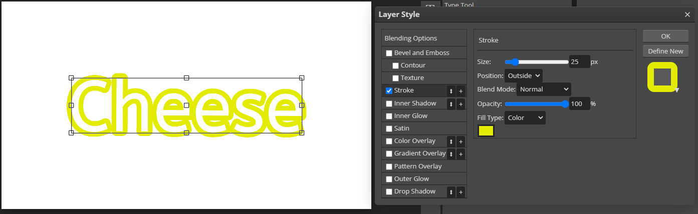
This is an example of what it looks like on PhotoPea. (A free online photo editor.):
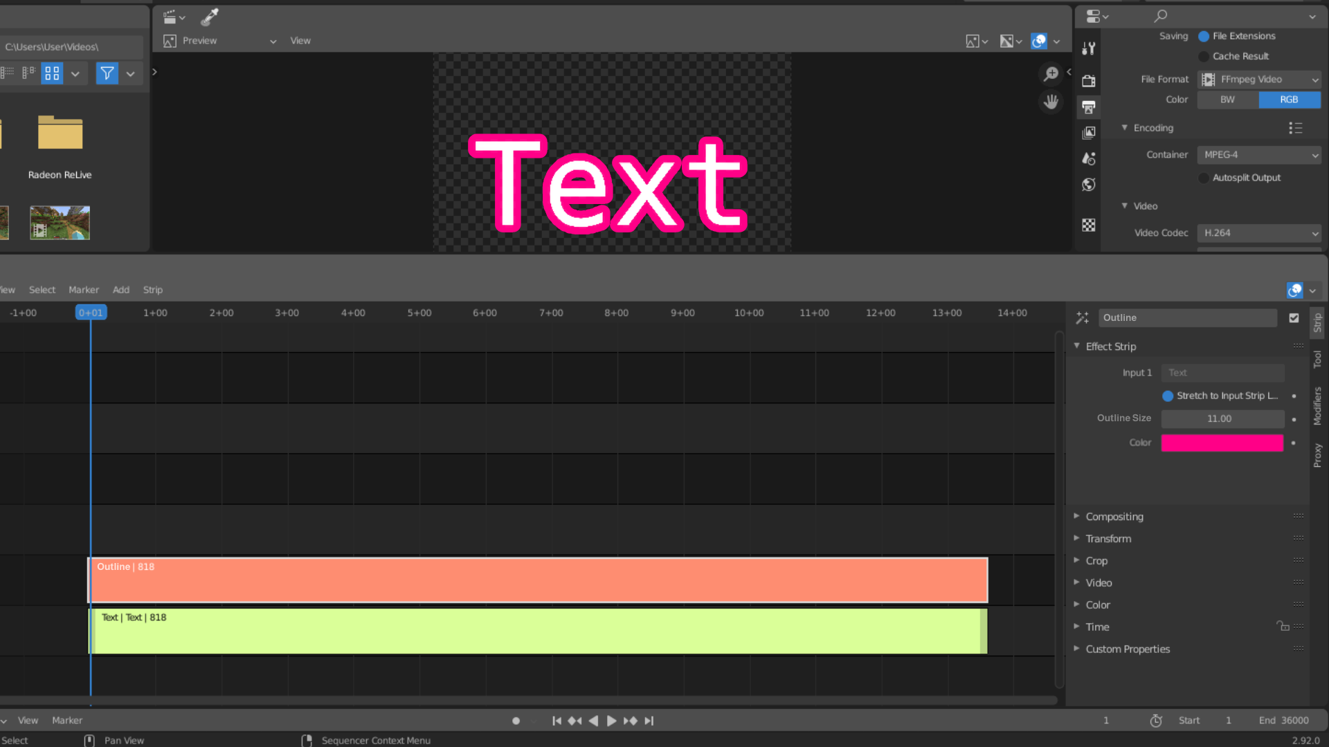
This is an example of what it might look like in Blender (Photo Edited of course):
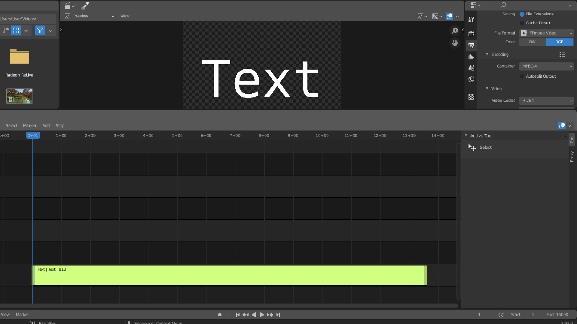
And this is what it looks like without the effect:
Here is an example with an image:

The usefulness of this effect are great for blender video editors. I personally have been wanting it for years, and have seen many other programs use this tool; I haven't switched over to them because blender is so much more useful in many other aspects.
4 Comments
First question is whether you need the letter interiors to be transparent. If not then you don't have to do this with outlines but with a second layer that outputs the text with a higher "grade" (increased weight without a change in advance). But if you need transparent interiors then I need to add a "stroker" to our text output.
Personally, I would use a transparent text background in specific cases, but if it's too much hassle, you don't need to; although I would like to know more of what you mean with a higher "grade".
Usually as we make all the strokes (lines) thicker we also make the character take up more horizontal and vertical space. We usually call this a change of "weight". You end up with text that is bolder but you can't just line up that text with the same that has less weight because the line length differs. To make them line up you need to increase the thickness of the strokes but leave the character sizes and position such that they still line up. That is changing the "grade" of the font.
Ah. That makes more sense, thank you very much!