
Stop removing the color from blender3D
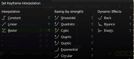
Not only that they put some horrible icons of the same color that do not help guide the view, but also make them dizzy ... Now I see that they also drew the color to the type of interpolation in the dope sheet .... Stop taking the color out of Blender3D because it is more complicated to use, especially for a beginner who, observing everything of the same color, will not know where to look.
12 Comments
there are already ridiculously long discussions about this over on devtalk.. a vague proposal in RCS is just background noise
Yeah, I'm fine with most of the interface icons, but the interpolation menu really bothered me. Some flat "pastel," style icons would be fantastic.
Color not only helps a little in differentiating different icons from each other, but it helps a TON in differentiating different parts of the SAME icon. IE: Look at the icons in the middle column. There are 2 parts, a number and the icon. Having them monochromatic makes them blend together if you are not looking directly at them.
This reads as a complaint without an actual solution. This site is for proposing ideas for improving Blender. If you have a specific proposal, then make the suggestion. This is not the place to vent about changes you don't like.
@<font style="vertical-align: inherit;"><font style="vertical-align: inherit;">Jason van Gumster</font></font>: What is required is that these color icons are not deleted. I support it ...
@Jason van Gumster: My language is Spanish, sorry if you do not understand the concept I use the google translator ..... Also if it is a complaint and many people agree.
Icons will no longer have baked in color, but they will be themable. That is - Their color would be defined by Theme. It is not implemented yet, but it will eventually. Don't worry about it.
Yes! It's because the icons can now be colored by a theme so they have to be white (icon pixel color * theme color) so I am guessing this will get fixed when the themes catch up. :/
Honestly I find those easing types pretty useless, the dinamic effects are ok, but maybe one of the easing tipes that you can tweak would be enough.
I use the google translator, since my native language is Spanish.
I would suggest changing the title of this proposal to something like "Stop removing the color from blender3D." The way it's phrased now sounds like you want them to remove all the color.
Maybe even something like "Bring the contextual color cues back into Blender's UX" if you want to be fancy.
@warpzone32:
I use the google translator, since my native language is Spanish.
@Ariel Gimenez: I understand.
My only goal was to help you promote your idea more effectively to native speakers before the click on it. :)