
Top Bar/Tool Shelf Alternative proposal
A few proposals for toolbar and other UI rewrites have been floating around.
As Pablo mentionned it would be part of the focus of the home stretch, I want to quickly materialise what I think is the most simple and obvious move for blender regarding this part of the interface.
I think the idea of a top bar for tool options works in a software like photoshop where most tools basically do the same, and it's mostly brushes, not so many manipulation tools. In a 3D software, things are much different.
Tools have varying degrees of complexity and needs for options. Having the top bar doesn't always make sense when the tool has only one option, and it's taking away from a valuable ressource which is actions rather than tools.
Actions in blender are currently accessible through shortcuts or through the 3D view menus. Adding an object, making a selection, transforming it, all these options are hidden behind menus with several levels of depth and most people use shortcuts or pie menus to access them because they are so annoying to reach.
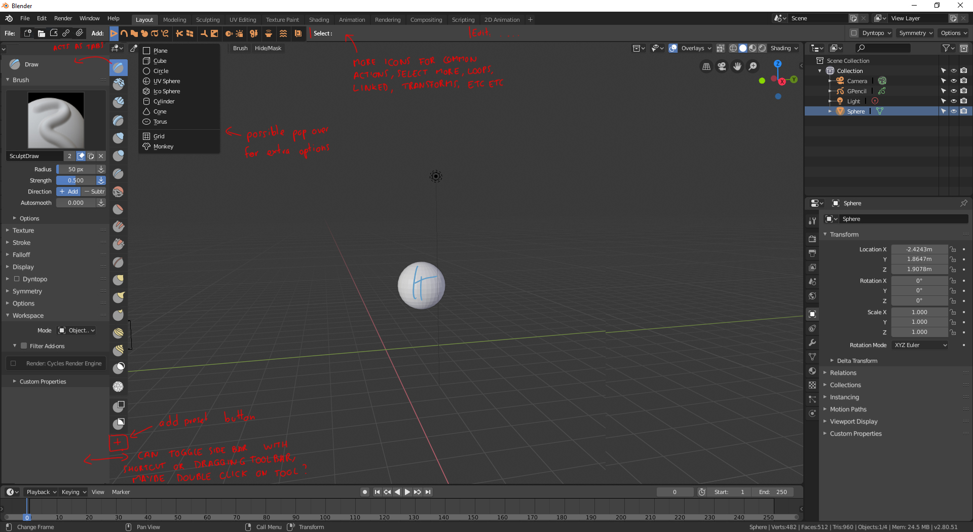
The most obvious thing to do, to me, would be to expose these actions as buttons on the top bar.
People worry about "button soup" but I think it's a matter not of number of buttons, but of grouping them in a clever way. Blender could make available as buttons all these actions in clever grouping to make newcomers aware that they exist, to make tablet users able to function without a keyboard, and to make the UI less menu based.
It's also a common pattern we've seen in Maya, Max, and even BForArtists. People feel instinctively at ease with it, and even if there are a lot of buttons in the end, people just need to look at them once to know what they do and they're always within reach.
They can also be mode dependent. Different menus are available depending on edit mode, and so the same could happen to the bar. Maybe not all actions would appear in that space, but allowing the user to customise them and add or remove buttons would let each person tailor it to their needs. There could also be different presets for each workspace.
The second part of my proposal, is a sort of T shelf which would just be slide out properties for the selected tool. We can use the same "vertical icon tabs" paradigm as the property window to show that the settings are actually those of the selected tool by having them side by side. We also now have a lot of room to expose all the settings, and they're always within reach with the possibility to toggle it like the T shelf used to be.
The problem of the old T shelf was its static nature and its kitchen sink look. Without the tabs, and by only showing the information tied to the selected tool, it can be very useful and also simple.
This is only an outline but I think it highlights how it could fix many problems with the current system all in one simple change.
4 Comments
The topbar full of icons is not my favorite, but I do like what you did with the 'T' shelf. Unfortunately it fails in the same way the accordion menus fail:
They're too busy/dizzying to look at. D:
They need a "temporary popup" button so the ones (most of them) you rarely use don't have to be opened/closed repeatedly when you have to tweak one option here and there: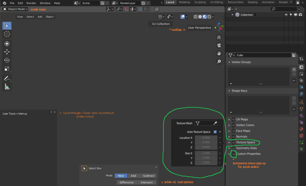
honestly id prefer to completely get rid of her
* @dodododorian * It's already possible to hide it, why not find a use for it instead? Also, do you see what I meant with the T shelf?
Hello. Respectfully, I think I would be more clearer to see the captions if your font color is white.