
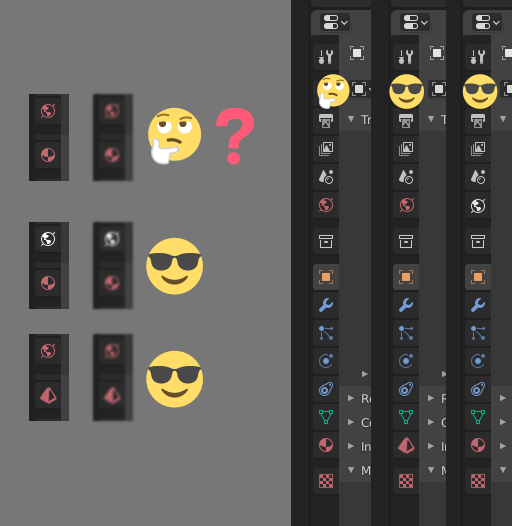
Update design of either 'World Properties' or 'Material Properties' icon so they don't look so similar. They're both small red circles!
These are both nice lookin' icons, but I still click the wrong one occasionally because they look so alike. There's really no good reason to have them the same shape and the same color, right?
I assume there's some historical logic to the color choice (white is...general? blue is...I don't know?) but having two different icons that are both small red circles just seems silly :-)
If you squint at it (or have bad eyesight or a bad monitor) even the pattern of where the dark patches are is the same on both.
Not sure what the fix would be - at risk of offending Martians I'd suggest swapping the red planet for a blue planet, but not sure if that fits with whatever underlying logic there is to the color choices?
Of course that may still not work for color-blind users? Having the icons at least be
different
colors or shapes might be a start though...
[edit] As some users have pointed out, the colors are red because both icons are in the 'Shading' category.
So here are two suggestions, either of which would make this clearer:
- keep them the same colour but change the shape of one of them - perhaps the Material Properties one, since worlds are usually round but materials may not be?
- An alternative solution would be to put the World Properties icon in the Scene category, since that also makes sense (after all, each scene has its own world) and also looks kinda neat :-)
I don't mind which, I just think the icons should all look different :-)
10 Comments
These colours are not random, both tabs are about shading (object \ world). Also you can partially customize these colours: i.imgur.com/r2TqpWm.png
Thanks - as you say, you can customize the color somewhat, which is great for colorblind users. However because both icons are 'shading' they will always be the same color, so it doesn't solve the problem of 'both icons look the same'. As I mentioned in the post, I'm aware there may be some reasoning behind the color choices, but surely it's a pretty basic rule of UI design that icons should be recognisably distinct?
How do you feel about changing the shape rather than the color? I know we're used to the current design but I think it could be clearer?
I've revised the mockup based on this - what do you think?
The are in far enough places that they shouldn't matter. Besides, changing the color would ruin the specific color coding.
While the two buttons are some distance apart, their positions change depending on what type of object is selected, and it's perfectly valid to have the panel small enough that you can only see one or the other, in which case you don't know which one you're looking at. While you say this "shouldn't matter", I've certainly clicked on the wrong one plenty of times, and I'm pretty sure I'm not the only one :-)
I know it sort of works but hey come on this could be better. Surely the whole point of icons is that they're visually distinct!
In this case, I would recommend changing the shape of the icon itself, not the color. Changing the color would break the color code, as @fructdw and I mentioned.
Sure, that makes sense to me! As long as users can tell the icons apart I'm happy :-)
I've updated the mockup accordingly, what do you think?
Hey, not bad! As a previous user, the icon is similar enough to understand what it is. The icon also makes sense, so I would be able to figure out what it means based on my previous experience in other software, if I was new to blender.
I have a "lateral thinking" idea: get rid of world icon. How? Just get rid of the whole world concept. Change it to "world lamp": you have to actually add a world kind of object in the scene. All the settings that are now in world panel would be in the object data panel of that kind of lamp, and it would have its own shading tree too, as lamps and materials (no more switching back and forth world/object shading trees)