
super annoying popup menu fix
Problem (only happens with resolution scale and when the mouse pointer is in the bottom half of the viewport when calling the menu) :
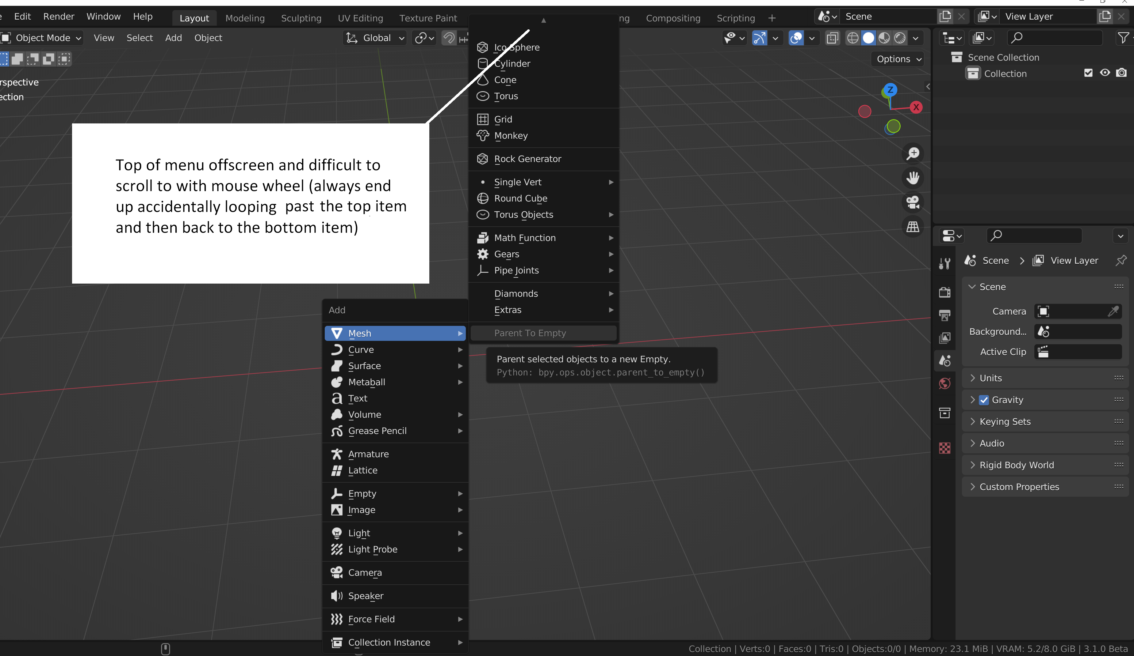
solution:

Additionally, the pop up menus should have:
a) scroll with middle mouse button and dragging (same as everywhere else in blender), and there should also be a scroll bar
b) scroll bar to the right of the current hovered menu (only current one so that it doesn't obscure sub menus when they appear)
c) remove continuous looping around the menu to avoid going past the last/first option when using the mouse wheel.
5 Comments
The solution you show isn't a solution, it just shows how it already behaves when you are not too close to the bottom of the window.
The issue here is that when you are too close to the bottom of the window for the new menu to open, it flips its display direction. And if that's still too small, it also switches the menu display to a smaller list with scrolling.
A solution could be to not flip the menu, but then on extreme cases where you are so close to the bottom you can't fit more than one or two elements, it makes no sense to persist in displaying menus downside.
Why not just move it so it always fits?
It already is the case.
I think a bigger question is- why are all of the context menus so long? Blender in general needs to become more context-aware- if you're in the modeling workspace, don't show things like armatures and particles... things like that. Power users will always create their own menus anyway- so make the defaults 'smarter'.
Erm, no please don't hide stuff depending the workspace. There are already enough troubles with the addons filters without adding even more inconsistancies.