
UI tweaks on Units and viewport Grid
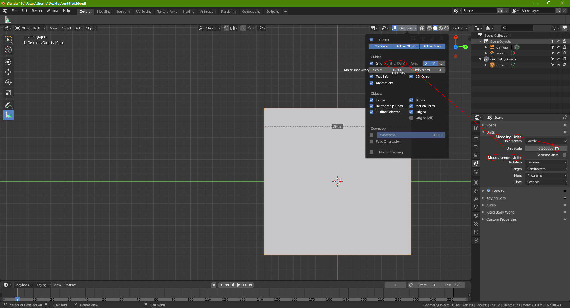
There is a little confusion when it comes to setting up proper unit scale in Blender along with the viewport grid. As such I recommend the following:
-
a) In the scene-units panel:
- Adding two headings "Modeling Units" and "Measurement units" would help clarify the intended purpose of the respective settings. (please see attached mockup).
- Adding the master unit (such as 'm') next to the unit-scale number would help a lot to clarify what blender is trying to do. Essentially driving home that the "unit-scale" is where the user actually sets the modeling unit.
-
b) The grid settings under "overlay" introduces a second scale which causes confusion right now.
- Recommend the grid to use the modeling units directly from the scene properties (please see attached mockup) and it would help to see a text of the grid units for immediate reference.
- Instead of "scale" it would help to switch to "Major grid lines every" so many units.
0 Comments