
Menu icon colors easier for eyes
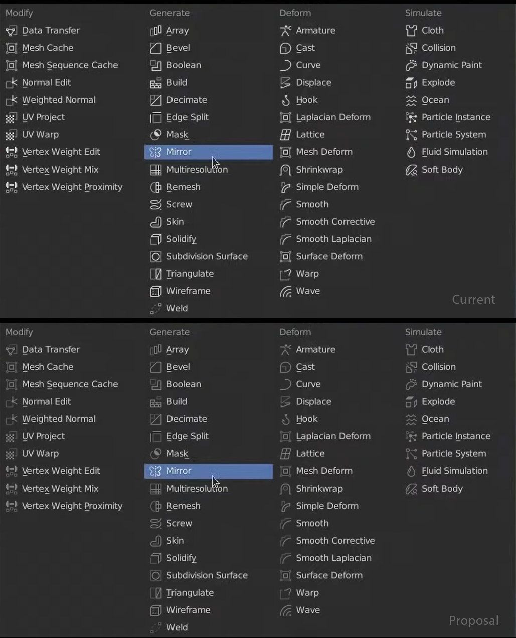
Could there be possiblity to dim the icons in the properties menus? Currently both, icons and texts have the same priority color (white) and they are fighting against each other. It would be easier for eyes to skim the items through.
Below you can see the mockup: Top > Current Bottom > Proposal
3 Comments
How about color coded for these, I saw someone did two colors mockup and it looked great.
You'll get low contrast ratio between icon and its background. It'll read poorly this way.
* @Alexey Adamitsky * But the icons and text have same hierarchy and they are fighting against each other. Isn't the text more important than icon? And icons task is to support the text?