
Right Toolbar needs improvment in 2.8
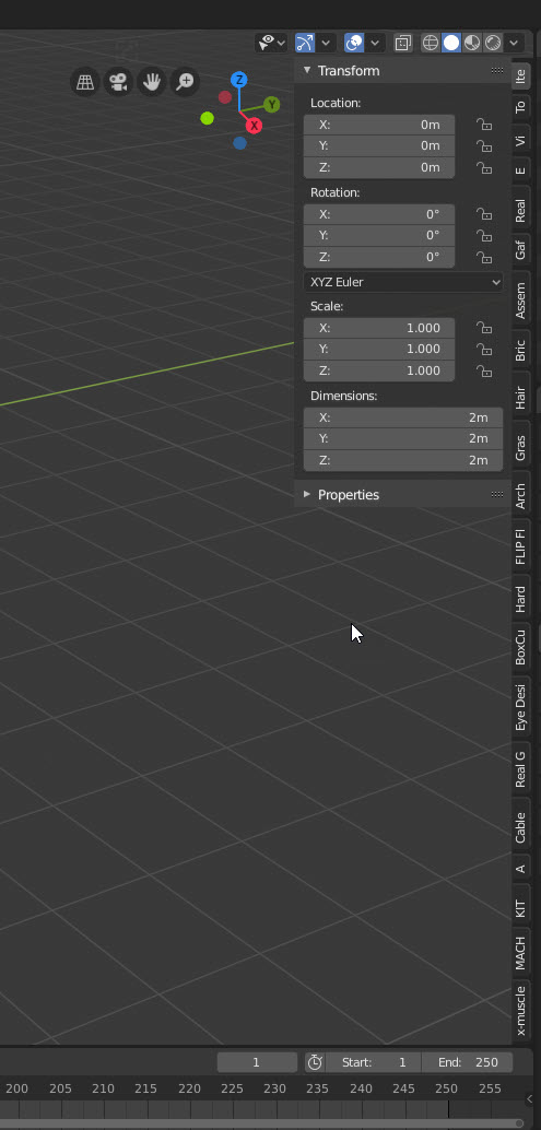
One thing that I noticed in Blender 2.8 is the toolbar on the right side of the screen when you hit the "N" key. It is awesome until you buy a lot of Add-Ons. Then it becomes super crowded and you can't read the tabs. You can use ALT + MMB to Zoom in on them but it is awkward when you have 20 or more tabs. Also you can't change the order of the TABS. I think having them a set size and using the scroll wheel to scroll through the tabs would be useful. Or having them enlarge when you hover over them, So you can read them would be helpful.
11 Comments
There is a large discussion right now going on at the devtalk forums about what to do with the right toolbar. Feel free to join in: devtalk.blender.org/t/the-toolbar-sidebar-interface-issue/8704/47
A lot of add-ons would probably work fine if they were in their own actual panel/window/editor (like the properties or outliner panels)
For the rest there could be a preference widget where all the possible side tabs are listed and the user can check/uncheck which ones they want to be visible at the moment. There's no way you need more than 9 or 10 of these things simultaneously.
* @thinsoldier * I don't like your solution because it doesn't fix the issue. It just fixes the symptom by forcing the user to manually toggle addons on and off just so they can fit on screen. Issue is not too many addons but how they are shown on the menus. I don't like the idea of addons getting their own panel either because that just makes using the addons more difficult and slow when you need to navigate to it somewhere and then enlargen the viewport there to see all the options.
The biggest issue is add-on developers thinking that their add-on needs its own dedicated tab. In most cases, that's not really needed. A lot of these add-ons could easily be integrated into existing part of Blender's interface.
I think the answer is something that has mentioned many times but always rejected by blender users. A toolbar. I'd take a hard look at the left side t menu and see if it is actually an improvement over 2.79. Here is my test proposal:
The reason to have at lease two or three levels of categories is to heavily reduce ui spam. Too many sub layers and you end up creating deep tool trees where maybe one tool is at the end of 5 clicks. Too few sub layers and you need to display too many primary tool groups at once because in such situation the first step is to find the correct tool path from that huge list before the user can move down the tool tree to the tool he wanted.
This hierarchy is not just for blender tools but for addons as well. I can't code myself out wet paper bag but I'd imagine finding the good place where to put your addon is not very easy or simple in blender ui. This hierarchy should help with that a lot as a bare minimum all tools should be forced to have a place in the hierarchy.
This hierarchy should not be like the tools are categorized in blender currently. The categorization should be about what the tool does (selects, snaps, moves, shading). Not what the tool edits (vertex, face, normals).
One key aspect of this categorization is make clear division between blender tools and object tools. These are terms I just invented but this is what they mean. Tools like undo, repeat last, snapping, 3d cursor, selecting etc. are all blender tools. They change blender, not the object. Object tools are tools that do something to the object. Move, scale, relations, editing tools like extrude and scissors are object tools. These two groups need to be separated to their own groups and these two tool groups should not be mixed.
Of course context sensitiveness is key part of this. Makes no sense to clutter the modelling t toolbar with tools from different workplaces (rigging, animation, video editing etc.)
I have quite a few addons and with now, i really can't see ANY names :(
This is describing an issue without proposing a solution. A few proposals around this issue have already been posted here. It may be worth it for you to search them out and contribute to those discussions.
Vertical tabs are not ergonomic. Even after years of usage I need to slowly search through. Horizontal stacking is the better way to have them.
I've seen this brought up quite frequently in the Blender weekly streams for months now, know that devs are definitely aware of this issue. But if you've got some mock ups on how to tackle this situation, do post them here.
* @akshayxw69 * I think that the length of this window should be dynamic based on the number of tabs. But the user would only see a section in the UI. Then you could use the scrollwheel to move the visibility of what tabs you would see.
* @EddieChristian * Currently if the size/number of side panel tabs exceed the vertical space of the Workspace area, they are shrunk dynamically so that you are at least still able to click on each tab individually but you and I can both agree looking at the attachment that it is a rather poor implementation and is need of a partial/complete do-over.
{attachment Desktop_Screenshot_20190826_-_18152170png}
When you hover your mouse over panel tabs area then the scroll wheel should work in a similar fashion like it does for the header panel. (this gif attachment doesn't seem to be working but you can try it out yourself)
{attachment ffgif}
As of now, the scroll wheel changes the visible addon panel tab rather than scroll the panel Vertically which I strongly believe should be changed to 'Ctrl + Mousewheel' since that's how it works in the properties menu and many other drop-downs in Blender internally.
For now you can use the "Filter Add-ons" checkbox under the Workspace panel in the Active tool and properties panel and disable all the non essential addons, know that it doesn't just hide the addons but rather disables them entirely.
{attachment Desktop_Screenshot_20190826_-_18040781png}