
Solution for handling alignment and usability of panel toggles (UPDATED)
Hi folks!
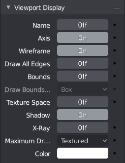
Since single column layout and other UI tweaks came to blender 2.8 there appeared a problem about inconsistency of toggles inside panels. I think that the best solution is to make them a full-fledged elements like buttons, pickers, combo boxes etc. It means that a toggle square with tick should be expanded to a full width size and act like a toggle button with "on/off" or "enable/disable" text, or even a "tick/cross" icon. It will bring to layout consistency, more ease readability and more precise click action. (It is not for replacing all the toggles, only where it make sense!)
On/Off text version:

Icons version:

Two column layout toggles vs original vs dot icons:


Possible solutions from devs (Link to task) :
 Although default checkboxes fits in places where there is no other elements (mostly two column layout,
but there is a problem with cropped titles for them
, in single column layout making wide toggle buttons will improve readability and "flow of clicking through elements".
Although default checkboxes fits in places where there is no other elements (mostly two column layout,
but there is a problem with cropped titles for them
, in single column layout making wide toggle buttons will improve readability and "flow of clicking through elements".
P.S. Similar approach you can see in some parts of Substance Painter UI for example.
11 Comments
Full on support for big buttons. Easier to click, more ability to customize, easier to trace to a label, and great. It is a little loud to the eyes, but worth it. Also PERFECT for touch screens.
@ondraise15: Hi, thanx for your opinion. Glad you like the way it looks and work! Unfortunatelly, devs closed task where toggles discussed. Maybe it will be reopened soon.
@ondraise15: Hi, thanx for your opinion. Glad you like the way it looks and work! Unfortunatelly, devs closed task where toggles discussed. Maybe it will be reopened soon.
wow! This is so much better than the current layout. I would like to see this implemented. 🤞 @stepanoveleg.dev You might want to add the existing checkbox for comparison. which makes it much clear, why this is a better looking.
@sreenivas9alapati: Hi! Thanks for advice! Well, then I will add an image from developer.blender.org about devs possible solutions!
Ooooh this does fix alignment inconsistency & I really like the icon version. If we can change the icon's colour as well, I'm all for it.
@fudushae: Hi! Thanx for reply. Yep, style is up to discussion. Interesting idea about colors like red for disabled state as example. There is already row contrast between toggles which is very easy to read, but your idea might work as well!
I actually like this, in the X-V flavour. If numeric fields would be not so wide it could resolve a lot of the issues that are now under study
see here
@lsscpp: Hi! Thanx for sharing your thoughts, glad you like it!
Looks ugly to me. I prefer the normal checkboxes.
@vertexsupa: Hi, thanx for writing your opinion! It looks a little ugly because I did a mockup in python code using some hacking tricks. Ideally it will look more solid with other ui elements. Anyway, those buttons is more readable because of better color contrast in rows and it easy to click on them!.