
Search window
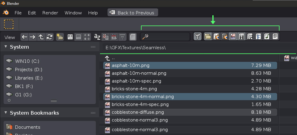
There is a redundant bar in the search function that I find it has little use. When you select files only the last filename is shown and we don't really need to have a bar occupying precious height space as files are highlighted and visible anyway. Also, I don't think splitting the top bar options in two would be wise as most things are on the left. I find it terrible when I have to move my mouse to the other side just to use the search function. You can open the files by using "Enter" so selecting a drive, folder, using search all on the left side would be much wiser and faster IMO as you don't need to move your mouse to the right for anything if you don't want. One more thing is that right now the search only works for the current viewing folder but let's say you have a main Textures folder and you remember a texture name but not which category folder you had it in. I think it should look for files in any subfolder as it does work in explorer for instance.

1 Comment
If you ever use a Widescreen you'll understand why putting those elements on the other side doesn't really feel comfortable. Using a 3440x1440 screen in my case.