
Convert the Topbar into a second editor header.
I think that blender has worsened a little its functioning and philosophy since the inclusion of the topbar. To improve the functioning of the active tools, give much more flexibility to the program and also improve the multitasking I suggest that the Topbar becomes a new header that is in each area.
The idea would be to divide the current topbar into two parts, the current top part containing the menus and workspaces would not be almost affected. Just a small rearrangement of the elements not to fall into the problems of the current Topbar, making it more pleasing to the eye. The lower half of the Topbar would become a new header dependent on each editor (or on each editor that needs a Topbar). And it would contain different elements depending on the editor it is in.
This restructuring of the interface would allow a great flexibility for the users. You can place the topbar where they consider best. Place each header on one side, or both on the same, or invert it...
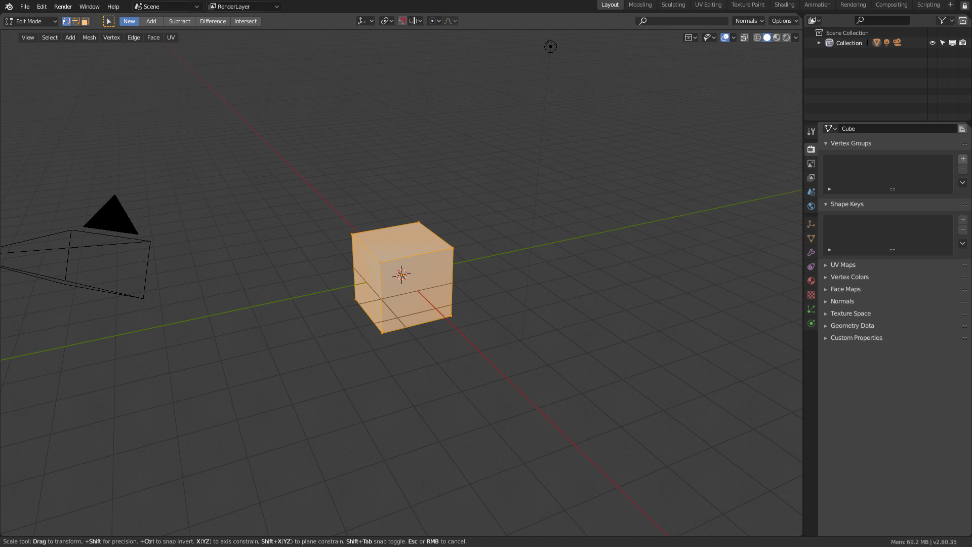
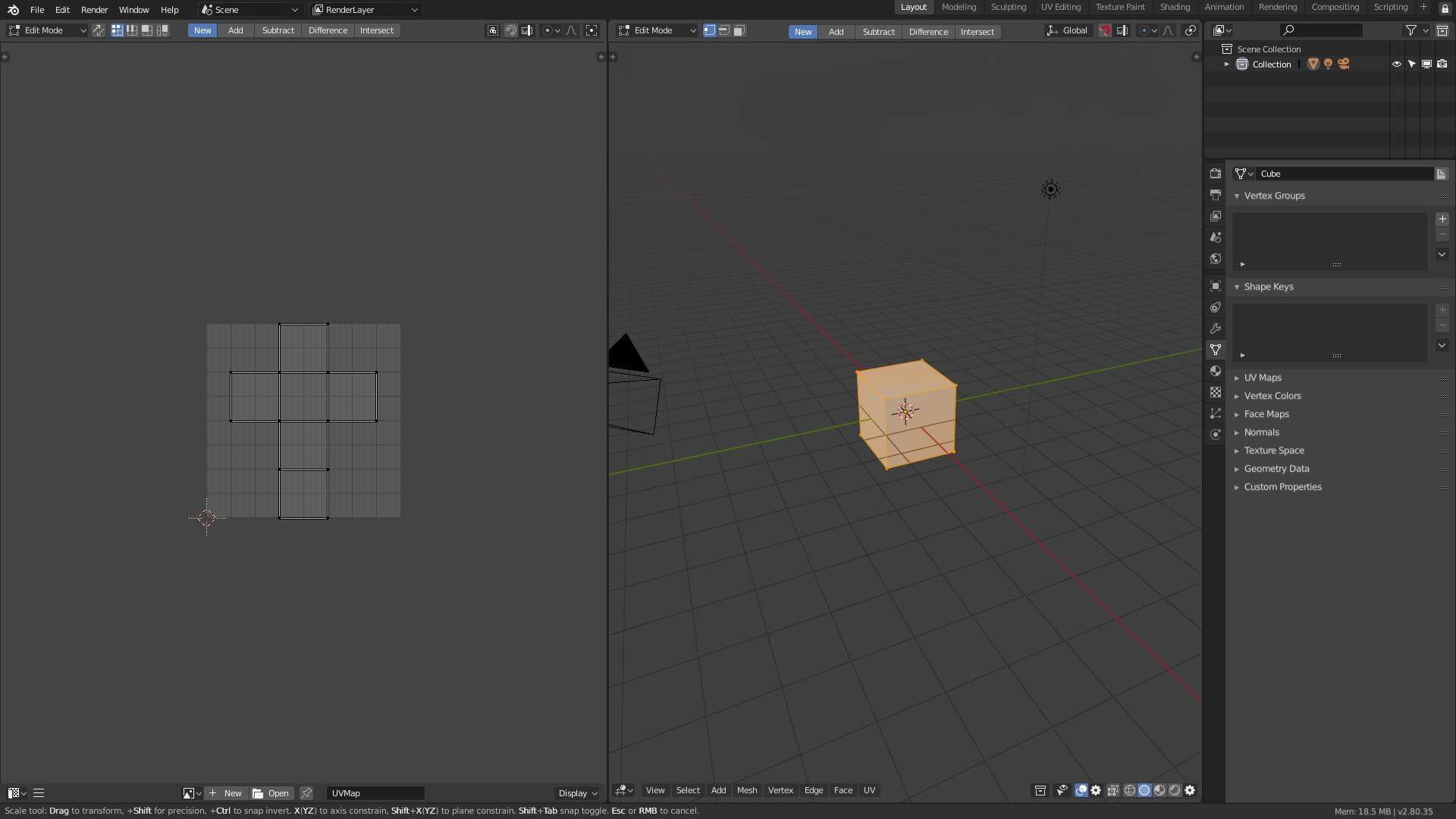
It would allow to use two different active tools in different areas and monitors without any problem. Currently in 2.8 can not work well with this because if we change active tool having two different editors the topbar is only able to show the last active tool activated. Making it difficult to understand the program and leading to errors.
It would allow you to put a search box in the topbar itself which is currently impossible because the search depends on the area where the user is acting. Facilitating the discovery of this tool for beginners.
It would allow to make a more specialized topbar in each editor where it is used And not just a repetition of the options of the active tool.
It would bring the Topbar closer to the user's work area. Unlike the current topbar that on wide monitors is very difficult to use. Also the user will have more space to configure the layout
It will allow to reduce the density of elements of the current header that would be distributed in the new topbar. Focusing in the topbar all the options of edition, options of the active tools, mode of edition,... While the classic header would only contain menus and options of that area as for example the visualization of the viewport. Separating and nesting the interface better
Best Regards
Edit: In order not to confuse people, both header would be configurable. Allowing this others layout like this
devtalk.blender.org/uploads/default/original/2X/a/a13117190fb5b0b4a6f35a24bf7b98baa68c6705.jpeg
this
devtalk.blender.org/uploads/default/original/2X/b/b80a83957f74b610b337862e64c10cfdba6e5f62.jpeg
this
devtalk.blender.org/uploads/default/original/2X/7/7a85c947852795b82fe06cc74ea12cc02a42fef1.jpeg
or this
devtalk.blender.org/uploads/default/original/2X/3/3fb1e92571e6a91d7ba4b87e2bd723ed9679377e.jpeg
NOTE: Devs have implemented this proposal, some details are not similar. But the main idea is done.
20 Comments
The topbar could just be an editor view like the toolbar of #bforartists fork, they have a working toolbar editor that you can place anywhere, duplicate and customize - with the new topbar sliders and button/dropdown system, youd have the perfect solution. It's an addon, but it also can be a working concept of your proposal.
It seems like maybe the topbar current tool concept could be improve, but this proposal seems unclear and under-specified.
From the screenshots, I can't understand what consistent change you are suggesting the programmers to make about the placements of the different UI bars. They just seem randomly moved around.
If the current mouse-tool is per-area, does this mean the 3d-view mode (object, edit, sculpt, etc) would be per-area as well? (because the current mouse-tool is specific to the view-mode)
If 3d-view-mode is per area, it seems like we'd be moving towards a situation where workflows with multiple 3d-views would need to toggle workspaces instead of the historical model of toggling modes. This suggests perhaps TAB should be changed to hold-for workspace-pie-menu and tap for last-workspace-toggle. This has advantages and disadvantages.
* @David Jeske * I don't understand what you're saying, I don't think you've understood the proposal or I've explained myself very badly.
There is no random order. The controls have been reorganized so that the topbar contains the user's tools and the active tools. In the header the user contains the menus and the properties of the editor in question, which are secondary.
It doesn't change anything about how blender works internally, it just restructures as the topbar is shown. The proposal does not ask to change how the blender tools system works, how they share the editing mode and the tools in the same area.
* @Alberto * FIrst off, I agree that the topbar is confusing... however, I don't understand your proposal. It would help if your examples were annotated with boxes and descriptions explaining what is going on.
You said "It would allow to use two different active tools in different areas and monitors without any problem." As far as I know, Blender only supports one active tool across all of blender, so how would it support two active tools in two different areas? Can you provide an example? Right now, if you make two 3d views, they both have to stay in the same mode and the same active tool at all times.
Let's also talk about your first mockup. If I understand correctly, you are suggesting the 3dview would get a two-row top-bar.. The current global top bar would be in the first row, with some other stuff. Where did the editor type selectors go? why is there a search box in the new 3dview topbar? What does this look like with multiple 3d views?
I think we should be thinking hard about whether blender should support different 3d views in different modes or tools simultaneously..
If the answer is no, perhaps we should consider the opposite suggestion, and consider moving more stuff to the global topbar. For example, currently the 3dview-mode set is global for all of blender, why repeat it in every 3d view? Instead it could be in the global top bar.
If the answer is yes, then we need to change blender to support having one 3dview in edit mode, and another in sculpt mode, in which case the global topbar makes no sense anymore.
* @David Jeske *
I like your proposal, but I don't want icons cluttering up the UI. I want to be able to hide all the icons, like I can with the toolbar. Maybe I don't understand your mockup?
* @Josephbburg * yes, you can hide the headers in this proposal
* @Josephbburg * Yup, I'd be afraid if the ability to hide it all along will be gone.
I agree that the topbar should stay in the 3D viewport area, but disagree the move of some elements of the header inside of it
* @dodododorian * becasue some tools of the toolbar simply have too much option in it and it would be confusing to mix the actual tool with a more generic function of blender
* @dodododorian * but the toolbar just above the header is an excellent idea !
* @dodododorian * * @Pablo Vazquez *
Upvoted, as I upvoted anything that pushes in the direction of revisiting the topbar, which, as of now, it's faulty
* @ Lsscpp * If you want to suggest something tell. I want to make the better proposal for topbar.
* @alberto3d.1984 * I think it could take a hint from bforartists, and display common single actions depending on the mode. So add meshes in object mode, select loop or extrude etc in edit mode, retopo or subdiv in scultp...
Also offer some settings like different views, the rendering engine...
The current tool settings approach is redundant with the property view which has more settings, and is a bit too far from the center to truely be a place for shortcuts.
* @Alberto * I already made my proposal here
* @ Lsscpp *
It seems that this proposal has interested something, so if you want to pass me your ideas if I can add and defend them ...
Is it just me, but I always hide the top bar. ALWAYS. IMO, it's absolutely rudimental, and I really like the way the icons and menus are layed out on top of the viewport area without obstructing my view and giving me ability to have more viewport space in fullscreen mode. The more free space and less bulkier UI all around my viewport is better, for me personally, you can have a different preference though. I'd ditch the top bar completely, focusing more on some icons and drop downs and more pie menus and more options in context menus. When I work I try to always focus on the center of the screen and rely on hotkeys and mouse I really don't want to look up or anywhere else apart from the center of the screen it kills the flow, slows me down and reminds me of Autodesk (and brings back my PTSD). And I really think that retaining the maximum height of the viewport is way more important than it's width, as we all use widescreen monitors. I'd rather have more icons the way we have now on the left and right side (given that they are compact and not too wide).. But it's just my preference =/. P.S. Please don't remove the option of hiding the top bar all along! Please don't give away UI customization flexibility if you are to make changes to Top bar.
* @Chingiz Jumagulov * You have valid personal points. I've worked with an iconized topbar that is customizable with a fork called Bforartists, and I have to say I use it more than I use hotkeys - but indeed the point here is that it should be as customizable as possible with some ok defaults.
* @Andres Stephens - Trinumedia *
Please join us in discussing exactly this in this thread :) devtalk.blender.org/t/convert-the-topbar-in-a-new-editor-header-proposal/6431/101