
Move the channel box filter above the channel list
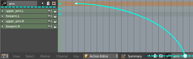
It would make much more sense if the controls for which channels are visible are moved above the list - much in the way the Outliner is designed. Also the search channel input box should operate like the one in the outliner - in real time, without a need to hit ENTER to get search results.
It would also be very useful if we had a search filter for the Dope sheet as well!
wiki.blender.org/index.php/Dev:Ref/Proposals/UI/Better_gui_for_animators It should also be above the list. This should free up some space in the already cluttered bottom panel too. It just doesn't make sense to have it in the bottom panel.
1 Comment
yes very much please, it takes too much space where it is now and it could also feature a filter preset for translation / rotation / scale which would be nice.