
N Panel Tab Clutter
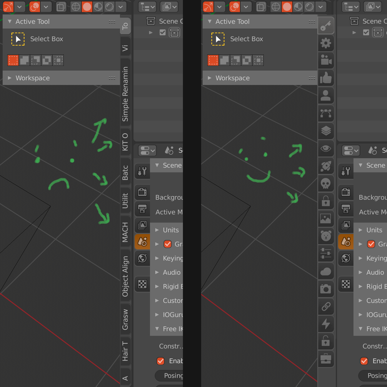
After adding a couple of addons things can get quite messy in the N panel. I'm no UI designer, and I'm very much open for suggestions, but after spending some time on renaming addons by going into the script, re-doing it after updates I figured there must be a better way.
The suggestion would be optional icons instead of long names for the tabs. I guess if addon dev's could do the icons it could mess up the interface (maybe guidelines would solve that, not sure). Anyway, open to opinions, cause my N panel is starting to be an eyesore. :)
51 Comments
Another solution could be double (or more) columns. It would provide more space for each tab in case they have long names, and could in theory be scaled up to as many columns as you need.
{attachment expng}
It's not the prettiest solution, but it's probably more likely to be implemented this way.
* @Zach Hixson * Good idea, multiple columns could help - I'd even make multiple colums for icon tabs, there can be a lot of custom scripts that are needed in a larger production environment.
Everyone has their preference, I don't really need the name for the script/addon I'm using, I've gotten used to having icons for world settings, object data, modifiers, modeling tools etc., could go with the same for addons.
I can perfectly understand if someone prefers to have names for tabs - that's why I'd make it optional.
* @3dddan * I do like the Idea of allowing developers to add icons to there addons. It seems like something that would be easy enough to toggle on and off with preferences.
* @Zach Hixson * it’s an obvious solution at least have that, I have over 100 addons, and can’t even see the names anymore - so use the mouse scroll until I recognize the interface - terrible way to navigate, and using the pins for favorites - that’s the only way to keep it under control - I also saved it with pinned tabs as a startup file
* @Zach Hixson * That would be amazing and I think would work best. I hope devs can actually implement this simple solution when they are done playing with grease pencils.
Icons can be really confusing, I would rather keep the vertical tabs and make the tabs list scrollable or put the text horizontally, even though it's far from being perfect.
On web browsers, there are addons to deal with tab clutter like
OneTabfor Chrome : one button that displays a vertical list of all tabs. Applied to Blender it could be something like this :It would allow for more expandability as you have more rows + scrolling list, also more horizontal room for long titles. Still not a perfect solution but better in terms of ergonomy and less mouse travel.
* @hrdcrpxxx * I guess it's a matter of preference. I'm used to using Maya in production, with the ability of easily drag and dropping own or imported scripts to the shelves, assigning built in or custom icons for them and moving them around freely. Whatever someone is comfortable with - that's why I stated optional. I'm not a fan of written text and lengthy descriptions.
The thing is, in a big production you often need more than 20-30 custom scripts from different departments on a daily basis, it'd be helpful to sort these in a streamlined matter. Whether it's text or icons, as long as is optional I couldn't care less.
* @3dddan * yes, it's definitely a matter of preference.
I think we all agree there is a problem with the current N tab panels. It needs a major overhaul, but that is probably not for 2.81...So I was suggesting more of a quick 'hack' (ie addon) to make in more practical in short term.
Also being a Maya user myself, I find the custom shelves invaluable in day to day use, but it's also a VERY POOR integration imo (like how many times did you lost your custom shelf prefs ? or how do you deal with naming you rcustom buttons using 3 letters / waste time making custom icons). The Maya custom shelf is a mess in terms of UI and ergonomy.
The 'custom toolbars' of 3dsMax are much superior in that regard (custom toolbars can be docked / floating, have text or icons, fully resizeable,... ). Maya's custom shelves are very useful, but at the same time very frustrating and porrly designed (it's probably a good summary for Maya in general).
Regarding text vs icons, I'm heavily biased toward text : I like lightwave's approach, or ZBrush's Zmodeler's text only menu (I would't consider Zbrush as the pinnacle of GUI design though). Try to picture Maya's hotbox (space bar menu) with icons instead of text...nightmarish. Rappatools plugins menu : even if you don't know the plugin, it's easy to understand what it does.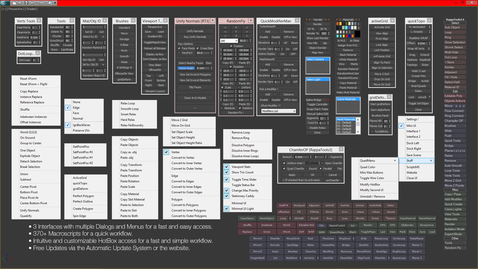
* @hrdcrpxxx * haha, ye, I guess it truly varies from person to person. I'm a very visual type, if it was up to me I'd make an option for icons only. Like maya tabs, you'd usually populate them with scripts using custom icons.
Completely agree though, the custom shelves are very useful, usually in bigger productions you'd set up different shelves for different departments, so one can easily access tools used in layout or lookdev when working on fx. Currently there's no such thing, I'd have to manually enable every addon one by one. Also, usually having at least 20-40 inhouse tools per department used on a regular basis would further complicate this issue - one that'd need to be resolved, if we want big studios to even look at Blender. (talking about VFX, not sure about other fields - 800 people working on a show with 2000 shots, Blender at the moment is just not ready for this on many levels, UI being one of them)
But yes, some people are very much into icons, some prefer text, some like hotkeys, some marking menus - to some extent we'd need to accommodate for more scenarios than one, else we'd loose a part of the user base.
Please make addon like this for where is posible to scroll between addon tabs without shrinking. That would be revolutionary! Keep great work! :)
Hi everyone, please take a look at this add-on made by Chipp Walters:
👉 gumroad.com/l/simpletabs
👉 youtu.be/6h3SyW0YgRs
Icons instead of text? No thanks!
Perfect interface in LightWave 3d - strict and concise, without tinsel.
* @l2zvery * OK, you put some effort into replying, might as well have read the suggestion and the thread. I'm going to sum it up for you:
-I'm no UI designer, this is merely a concept -The icons are placeholders and would obviously need to be Blender conform
If you want lenghty descriptions instead of icons that's fine, I'd stick with icons, as is the rest of the interface. Wrench for modifiers, Icons for extrusion, and other operations, it's not like this would be throwing off the balance - however, this is why I said
Optional
A number of times. I find the lightwave way awful and prefer the maya way, everyone is different.
I woudn't mind having a skull and a teddybear though :)
* @3dddan * A beginner may not understand.
Either text + icons, or text only. No other way.
Icons for quick visual identification only. Text to give meaning to the button.
* @l2zvery * Let's agree to disagree. Maya has mostly icon's in the user interface. Zbrush is text only and as much as I like it it's neither user friendly nor a good interface.
* @l2zvery * Have you really misunderstood the idea or are you just trying to be so arrogant? It's about having a choice. It's a great idea to have the icon panel as an option. Customizable icon looks fine as an idea.
Hi.
This issue (the N panel being cluttered by tabs) is a real annoyance for Blender users.
As you may have noticed, addons are not simply displayed in a tab, but also in an expandable drop-down menu, a "container". And I noticed that some addons had an option to customize the location of this "container" (for example "Backface Hiding" : gitlab.com/ChameleonScales/Backface_Hiding ).
That's why, for a few weeks, I have contacted several addon developers to ask them if they'd agree to add an option (in the addon preferences) to let users customize the location of their addon. To let users choose where they want it to be placed.
The overall response has been really positive and most of them consented to add this option (if you read this, thank you, addon devs!).
For the moment, I have asked 43 developers to add this option (some devs have created several addons).
* @ xan2622 * cool proactive thinking. Do you have a list/google doc of the addons ?
* @_hpx1 * No I haven't. I just have bookmarked them.
* @ xan2622 * And I was one of the developers who added it, or maybe I was in the todo stage when you wrotte this... In my case I added but in a buggy way, blender should do something cause is tiring to manyally change it everytime you update them when there's too many addons🙄
Here is my proposal. The thing would be:
The best option in my opinion is a normal HORIZONTAL STACK of headers that are expandable, no hard to read vertical text. It can have a behaviour like in zbrush where Click opens only one and closes the others and Shift+Click alows to open aditional ones. Common we can already hide this with N, why do we need that poorly designed bar? Even after years I can't get used to read vertically and I loose time to search to the ever changing N panel.
This annoyance is finally about to come to an end. 😌
This patch (not reviewed, not merged yet) makes addons tabs in the sidebar (N panel) not shrink when there are too many of them: developer.blender.org/D15395
Consider awarding a ❤️ token to let #b3d developers know that you like the patch.
⚠️ Remember that this patch is NOT the place to discuss about your suggestions for sidebar UI redesign.
I like the idea of heaving icons to fix this annoying space issue. When hovering over the icon a tooltip should occur with the name. The list should be also scrollable if not enough space. And maybe an option to switch back to text, for people who prefer text over icons. With the scrollable list the space issue would be also resolved in text mode.
Personally I have a really hard time reading the vertical text. Moving the tabs to the top should be an option.
Sadly the one of solutions (addon filtering) is not working well for now (it hides import-export options). The second problem, that addon-makers make their own tabs even for small tools, instead inserting tools int oexisting categories. The next problem is a user, who want to keep 100 addons, that he don`t use simultaneously.
Hell yes.
agree need more icons everywhere, but problem need icons looks intuitive. May be need system for edit names for new tools, for change order place as u want and may be mark color of button with tile of tool
* @Serj Coruzyak * Yes, I agree - by no means is this a suggestion for icon design. They could be set from a pre-defined Blender conform icon library, could be colored for all I care - important thing is, they need to be consistent with the UI, and help organizing the N panel.
very nice
For this problem, I wrote a Blender addon: N Panel Sub Tabs. It introduces the concept of Sub Tabs. It can make the N Panel clean and organized, even if you have hundreds of addons.

Revisiting this chestnut...
It was bound to happen. There is only a limited supply of space and a plethora of very desirable add-ons. Some have short names and others have crazy long names. There are even some add-ons to help manage the clutter caused by the continued adherence to this outmoded tabbed concept. That alone should be a red flag in the design...
Perhaps the Asset Browser could point the way to a simple ,configurable dropdown menuing system where users could create groups and organize their add-ons in useful and meaningful ways? Look at the flexibility that the solution provides for categorizing otherwise unwieldy information.
My opinion is to slim down the N-Panel for only the most important plugins and make a new dedicated window (Editor Type) for all plugins. This way you can position the plugins somewhere, even a second monitor, and have also the quick access in the N-Panel.
There is a new addon just released called Clean Panel. It works far better than any other addon that tries to fix this Blender problem. The dreaded N-Panel mess. I have it and it works greater than all the others. Its not free but its real cheap. They are having a sale that ends Jun10th. Get it here: blendermarket.com/products/clean-panels
Simple Solution: allow dropdown menu for selecting addon instead of vertical head rolling for reading
I've never understood why blender devs abandoned the good old dropdown menu concept working so well in 2.79, but let's invent the wheel anew ...
I think the N-panel should contain only the basic functions, all add-ons need to be removed from there and a new menu to be added, with the name 'Add-ons', next to the menu 'Oblect'. Each add-on must open in a floating window with the ability to move to a second screen...The 'Filter Add-ons' in Workspace Settings is one solution.
May be just show the recently used 5 tabs and collapse others.
a much better solution would be to create a new tab for addons in the N-panel and move all addons there
***@mod moder *** The clutter would still be there if the user has activated 15 addons..
* @ xan2622 * there is no mess on the list ...
Even a list of expandable tabs like the modifiers stack would be better. Vertical text is an annoyance even after all this time.
I do agree, im new to Blender (Comming from Maya) but one thing that would be handy aswell if you could open more than 1 tab, im doing rigging now and i all the time have to switch between my trasform and the Bone Layer (is a addon) Tab ... another extra mouse move and click ....
* @maarten * you can open more than one tab - right click on the tab name press pin, it will remain there - I've set up like 15 of those so they stay up on startup - helps a lot.. .. what I'm finding tho, n panel is basically blocking my view so I open another window to just use it for n panel.. it should have it's own window, and options to place tabs where you want, like horizontally would probably help a lot as I'm using wide screen monitor..
Yes Please!!!!!
I just voted UP and it sub tracked from the count From 50 to 49. so I voted down to go back to 50, boolean voting
The option to have icons here would be cool, in an addon level anyway.
* @rodgerdaledavis * Meaning if an addon chose to use an icon instead of text.
The devs are perfectly aware of the request for this feature, we've ordered it like 20 times. several at RCS.
* @Alberto * I'm sure they are aware,the issue is pretty hard to miss. I haven't seen any to-do's for it though, plans in the modules. Might have missed them, not sure, but this has been a problem in earlier versions as well. Figured it can't hurt to have an open suggestion, that doesn't really hurt anyone, right?
* @3dddan * No, it doesnt hurt. I only tell you that we did 4-5 request of this site, petitions in the developer thread of the sidebar also a lo of people also the official icon artist made some mockups and William read all that. all in the last 2-3 months
So, if they want do it or don't... is other history
* @Alberto * I'm following the dev forum to some extent, and rightclick about once a week, seen some conversation on this but it never led anywhere. With a constant flow of new Blender users you're going to see this regularly unless a moderator flags it as a duplicate.
If the majority is fine with how it is now I'm perfectly OK with using Blender like this, and by no means would I want to transform it into something that it's not.
That being said, In the Maya shelves you can easily drag and drop an imported or own script onto the shelf, choose an icon or make your own and move it around to your liking. If something makes usability better might as well talk about it.
This may be OK for hobbyists, but imagine a big production scenario. There are so many custom tools at big VFX houses, I'm currently looking at twice as many Maya tabs full of scripts as the default would have, and I really cant see where I'd fit these in Blender.
Thank you for pointing out the history of the conversation regarding the n panel. I replied to the dev talk thread as well, probably angering some people :) (but there's no way have the time to read all 1280 entries. It'd be handy to have a summary on these subjects)