
Minimum width for properties and toolbar panels
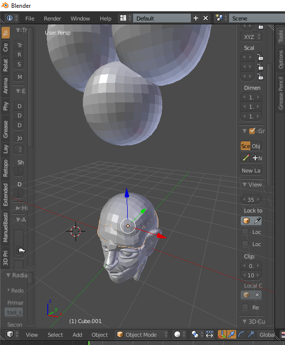
Adjusting the toolbar and properties panel widths is very useful. However, having them adjust to an unusable width can be confusing and unnecessary. I suggest adding a minimum width for panels and collapsing at the minimum width. Maybe have it as a setting in the system preferences? Either that or have tabs visible at a 'minimum' and have the full panel visible on hover.
6 Comments
appear on hover would be confusing imho, but i agree in general: if you drag it over a threshold, just disable it
why is it a problem for you that Blender lets you set a witdh that is unusable (for you)?
@Caetano Veyssières: It's more of a general UI problem. UI should have purpose at any scale. If it doesn't serve purpose it shouldn't be visible otherwise it'll just create visual clutter. The panels don't elegantly display information at a certain scale so I propose it not be seen at all.
What would you recommend the default minimum width to be?
@Jason van Gumster: Not sure. It would have to be variable since the UI scale is adjustable. Possibly 300 pixels but I would have to play with the size to determine that for sure.
@rndpln: I'm not sure that it's wise to set a threshold in terms of pixels. The same .blend file could be opened on a giant 4k screen or on a small laptop screen with scaled UI elements. You'd need to set by some percentage somehow. However, I'm not not sure that there's an easy "sweet spot" to pick as a default value that makes sense for all of the different display possibilities available to Blender.