
Long press/double click for Viewport Shading Dropdown Menu
Would it be easier to access Viewport Shading Dropdown Menu by using Long press or double click. Just another option, we can keep the down arrow btw.
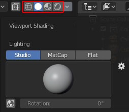
Would it be easier to access Viewport Shading Dropdown Menu by using Long press or double click. Just another option, we can keep the down arrow btw.
7 Comments
good idea, but still I don´t know if it would be good to remove the dropdown button as well.
Absolutely the right decision. Fewer elements in the interface, more use of input methods.
* @AUDITORIUM * I'm not sure how it's fewer elements. He's not suggesting that the down arrow be removed.
* @Jason van Gumster * Personally, I have no problem with that being removed (fewer elements is better, and I like it). But looking at current developments from 2.79 to 2.80, that I think they are focused on User Interface for "novice users", maybe they should keep the down arrow for a while.
* @toasto * NOt a fan of calling it 'novice' as this makes it sound like it's only there if you don't know what you are doing. Yet if you encounter a menu item where you actually really don't know what is expected of you because someone else thought clarity meant 'for beginners' then you get frustrated.
CLock-hold would pobably be more consistent as there are already other icons which are doing that. Though in that case there should be at least a small arrow in the lower right corner of the icons to indicate click-hold like in other instances. On the other hand this also might slow editing down when you have no other option than to wait a second for the settings.
What I'm saying is: Yes but keep the arrow either way as it's probably not THAT trivial. ;)
* @motionblur.of.doom * Yes it's not trivial, because it's just another option. Only time will tell what user will used the most later on.
And about to wait a second to hold, I am agree about that might slow when editing. But I think double click still faster than dragging the cursor from shader icon to the arrow.
About a "novice", sorry about my English. I used quotation because i wanna say something other than that but I can't find the word. Pretty same like Blender now have toolbar or gizmo and doesn't have before. That tools exist just for another option. Just my opinion :D
* @toasto * Yes - that's the way I see it as well. More options are better as long as they don't clutter the screen space unnecessary. Still: Clarity and intuitiv usage (meaning: predictability and consistency) are the highest priority because they dictate how easy you can pick up a tool or workflow you haven't touched yet or thought about in a long time.