
Minimalist attributes.
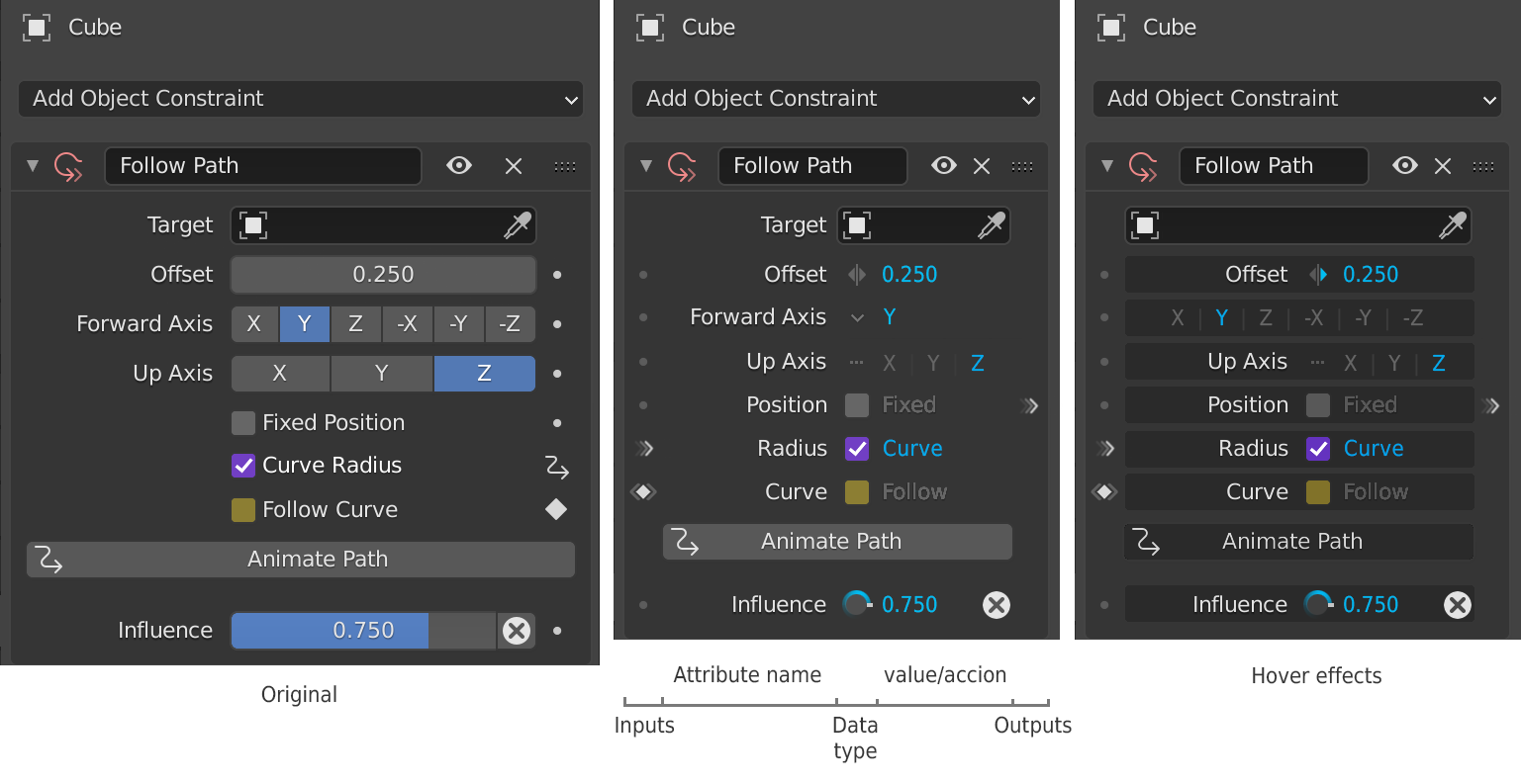
In an attempt to compress the attribute editor and remove the permanent giant buttons and sliders, I have come to the central image layout.
I have put on the left side, the inputs such as the animation keys and the drivers. Conductors for other properties, which are currently unrepresented, are on the right side as an output.
Coloring the central row data type could indicate animation or input drivers, allowing to leave the bluish color for the values.
As some parameters such as Target or Forward Axis have a reduced space, when the cursor passes over them, they expand horizontally.
This is a minmimal example and requires a more in-depth study, but I think that this arrangement favors the understanding of the data, is more compact, and spacing more regular.
Although in the recent versions of Blender the UI has already improved, what do you think is worth it?
8 Comments
I am voilently opposed to adding any further icons to the UI unless it's a major tool like in sculpt mode. (but there have been brush/tool management proposals that actually remove nearly all current sculpt tool icons)
* @thinsoldier * I agree. Keep the old icons, so people don't have to relearn them.
Opinion is divided, although now there are only five votes in favor, it has fluctuated considerably. Thank you all for voting and commenting.
I'm not a fan of this direction either. If you're not familiar with a dialog/screen, you find yourself hunting for what's most important first and visually-speaking, finding scattered items.
This is the direction Apple has taken with removal of buttons from iOS in the last few years, only to substitute miniature < marks and non-obvious words as buttons in the corners of some screens.
It's also why I get calls from my Mom who now finds navigating much more difficult on the phone that used to be so easy it didn't need instruction.
The third example is better than the middle one, but the first is mentally far less taxing to use/find/identify what things are and what they do.
* @b.a.freeman * Although I have not looked at it, After Effects is more the reference than Apple i1.creativecow.net/u/328246/whatdoesitdo.png
The drop-down menus require some extra step but compress the data better than the ratio buttos, and show only the active option, less distracting. Ratio buttos is only suitable if constant modifications are required. Blender when you edit the last action "F9", it always shows drop-down menus or vertical ratio buttons, and they don't bother anyone. docs.blender.org/manual/ko/2.81/_images/interface_undo-redo_redo-last-edit-mode.png
Perhaps the best solution would be to show the vertical menu by clicking on it, so when hovering over it, the menu would not be activated automatically, the typical thing.
Although in my proposal there is already an arrow that looks down to indicate that it is a drop-down, and hovering over the cursor could light up without actually displaying the menu until you click.
Buttons are overrated XD
I like it a lot. Just a few thoughts :
* @Alexis Benoit * True, but if the list is vertical it could cover the rest of the values. A side scrolling like the desktop of a phone could be the solution.
I had also thought about the ratio buttons being automatically converted to this type of list, when there is no space left. In this way, when the width allows it, all the options would be exposed.
And the wheel depends on the interpretation, it can be a clock or a dimmer. i.pinimg.com/originals/cb/f6/ae/cbf6ae344db479fff40ee30a02aa6207.png
This is much more organized than the original. Good job!