
Design / icon and layout improvements
Hi
i have made some designs and layout improvements. i posted these as a You tube comment page a few days ago that probably no one from the Dev team even saw so...
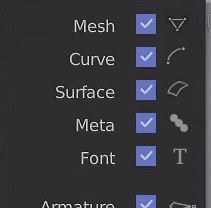
Blender Icon ideas as asked for
The Blender Icon ideas for visibility i think would work but i am not 100% familiar with each type and what best represents them.
Blender UI improvements
Really feel the side panel could do with improvements and layout tweaks, the icons look messy and inconsistent and it would be much nicer having less rounded corners in the UI and some simpler clearer icons.
Thanks
P
14 Comments
wow it looks much better in my opinion. but it might be better if you can put your gif directly in the post like this
Ok sorry it is my first ever post on here. i was trying to do it like this but wasn't sure how. Thank you for adding it for me :)
What makes good during the design is not always what is most convenient to use. Remove the colors, is not a good idea.
Dunno, people seem to be fairly happy with Substance painter, Photoshop and even Zbrush. all of which have gone down this path. love the new Substance painter which has removed a lot of the colour and redesigned the workflow. i think it has to go hand in hand with workflow tbh.
but as i said below a bit of colour can be a good thing if used wisely. :)
Maybe two sets of icons can be created. One in color, the other not. Color is very important for new users. I challenge you to work by juggling seamlessly between texture tab, material and object without a few colors to differentiate them.
Maybe, im sure they would get used to it. but maybe you are right or maybe there could a better way of grouping tabs so it de clutters the work space, there is a lot of Tabs there im sure there is a better way of customising it so the important things people need the most are easy to find and access. anyway i've made my point and spent some of my own time trying to help make blender the best it can be, over to the Devs now to think more on it than i have time to.
do u have a working SVG file to test them? and plz post them on the forums or devtalk..these are much better than the current mono ones
im sorry but having color make it more fast to recognize where you need to click
Yeah, I agree with this. It would be great for us visual learners, and also with icons the text might not even be necessary and things can be compacted a good amount more.
Real cool ideas here. Could you lay every icon on an image so we better see them and compare?
I say yes, it's modern and efficient. Personally, I don't mind about colour since I know where the icons are located the ones compared to the others.
I like the proliferation of meaningful icons. Particularly in the hide/un-hide layout. However I think the removal of colors, while perhaps less "gamey" does not facilitate quick identification of icons among many. I don't think It's as helpful to have to stop and identify the shape of an icon if, shape+color will get me there more quickly.
In particular I like (in standard blender) that the shader, texture, particle, and physics buttons are colored differently and I can ID them more quickly than looking a flat grey images. At the end of the day I'll take the quick ID over the more "professional" (I read that as dull, lifeless, business, cube farm) look.
i see your point and maybe that including some flat colour is the way to help with that concern is the next area of exploration. my problem with the colour at the present time is that its too illustrative, my eye does not know where to fall as it all clashes with each other each icon is battling with its neighbour for supremacy. Making simpler and smaller icons helps in that regard it calms the interface and makes them harmonise. i haven't designed it just to be "more professional" its done with a purpose behind it to help with "busyness". i also think the text personally is to big and bright but i didn't change that as i couldn't afford the time.
im not disregarding colour, colour does play an important role but it can also be distracting. it has to be tasteful colour that works with the design and serves a purpose.
I like your proposal. Feels less cartoony, more professional and even more neutral (UI wise).