
Add menu spawn behaviour is not intuitive
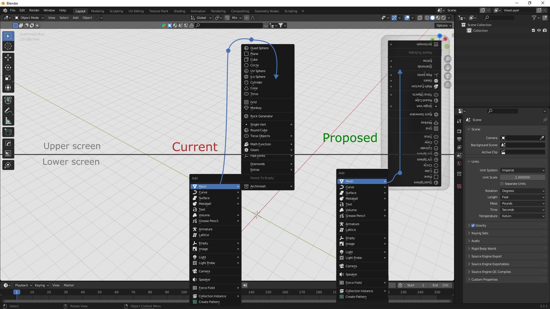
the add menu shows the submenu items from top to bottom but it should show them according to where it spawn. for upper part it is fine but for lower screen it is not intuitive. see the image for clarity. I see this behaviour in other software so think blender should also have this for better UX.
1 Comment
I'm pretty sure this has been requested before.
And I don't see in what way having menu items moving around is ever considered better. Ruins muscle and visual memory.