
Top 3 Features for Blender 2.8 (Feb 2019 Suggestion)
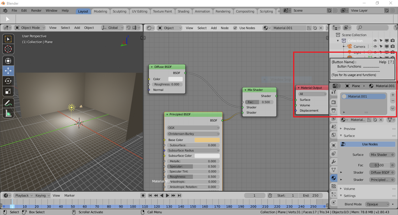
Help Window for Blender 2.8 (Hover Information for all functions)
I have been using blender for about a month now, and the one that made it challenging for me to use it was the lack of UI functions knowledge. As I was learning the software what I discovered is that being familiar to the basic UI functions and including the advanced creates a strong foundation on your learning journey in blender.
That is why I would like to request a feature where there is a box or tab that displays the function the buttons that you are hovering.
(The Image I uploaded is the sample for no.1)
Easy First Person Mode in View port
I don't know if this is possible but I would like to have an option to see my work in first person mode. I believe it will help improve my creative ideas and perspective while making my projects.
It is nice to look at it in the camera or hovering view but It is also fun to move around and just look at your creation in that new perspective.
Legacy Mode Theme
I don't know if is it just me or many people do notice it that having those somewhat 3d icons make the UI more user friendly and pleasing, Like it is creating a depth for the software UI and makes you want to use it more. Although I like the new 2.8 UI arrangement I still like the 2.7 icons and color(atmosphere).
Also having those somewhat embossed drop down tabs make it more easier to navigate all the options compare to the flat and minimalist themes in my opinion.
I have recently been using Gimp as my photo editor and at first it was so hard to understand the software's UI but after some changes in the user preferences where I switched the theme from a minimalist flat symbol icons to the classic 2d/3d with color symbols, it was night and day and I began to understand Gimps UI and it made it easier and fun to roam around its UI and discover its features. All that because the UI became more user friendly. (The Light Theme also helped).
5 Comments
Hi @johnpdelacruz26, with regards to your 2nd point, can I suggest that you try blenders existing walk/fly mode, as I think this does exactly what you require. The shortcuts are no longer the same in 2.8 but if you use this view a lot customize a shortcut to your own preferences. Don’t forget the tab key changes the gravity modes which is very useful. I like the simple implementation of collisions in blender. You can walk through objects but you don’t fall through them. Check out the documentation for this feature here .
Also remeber to try change the viewports field of view by changing the lens on the viewport toolbar on the left. For interior views sometimes a 20mm lens can be very benificial
* @Marcel Quintas * * @Eric * Thanks for the inputs guys. I am new to blender and I just recently tried the 2.8 and it is quite nice. I would also like to add to the suggestion no.1 to be like a small window where you can just snap everywhere and it has minimize and exit button.
This is three proposals rolled into one post. To make it easier for people (users and developers) to discuss and vote upon your ideas individually, I'd strongly recommend that you break this up into three separate posts.
* @Jason van Gumster * Thanks for the input.
Hi, try playing with the theme a bit, it might make things a bit more usable for you. I had to change a few things to suit the lighting environment I work in.
The flat look has had a lot of debate. I liked the older style icons better, but on the whole I am getting used to the flat ones. Maybe you could play with making a few 3D icons and create an example UI to better explain what you are looking for?
One thing to remember about blender is that it is a community project so getting involved can actually get things happening. Don't be afraid to be creative and present ideas, who knows, you might just create a new direction?
I agree with you that more information could be added to the tool tips. Some of them do not give enough explanation of what the function is for or how to use it.
Maybe there could be a mode for beginners where a tool tips could act at a tutorial type thing?