
Compact the editors floating menu.
The menu to select the editors is long and not very compact. I propose to pack it more squarely, to better group the obtions. The empty space is even smaller.
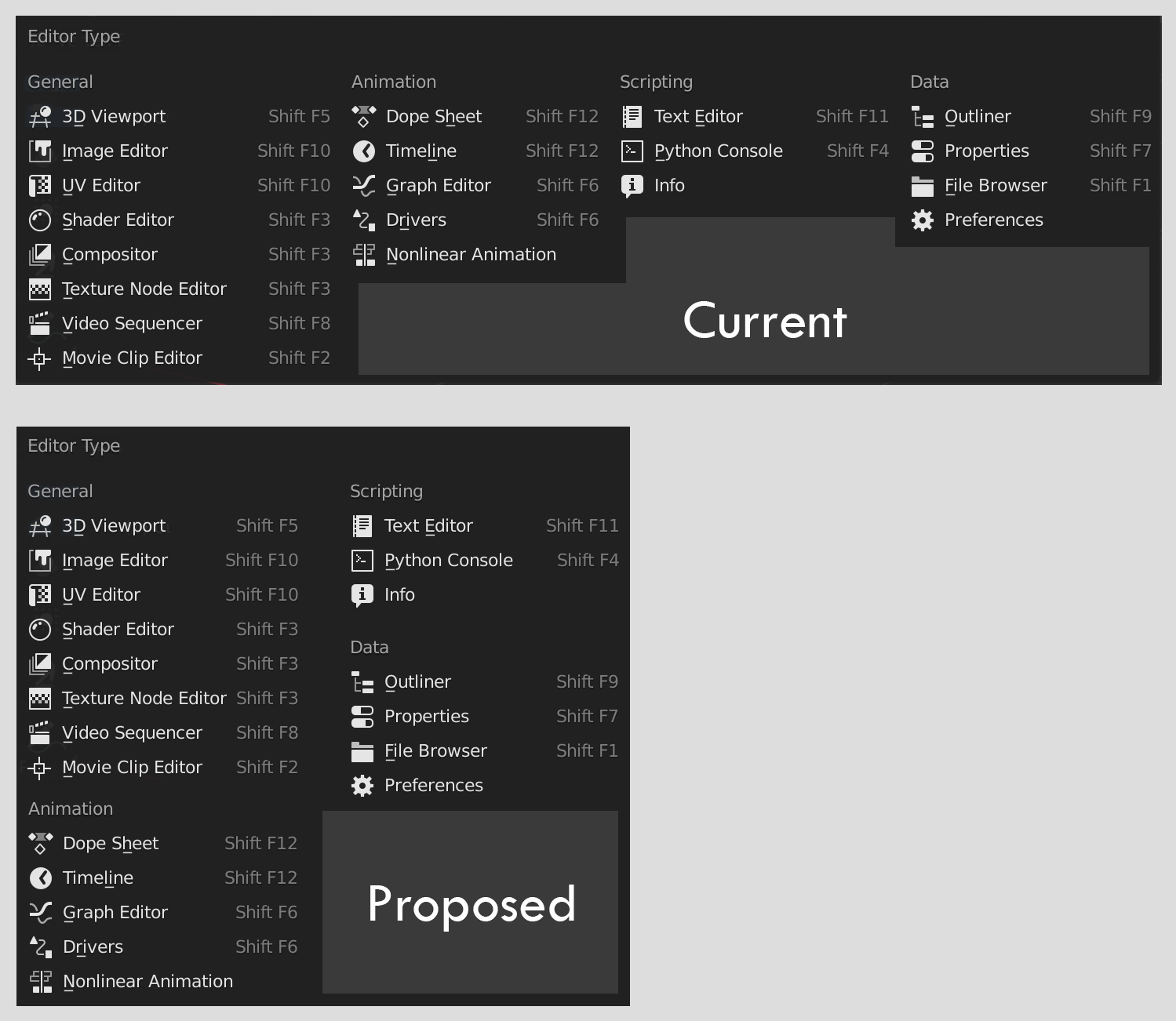
The menu to select the editors is long and not very compact. I propose to pack it more squarely, to better group the obtions. The empty space is even smaller.
1 Comment
To me it just makes things less readable. This doesn't have to be compact nor to have as less dead space as possible. It's just a menu, that is supposed to just let you pick what you want and disappear asap.