
2.8 panels visual feedback
Using blender from 10 years, i always had problem with panels design. We need to have better visual feedback on which part of panel we are looking at.
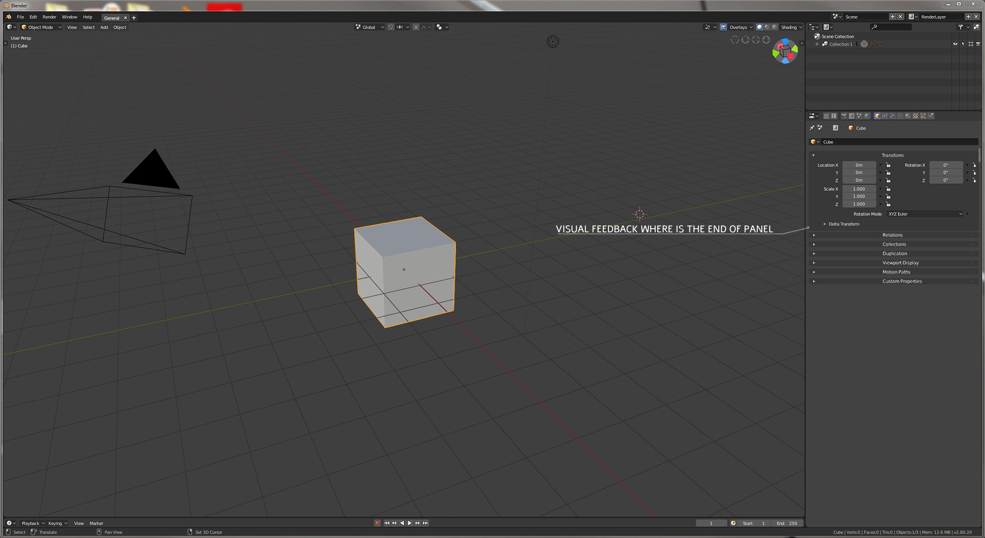
Using blender from 10 years, i always had problem with panels design. We need to have better visual feedback on which part of panel we are looking at.
3 Comments
UI gets confusing with new subpanels, so yes, voted +1
You can already define panel header & background colors.
@julien.kaspar: Yes i Know. But this rectangular bar- you can't say by looking where is end of previous panel. It is also some kind of depth confusing with colours... seams like title is deeper than content. Then rounded corners helps to identify that this field is ending and we can make title on same depth level-visualy. I really like the way theme is going- round corners are now clear to read where one editor starts and ends... It helped to get non-overlaping idea more eye frinedly. I think panels need same love. It would also make whole layout more consistent.