
Improve Dope Sheet legibility with better color-coding!
Personally, I find the dope sheet a bit of a visual overload - mainly because there's not much visual distinction between 'real' keys and 'composite' keys (markers that indicate groups of keys).
Often, a single keyframe will look like 3 or 4 keyframes - e.g. creating a keyframe for
X Location
will also create markers for
Object Transformation
,
Action
,
Object
and
Summary
. Here's an example of a very simple bit of animation - as you can see, it creates a huge unbroken wall of markers.
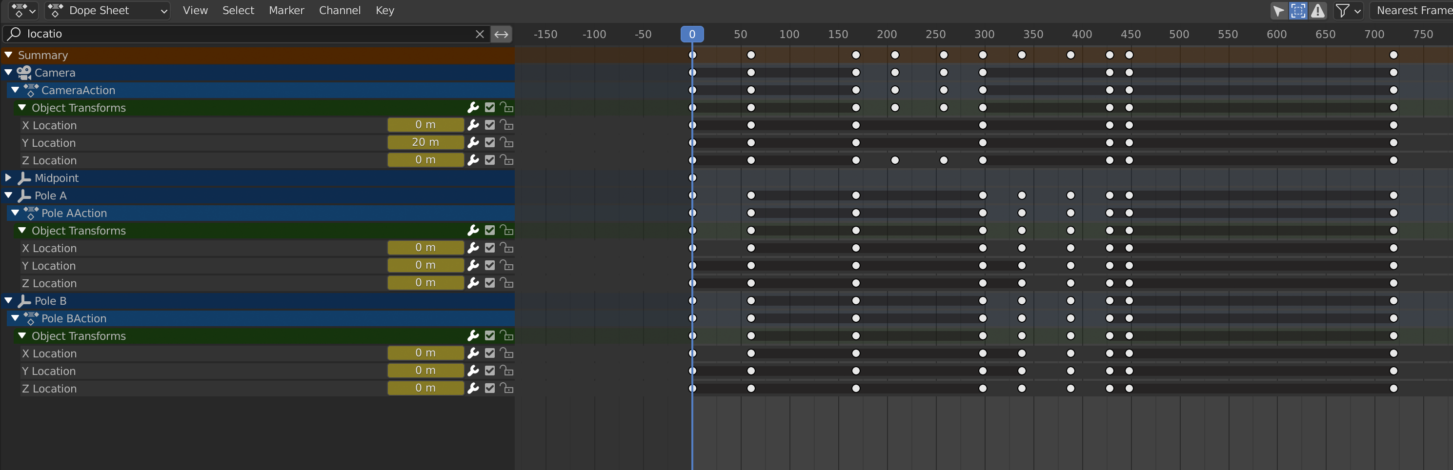
Of course, these 'composite keys' (or whatever they're called) are useful, so I wouldn't want to get rid of them. But I think they could be more clearly represented.
Here's a relatively simple suggestion that (in my opinion!) greatly increases legibility.
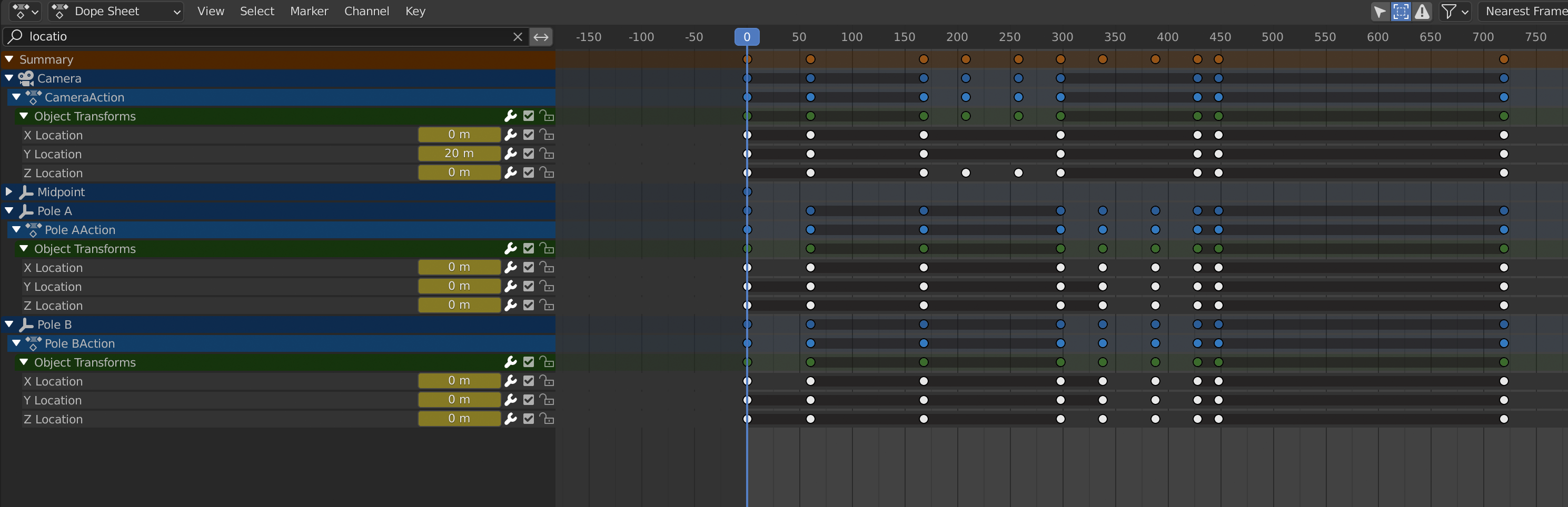
As you can see, I've simply given all the composite markers the same color as the marker type bar (in Photoshop - I'm using Hard Light @ 90% opacity). Suddenly, you can see what's going on!
Obviously there's many other visual solutions to this problem - this seemed like the simplest version since it doesn't require any icon design etc. Other suggestions welcome though!
What do you think?
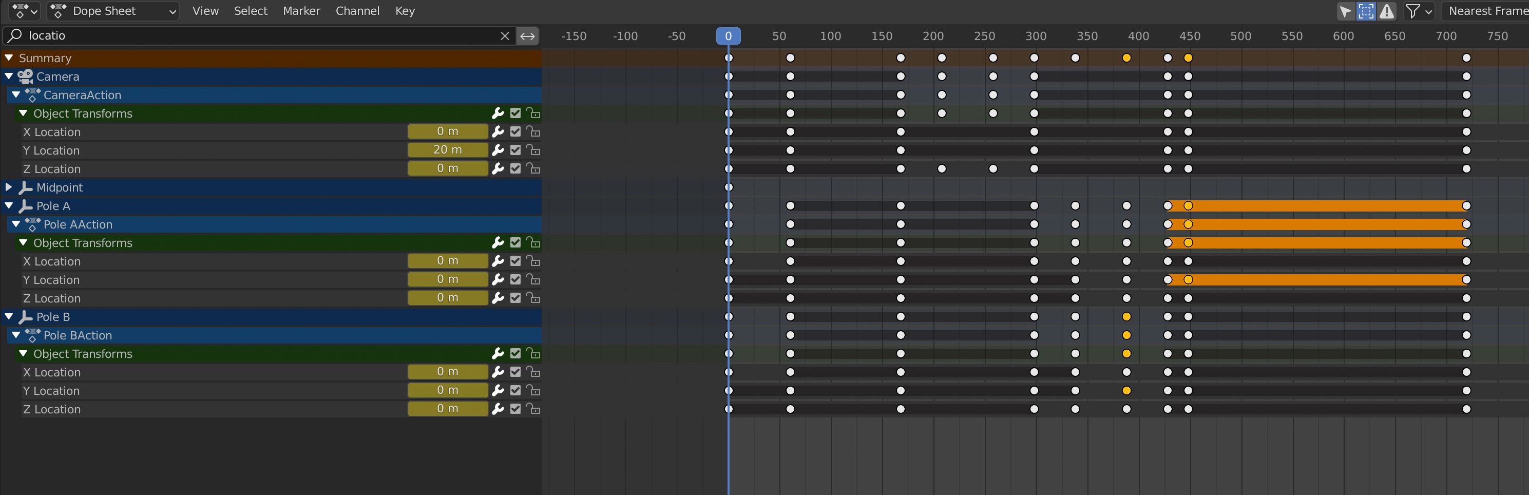
[update based on @alexisb38's suggestions - I've added some mockups of how it looks with selection highlighting]
Current version:
 With suggested changes:
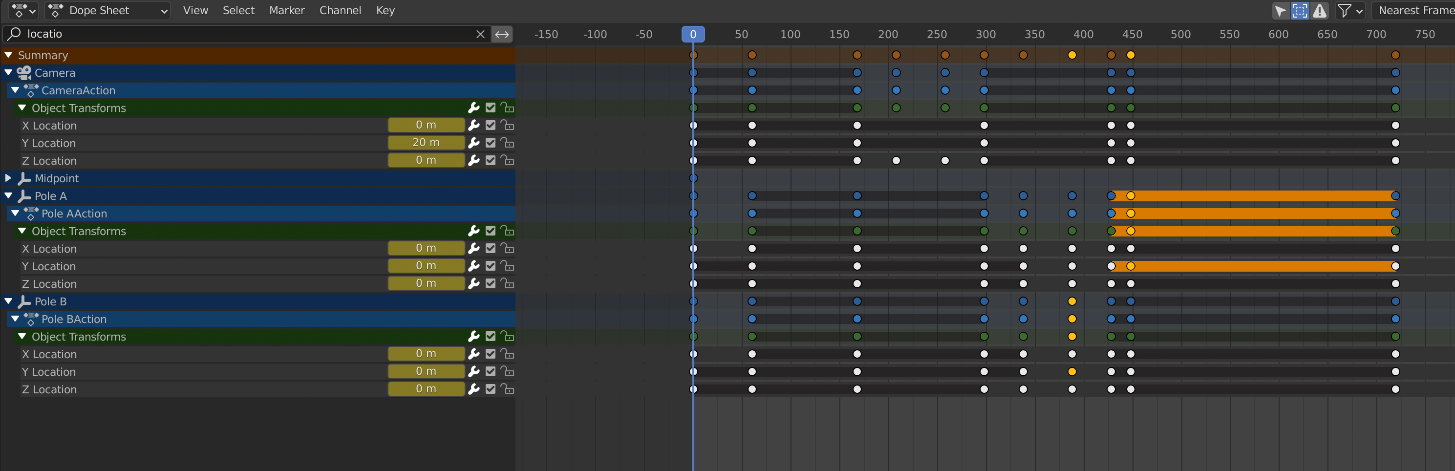 Think it does increase legibility - what do you reckon?
6 Comments
I think this or something like it would be useful.
This would make things so much easier to look at ! There should be a different look for selected and unselected keyframes though
Agree - I think this color scheme should work with the existing selection/deselection color coding...that bright orange color is very visible! Some people have pointed out that it may also overlap with Keyframe Types ( docs.blender.org/manual/en/latest/animation/keyframes/introduction.html ) - perhaps they could work together, needs a bit of thought though!
I've added some examples for how it looks with selected/unselected - what do you think?
Yes this seems pretty good ! Looking forward to it ;) I have no solution for the keyframe types. I have personnaly never used it, and I'm still unsure of their purpose unless it is simply for clarrifying the timeline. But for people that do use it, it could probably override the standard scheme ?
Cool!
Yes, I have also never used the Keyframe Types, but I believe they're purely cosmetic - the manual says they're for
visually distinguishing regular keyframes from different animation events or states, i.e. they don't actually change the keyframe value.As you say, it's perfectly possible to leave that Key Types functionality in there as overrides, as long as the colors don't overlap, although perhaps someone can come up with an improved design that doesn't have that issue...it's tricky though - the dope sheet has to convey a lot of information!