
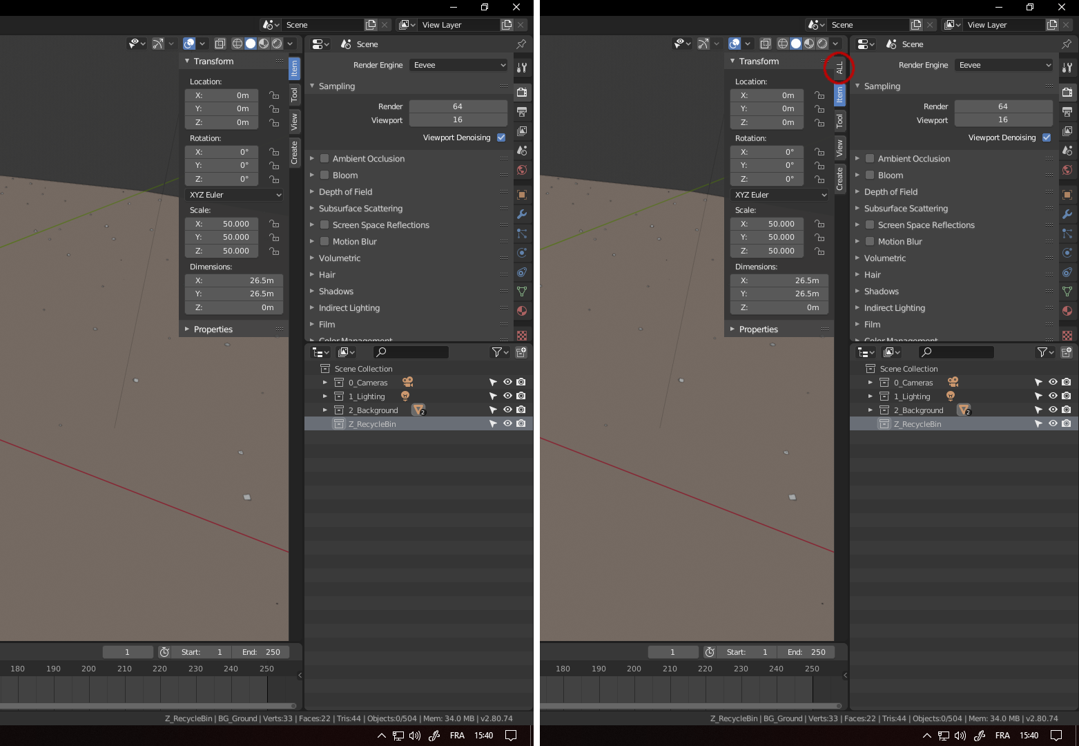
Add a "ALL" tab for the right panel displayed with "N" shortcut
Hello,
I began to use Blender 2.80 which is really awesome since months ago now, and I have to admit I'm rather hesitant about what to think concerning the idea of adding tabs to the right panels in Blender. There was not a lot of features on those panels generally, so I didn't find it necessary... PLUS, I often needed to switch between features in the 3D view's right panels which are now split in different tabs (the object name (which is now removed since 2.79b... why? I don't know, it was useful and sometimes a nice time saver) the object transforms, the 3D cursor transforms and the lock camera view).
So... is it a good idea to split this panel in tabs... maybe, but I would considere this idea a real improvement only if it becomes possible to have as well a "ALL" tabs like I suggest in the image below because... without this tab, for me, this new release will only make me loose time in production (just 1 or 2 seconds, but multiplied by the number of times I need to switch from tab to tab... it can be a lot and it makes me loose my focus as well).
(I'd also really love the come back of the box "Item" in this panel in the 3D view, which allow you to rename the active object in 2.78, but I don't considere that very important though...)

Thank's in advance for your attention. Kind regards.
8 Comments
I just found a (new?) feature in Blender 2.80 which could make my post a bit unnecessary...
I noticed that in the right panel, I can "Pin" a zone I need to keep by right-clicking in the zone's title and checking the option, or by maintaining "shift" and left clicking on the zone's title with the mouse.
So, with that new feature, I can say that adding an "ALL" tab is not a priority... Though, I wonder if this still couldn't be a good idea, so... maybe I'll keep this suggestion open, though, is some other people feel quite reserved about the right panel's tabs for the same reason as me, I just thought it would be good to share this technic of "pinning" the zones you need to keep.
I am so happy with 2.7 when I see this cluttered 2.8 UI ... I hope devs will do something about that mess.
* @Jan Kadeřábek * you have to say what you mean exactely, else everyone will just see your comment and brush it away because you are saying something but really you are not :D To me the UI is much cleaner and and clearer than 2.79 way more organised. the ALL tab as OT suggests although is really nice I think
* @Sam * As a very advanced 2.7 user who works in the program daily for years (it is my profession), I am very confused anytime I try 2.8. Yes, it is visually cleaner, but not ergonomically, at least not for me - there are just too many menus spread all over the program, with too many variants of interaction (tabs, rollouts, dropdowns, right-clicks, shortcuts - without any clear logic), they are using more space than in 2.7, floating over 3D view which I find distracting, I also find them more difficult to navigate because of that monochromatic theme etc. 2.7 is maybe not so cleaner in the first look, but it makes sense after while, but 2.8 seems to sacrifice the productivity to earn more interest in beginners (of course speaking about UI only). Anyway, UI is one of those minor issue that prevents me from switching to 2.8.
* @Jan Kadeřábek * Well whatever you think would be better I would say go ahead with your suggestions as this is the right bord to do that.
* @Sam * Don't get me wrong, 2.8 is really excellent tool, I don't want to sound like a hater. I gave up with providing feedback as my suggestions are are always outvoted by much larger group of beginners which don't use the program in the long-term and don't see what is really important for professionial work.
* @Jan Kadeřábek * I have to say I kinda agree with Jan Kaddeřábek about the monochromatic icons.
We get used to it, and the colours now in the properties window helps a bit, but it is the only thing I myself would considere as a regression in 2.8.
To answer you, Jan Kaddeřábek, 2.8 is really very close to 2.7 still. There are new features, but the shortcuts are more or less the same, and if you're not happy with it (which was my case as well), you can still customize it 100% in the User preferences as I did, so the shortcuts can be similar to 2.7' shortcuts.
This is what I like in Blender. You don't like something? You have everything you need to edit it most of the time, even if you're not a developper.
Also, I remember when 2.5 has been out (the first big improvement on Blender... at least I know about), a lot of Blender 2.49 users were complaining about how it is worse... But in the end, Blender 2.50 was far much better. And I think this is the same for 2.80 here.
And who knows... maybe we'll be able to get rid of the monochromatic icons with new themes one day... I think it could be great. ^^
* @Ak MC * I used 2.7 preset, so the controls are really not the problem, the real issue (for me) is that 2.8 doesn't bring any improvements in areas that are important for my specific needs (my job is a game scenery modeling / vegetation distribution / vertex painting) - it still struggles with large mesh edit / weight paint mode, it offers the same limited particle system and the most importantly - there are even features that were removed and which my work depends on (like baking to vertex colors, Only Render option, many very helpful Blender Internal features... I am sure all of this will be solved in the future, but at this moment, I can see only few new features that could be helpful for me if I am not going to utilize Eevee (like Weight Paint overlay transparency).