
2.8 Discussion - User Workspace Layout & Top Bar Association
Issue/Problem: I Don't Know You
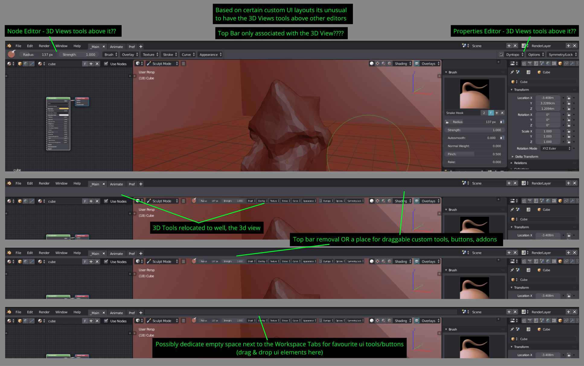
- First can we get clarification from the developers. Is the top bar ONLY associated with the "3d View"? (seems like it is so far). If not, what are the current plans with the top bar?
- Depending on certain user workspace layouts, the top bar extending the full width makes it feels very awkward to have the 3D View's items located above other editors; see diagram below.
Solution/Improvement: Finding My Role
- Either the removal or have the top bar be associated with any tools users want to add (yes I am aware you can hide it, but this is a question of how to utilise this top bar feature effectively in conjunction with other editors).
Addtion: Other Thoughts
- Maybe have the empty space next to the workspace tabs to allow custom tools, buttons, addons, etc.
4 Comments
Already done in the current builds:
Also, according to this dev task :
In the fork Bforartists, the toolbar is a view and can be placed and positioned anywhere. This system had been trying to work like the top toolbar here with sliders and more dropdowns, but it already is a lot more flexible and also adds iconology to some features. Maybe taking in a look as to how that can be implemented might be nice.
Yes, I do believe the 3 rows need some in-depth testing in order to make it better. I guess they are already doing it. I don't like the idea of having so much space taken away from the height. It can be more clever.
The top area of blender needs serious standardization...