
Default to a comfortable 'Backfacing' overlay color
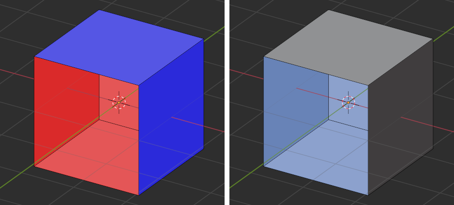
In the default Blender themes, the 'Face Orientation Back' and 'Face Orientation Front' overlays are highly saturated red and blue.
While these are alarmingly visible, they have the disadvantage that they can not comfortably be left on all the time.
This forces the user to consider the detection of backfacing normals a distinct and conscious act, rather than naturally arising in the course of modelling.
A great number of the errors that are brought, for example, to Blender Stack Exchange, would never have occurred if inconsistent normals were routinely visible.
The 'Frontfacing' overlay is redundant. If that was fully transparent (none) and 'Backfacaing' a comfortable mid-alpha tint, they could be left on all the time while modelling, and fewer errors would go unnoticed.
1 Comment
I agree up to a point. I had made a default setup and a blender theme that did this, for a while I was able to work with that active overlay and it seemed functional, until I had models with viewport colors, or textures, and with a backface-only overlay of that intensity I often didn't notice certain errors in the meshes (mainly imported) because the overlay is lost visually, which is where the current preset shines. I consider that this overlay is mainly for debugging and I learned that it is better to have them in "alert" colors.