
Modifiers menu small improvements
There are couple of issues with the modifiers menu. One is that it uses the space very poorly which means when you make the menu narrow you get very few letters visible about the modifier's name. Second issue is that there are no clues what the modifier is! It does not say shrinkwrap modifier. There is just an icon there of the modifier and some of these icons are not descriptive at all (look at displace or shrinkwrap icons for example).
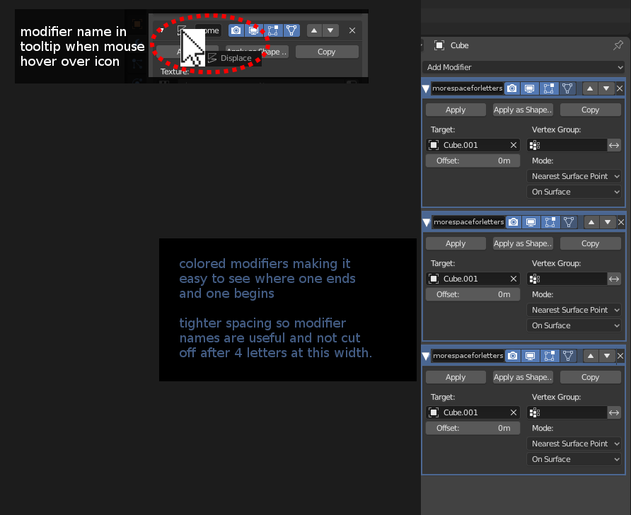
So I have added a quick mockup image of new "tighter" menu.
First, the tighter menu header for modifiers: I have grouped the up/down arrows with the X on the right as these handle similar operations and having space between them is unnecessary for readability. I have also taken away the small space between the blue icons and the text field. The name and the buttons are about how the modifier works so it makes sense they are grouped right next to each other. And it saves space. Last and biggest change is the move of the minimizing arrow on the left to all the way to the left like in file explorer in windows. That makes it more clear what the arrow does and saves space. Last I'd make the text field as wide as possible because that is the most important thing in that menu. The buttons are fine but in the example I went from just being able to show 4 letters of the name to at least 16! This also allows you to make the menu narrower without losing ability to see what is the name of the modifier because this is extremely useful information and 4 letters is not enough.
Second fix is to add a mouse cursor tooltip when hovering over the modifier icon. It should show the name of the modifier so you don't need to open the add-modifiers menu and find a matching icon to see what modifier it is. (please forgive me the poor choise of mouse cursor graphic :D)
1 Comment
Honestly, I'd go the opposite way: it needs more space, not less. When you have multiple panels open, it's already hard to tell where a modifier ends and another begins, and your changes would make it even worse in that regard. I'd suggest to just move the visibility toggles completely out of the title bar, maybe like this: {attachment stack_newpng}