
Make RGB Curve Points easier to click
I fail to actually get a hold on these curve points 50% of the time due to how little of it there is to click on because 75% is hidden when in the corner. Solution: Shrink the curve window down like 5% and make the points always above the rest of the UI:
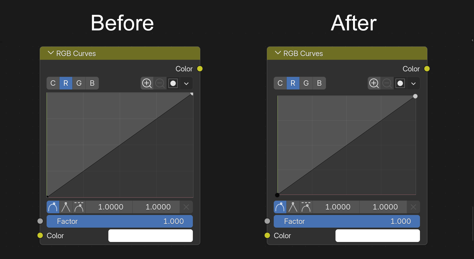
5 Comments
This is being worked on at projects.blender.org/blender/blender/pulls/163243
🥹omg, dreams really do come true 🌠
Done! It will be part of Blender 5.3 :D
This has been merged! (I can't find the button to say it's completed/done )Thank you Pratik Borhade, Guillermo Venegas and Pablo for adding this into 5.3 🫶
I'm not a fan of shrinking the window and displaying the points on top of the UI simply because curves are clamped by default, but you can unclamp it and navigate around the 2D space of the curve widget.
In this case, when do you decide to hide the control points ? does it just pop off when outside the widget window ? It would look weird.
Shrinking the window also means less space to control the points, UI mismatching with the rest of the elements on the node.
To solve your issue, perhaps there could be a rule that says : "If there is only 2 control points on the curves, insinuating the default curve node layout, the selectable area of those control points is larger, making it harder to fail clicking on it" I'm mentionning only 2 control points, because when you start adding points, having larger areas for selections can lead to selecting the wrong control points