
[UPDATE] More visual indication when "Lock navigation to Camera view" Is active
[Suggestion updated]
Maybe it’s just me, but I find the dotted red line around the Camera, when it’s locked to Viewport navigation, a bit hard to notice. I know the Toggle Icon also shows its state, but for some reason my brain doesn’t register it quickly when switching between Camera and Viewport, or when toggling Lock on and off.
When locked, the dotted line is almost imperceptible
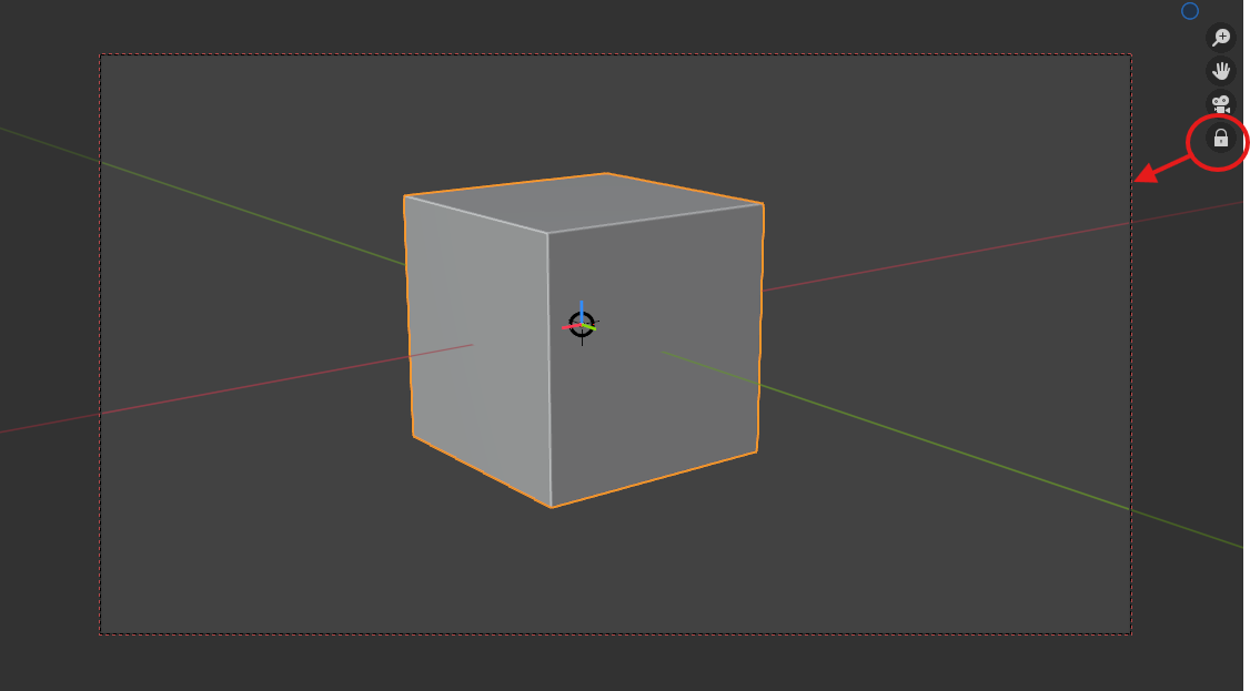
It's a 1px wide dotted line. I suppose the black line shows the render resolution?
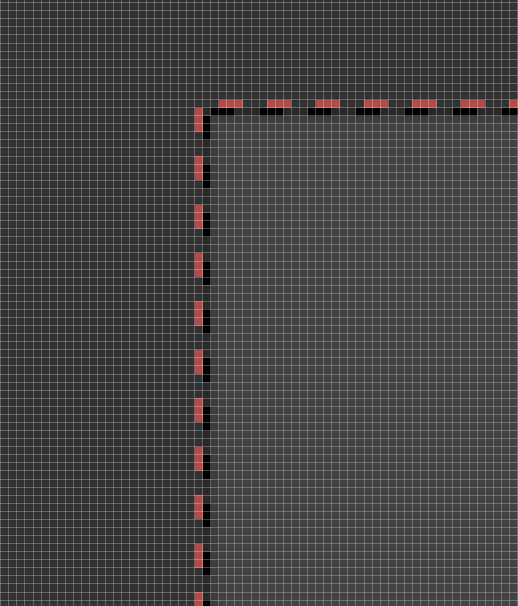
Updated Suggestion
I’ve realized an important point: the “Camera Outline” should remain visible even when the camera’s actual boundaries are off-screen. For instance, while in Camera View and zoomed in deeply within the 3D Viewport, the outline often disappears. In such cases, the outline should “stick” to the visible area of the Viewport. Let me explain:
1- From my Camera View, with the Toggle Disabled, I have zoomed in my Viewport to check my Cube shadows.
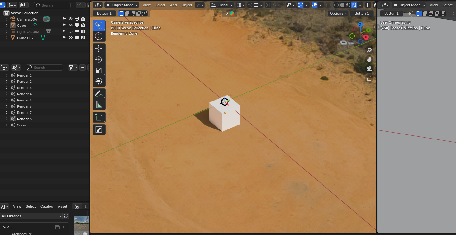
2- I now Lock the navigation to Camera to adjust it slightly. The outline should "stick" to the 3D Viewport's boundaries
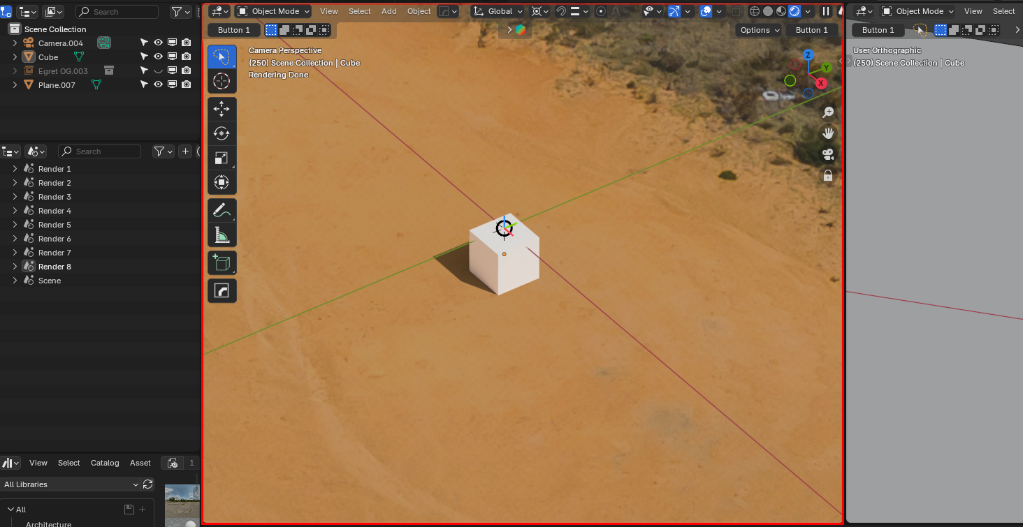
This should work also in Maximized View
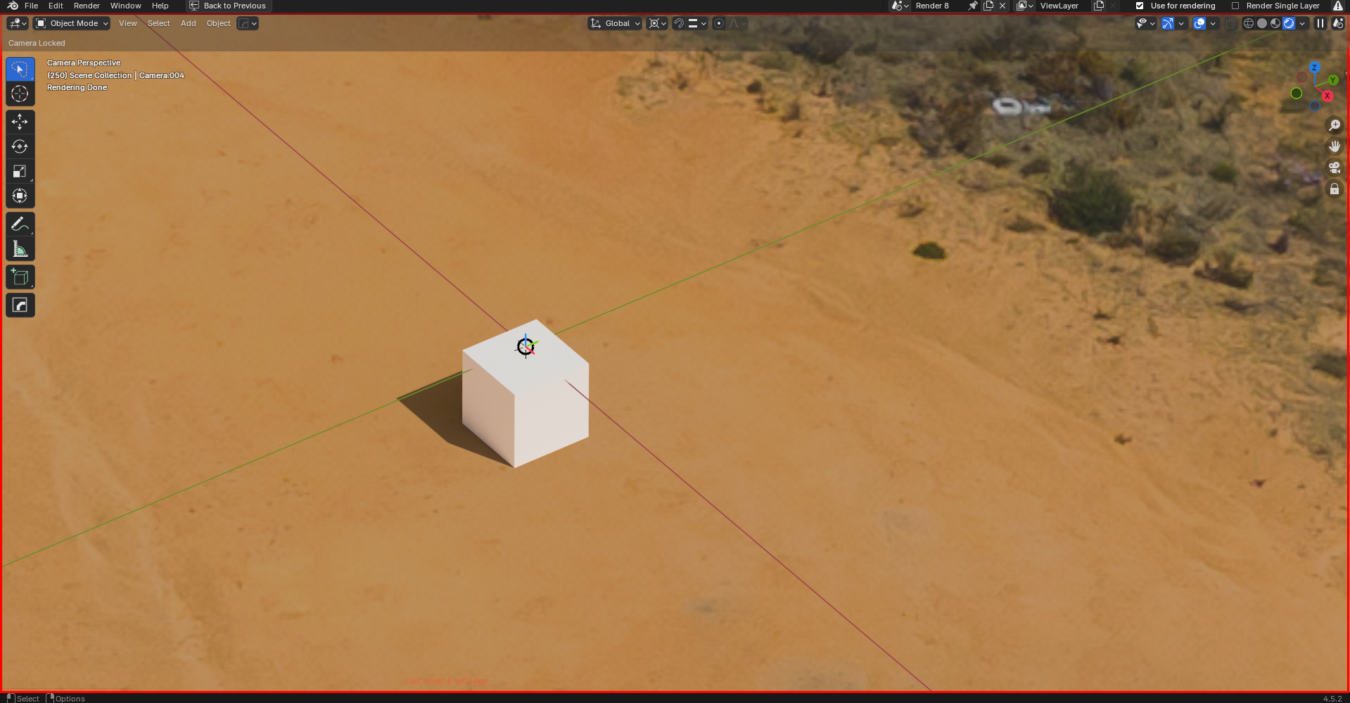
Initial Suggestion (themable colors/thickness):
Thicker outline
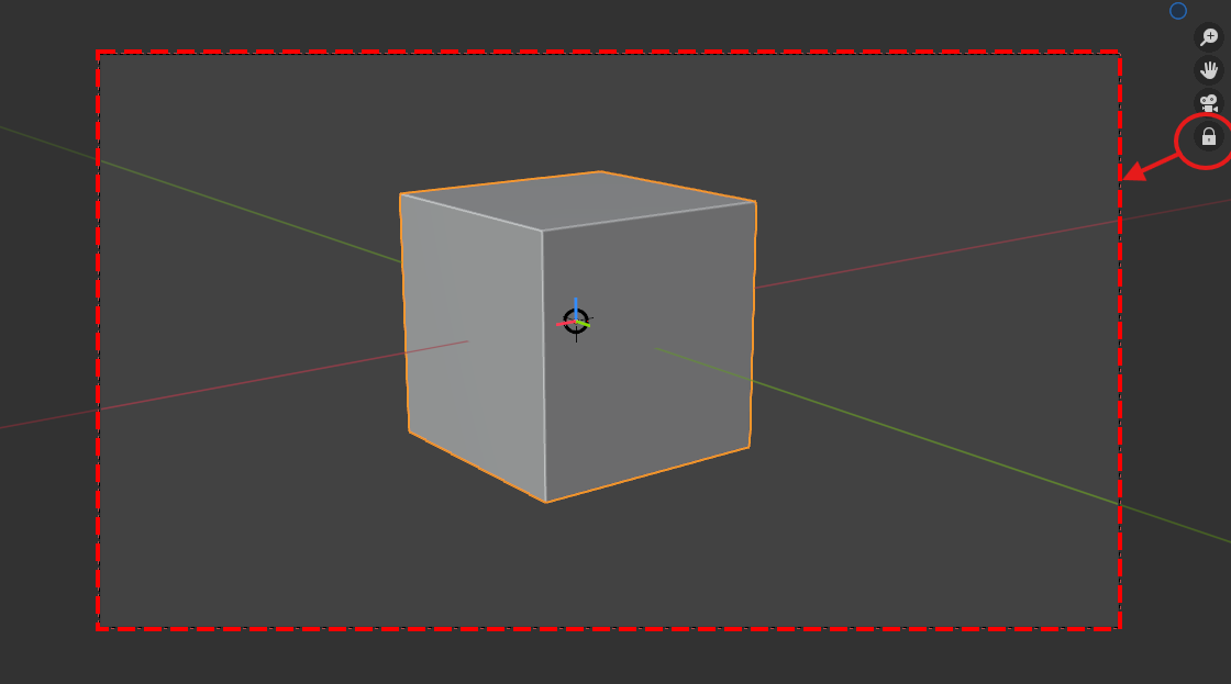
(Abandonned alternative suggestion)
Thicker outline + colored passepartout (if enabled)
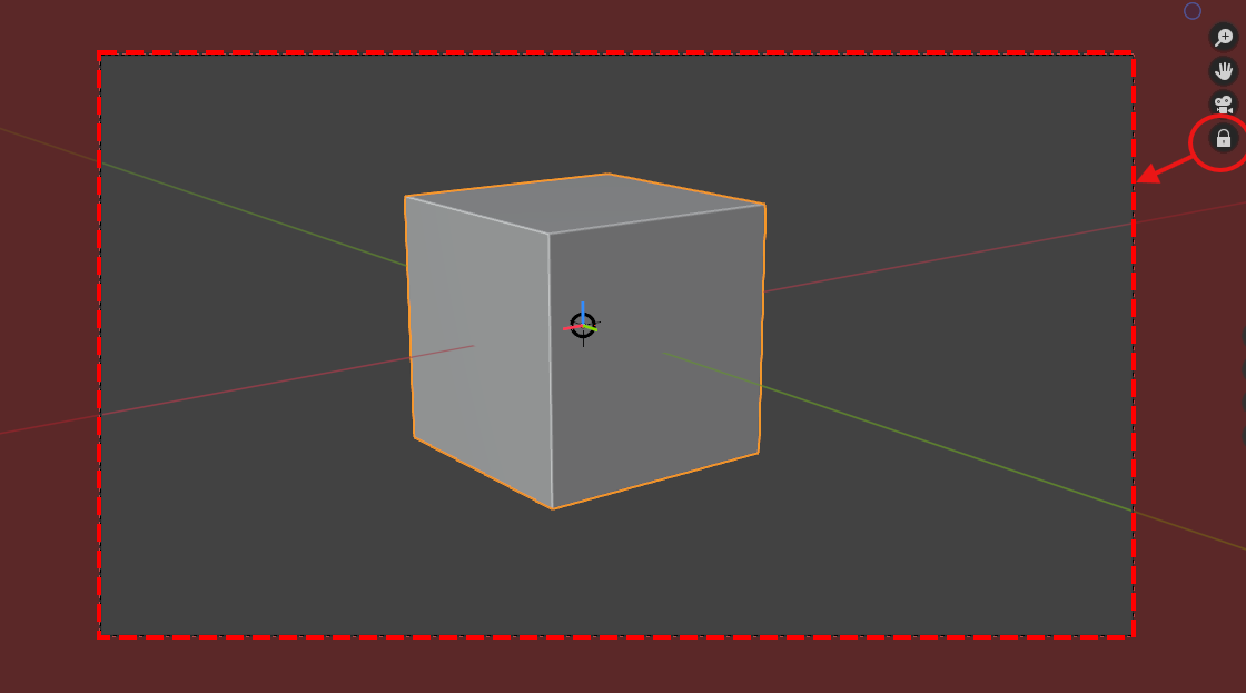
3 Comments
I think if the toggle icon were to change color to highlighted , it would help greatly.
I believe this was initially part of the original PR, but some didn't like the icon to do that.
I wouldn't color the passepartout. It changes your perception of color everywhere else and might end up making things more green tinted due to this.
That's a good point. I've just updated my idea by the way!