
properties panel toggle
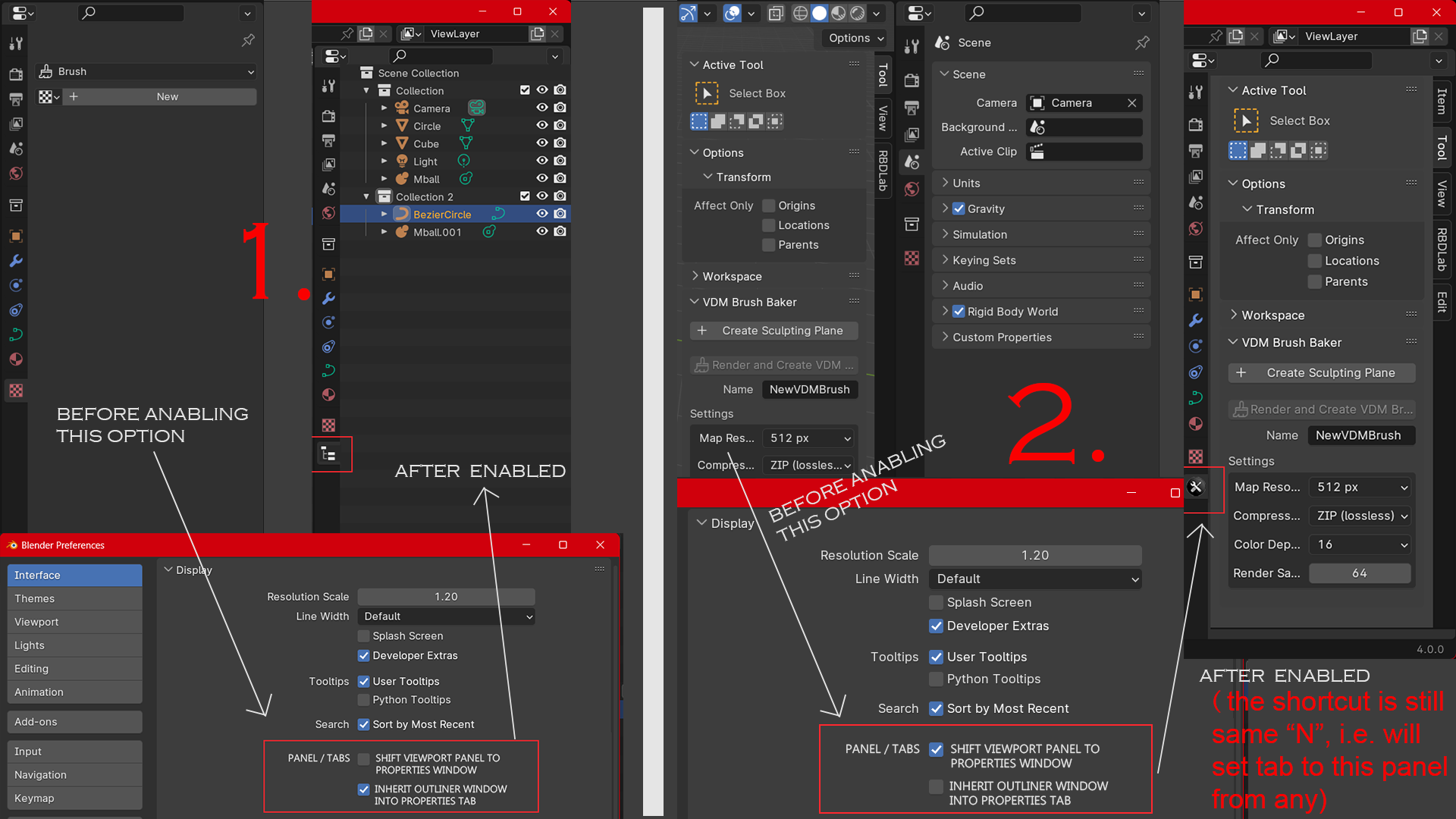
I have basically 3 suggestions for better productivity
- as suggested in below image.
but why? because i think by default blender open with a small window for outliner which isn't sufficient as scene grows, also outliner need more of a vertical tab/space
-
reason for 2nd edit suggest is because properties tab already takes 15-20% area of the screen and when "n" panel is open it takes extra 10-20% area of 3d viewport, think about people working on small screen or laptop, also toggling panel more frequently isn't more convenient
-
alternatively there should be a hotkey to toggle properties window ,just like hotkey "T" for toolkit to show or hide. i know ctrl+spacebar maximize viewport which is somewhat similar but , this implementation could be more handy.
4 Comments
So in a few words, you want to merge the outliner and sidebar into the properties editor, for the sake of saving space?
I think it is important to really identify what issues you are trying to solve before giving potential solutions. And then, for each solution, see to what degree it solves that issue and makes new ones, because UI is always a compromise. And finally weight all that with the potential cost of development efforts in making the change and maintenance.
I see two issues mentioned in your post: the amount of screenspace given to the outliner and sidebar, and the amount of UI toggling required to show or hide stuff.
Toggling
You mention how toggling different panels constantly isn't more convenient. What you propose doesn't solve that. You would still need to toggle between each tab of the properties' editor.
Then you mention the ability to assign hotkeys to tabs, but that doesn't solve the above issue, and it would then create the inconsistency of some tabs being hotkeyed and not others. Not to mention the loss of features from the sidebar and the additional crowding of tabs in the properties editor that already got messier with the appearance of the tool settings tab.
Screenspace
First, it is good to give limits to what we want to save screenspace for. No software can be made viable for every hardware. And as a computer-based application, and a visual content creation suite, Blender isn't expected to be used on small screens to begin with.
The Blender Foundation already made a choice in that area. While they don't specify a phisical dimension, they do recommand a minimum resolution of 1920x1080 pixels. That means for them, it is the minimum size at which they guarantee an optimal usage. And any problem that might arise from using Blender at lower resolution is most likely to be ignored, especially if requiring lots of accommodations to fix it.
You might argue that not everyone does have a big screen, which is true. But there needs to be a line drawn. And right now, 1920x1080 is the most common resolution, and the trend goes up.
According to the Steam Hardware & Software Survey (as of March 2024):
Resolution alone doesn't tell what the user experience is, but I happen to have a 1920x1080 15" sceen, which looks like this:
I don't think we can say that the sidebar combined with outliner and properties editor take an alarming amount of space. And I can still compress all of these elements in a smaller area without losing usability, swap them around.
So is there really a need to revamp these in any significative way to give more space to other things? I am not convinced. But let's admit we can spare the developer time and manpower (which we don't, they have enough on their to-do list for the next decade).
Does merging the outliner and sidebar into the properties editor saves screenspace? Yes, but now you must spend time switching across tabs when you need them. Aren't there solutions that already exist? Yes, toggle the sidebar anytime you want, and use Editor shortcuts to switch editors:
With this, the control is in the user's hand already.
You might say that you proposed your merging as an option in the preferences, and thus not forced on the user. Which is true, but slower to toggle for the user, and unrealistic to maintain for the developers that would have firstly to create all that new UI and then do the maintenance of the same UI elements but in two different areas, effectively double the cost.
How it works right now
The sidebar is very useful in giving quick access to different things from the viewport regardless of other editors, making it possible for example to work in a fullscreen viewport in Blender. Plus it is displayed on top of the viewport with transparent empty space, making it seamless when used in rendered mode and makes it look less invasive than the solid panel we used to have years ago.
The outliner doesn't need to be merged into another editor to be able to take all the space you want, you can already do that now in many different ways that don't conflict each other.
Plus I would argue that you never need to see the whole outliner's content, no matter the scene's size. It's not like most people need to see as many elements as physically possible at any time nor spend a significant amount of their time in there.
I think toggling in properties window in more flexible as it give more options like "ctrl+mmb scroll" cycle through each tabs, "ctrl+tab" does same one by one.
this hotkey for toggling isn't editor specific, its for the panel/tab on the right side of the display, it could have any editor inside of it, doesn't matter
properties tab would now have all of the extra vertical space of outliner, don't think now 2 extra little icon on it will make it messier
sidebar combined with outliner might not seem to be taking an alarming amount of space, but all the extra enabled add-ons appear there in the sidebar, some of them for example blenderkit, takes full vertical space, in that case sidebar transparency doesn't matter, also in some cases we need to scale it horizontally to be able to see all of the add-ons options properly. In mostly every working session we need to split viewport horizontally, maybe for shader editor or uv or anything else..
If merging to properties editor doesn't sound like a good idea then editor windows should have docking option, like for example we have properties tab open and if we switch it to outliner, both outliner and properties tab should dock to the window, with their respective icons on the top(similar to vertical tab icons in properties window to switch between) and a cross icon to undock when we know we won't need to switch to that editor anymore, in most of the cases we find overself switching to 2-3 editor (like in case of modelling, keep switching to shader editor, uv editor) more frequently then others (or some of them we never need for specific project) but still to switch we open list of all, yes there are shortcut like shift+f6,f7.. not convenient i guess
The tabs on the right of the 'n' panel (Tool, View, ...) need to be merged with the property panel tabs (icons) on the left. They are the same thing. I do feel this might make sense. The tool properties are already duplicated between the side panel and the properties. I don't see any need to merge the outliner into it, though perhaps you could go all-in and make everything a tab. I think being able to see what objects are selected while you manipulate a property is important. Another idea is to scrap the properties panel and put everything into the viewer side-panel, basically the same thing but the location is changed.