
Menu Titles are Hard To See and Inconsistent
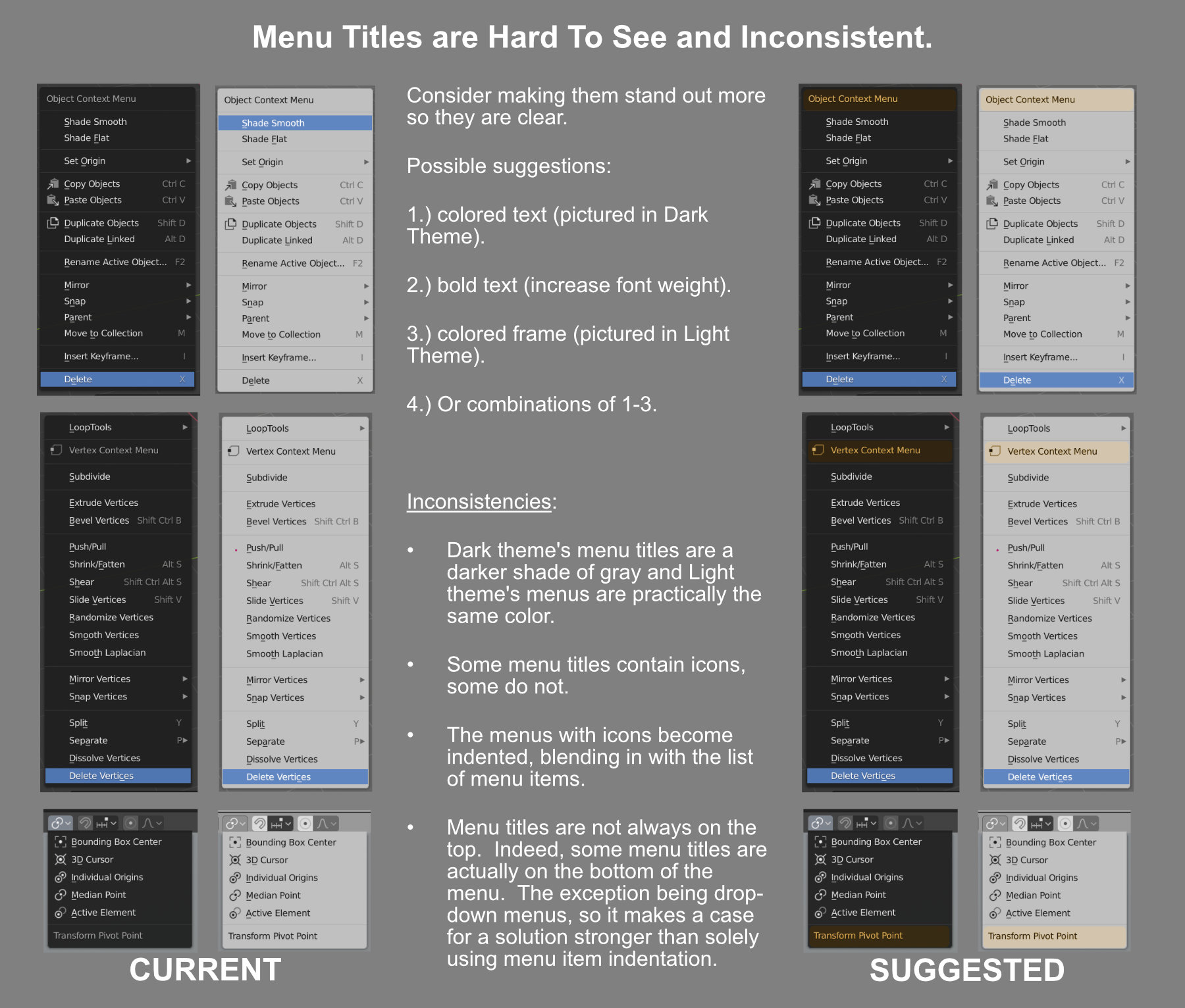
Consider making the Menu Titles stand out more from the Menu Items so they are clear. My apologies if this has already been suggested. I could not find it here.
Possible suggestions:
1.) Colored title text (pictured in Dark Theme).
2.) Make the title bold text (increase font weight).
3.) Colored title frame (pictured in Light Theme).
4.) Or combinations of 1-3.
Inconsistencies:
• Dark theme's menu titles are a darker shade of gray and Light theme's menus are practically the same color
• Some menu titles contain icons, some do not.
• The menus with icons become indented, blending in with the list of menu items.
• Menu titles are not always on the top. Indeed, some menu titles are actually on the bottom of the menu. The exception being drop-down menus, so it makes a case for a solution stronger than solely using menu item indentation.
3 Comments
i also like idea of highlighting previously selected option ("box" and "insert" options in my example)
I honestly never had a problem with it, and I'd assume that's what themes are for. I'd, however, agree with the option to have some texts bold - still though wouldn't make it default, but optional for people who need/want it.
***@Drax *** Unfortunately, themes do not address the issue of inconsistencies in the UI, and if the idea of highlighting the Menu Item is optional, that's fine, but it would augment the usability if it was enabled by default. I think it would help keep things straight, especially for new users as titles should never blend into the body of text.