
Improvement Bone Weight Painting
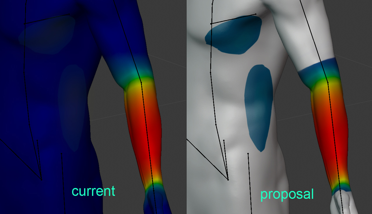
I suggest changing the color responsible for 0 Weight, frome Blue to a transparent color.

Red color - maximum weight
Blue color - the minimum value, for example 0.01 - 0.0001 (or something like that)
Transparent color - weight 0. Under this you can see the matkap.

What is it for?
- Working with a model painted completely in dark blue is uncomfortable for the eyes.
- It is very difficult to recognize really small weight values, because they merge with blue
color. 3. Skinning is a very difficult job. And the current color palette negatively affects eye health.
11 Comments
In "Preferences > Editing > Weight Paint" you can do this.{attachment Screenshot_20191129_222526jpg}
* @Antonio Puentes * Wow, this is already there. Amazing. Thanks.
* @Antonio Puentes * Holy wow. Simple yet effective. I will.. do this for sure.
* @Axel Mening * Are you able to put status from 'open' to 'close' this as it is already developed? Thanks.
* @Antonio Puentes * The more you know. I wonder if this is an issue of documentation and discoverability, or just shipping with saner defaults?
* @Nerve * I don't know if I understand your question well. If you know that weight paint is an overlay, the answer is easy to find in the Blender manual, looking for "weight paint overlay". And you can find more useful options.
super great helpful!
This is a great idea. I often find myself switching to masked faces just to see where I still have a tiny bit of weight, because blue on dark blue is difficult to see!
Yes please.....
With hard borders for where nonzero influence begins! This makes a ton of sense. Weight painting has terrible contrast and visibility at the low end of weights right now. Great suggestion.
* @Nerve * I will be happy with any improvements, with a hard border or soft. Any improvements are welcome.