
move some UI slightly to the left
move these to the left please, this is a little silly:
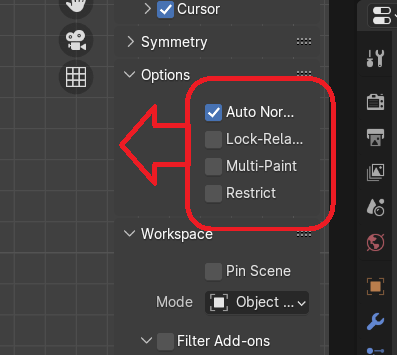 it would be great if we could move all of the one-off toggle options to the left, because they all seem to waste so much space being middle aligned. and if you're a speed demon like me you could shave off some seconds off of your speedrun by not having to move your cursor as far.
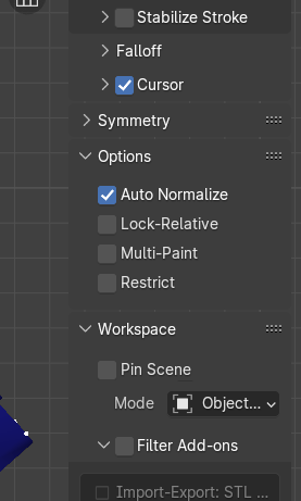
I manipulated the following image to show what it might look like to have the boxes moved:
0 Comments