
Collections — Linked Data Drawing
Hey, here is my rough thoughts about ;)
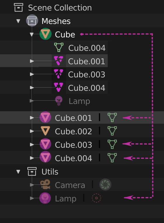
folded

unfolded v.1

unfolded v.2

unfolded v.2.1

I guess dashed icons looks dubious, but whatever
second iteration
just landed, and decided to make a plain simple MVP-way version, leave that fancy-schmancy concepts to the UI modders ;P

6 Comments
Can we just bold the name of the objects linked to the one currently selected
It could be enough to distinguish them from the rest
@george.mitev: Agree. I think if you switch to the hierarchy of different Collections then parent/child objects could be shown in simpliest possible way. Bold/italic/underlined text or just some icon showing that it's child. Enough to see there is something going on. You can always switch to sorting by Scene which has old outliner look if you like it that way.
By the way. It's possible to have more than one outliner open at the same time with different modes turned on.
I think it would be better if this " link " wires stay on left side in same place where current ordinary wires stay. Shown only if one of linked objects selected with some " point " highlight parent and go along left border ( such wire always straight because there is no few step parenting links - only one parent for some bunch of objects). It would be more logically organized.
@forestgumpovu4: yeah, that was my first idea, but it's require more space, remember you have more than one collection, lamp is also parented ;)
@Oleg Kondratov: Eehm, why exactly does that need more space? I think it's more logical to put it on the legt.
@benjamin.mueller: because of consistency, it's a thing now, heh
I mean - margin from left border to the vertical guide line is about of 1.5 unit, so after any manipulations with UI - margin obviously should stay the same