
Custom Grid Editor - A Native Layout Matrix for Buttons, Macros and Custom Tabs
Summary
This proposal introduces a new Space Type in Blender called "Empty Area" , fully integrated with Blender's existing Tiled Areas system. Inside it, users can build a personalized matrix of buttons, adjustment fields, tabs, and macro assignments | without writing a single line of code.
The Problem (Focus on Pen/Tablet Workflows)
Blender has an incredibly powerful Python API, but it offers no native, visual way for the average user to organize their own workspace and strip away the visual weight of tools they never use in their niche. As we all know, an interface programmer is not the interface's end user, and the end user is rarely a programmer | yet that same user still wants the button they need to be physically close to where they're already interacting.
For artists working with digital drawing, concept art, sculpting, or organic modeling using tablets or interactive displays, physical movement matters: button position and proximity between elements make a real difference on the body.
Having to travel across large 24" or 32" screens, open giant dropdown menus, hunt for tiny tabs at the edges of the interface, or simply click multiple times to reach the button relevant to your workflow is an action intrinsically tied to lost time and physical exhaustion. In short, it breaks creative flow , adds many hours of work through the accumulation of lost seconds, and increases the risk of fatigue and permanent physical injury.
Personal Motivation
I have a repetitive strain injury in my right arm, related to mouse clicking. I have 15 years of experience with vector drawing, vertices, and curve tools in programs like Illustrator and Corel Draw. I spent years working with the B-spline tool cleaning up images and photographs | including hair strands on people | a horrible and extremely repetitive task.
Early in my career I averaged around 9,000 clicks a day. That number quietly decreased year after year until I realized it had already cost me my health. Repetitive strain injury is a discomfort that starts imperceptibly and gradually turns into unbearable pain, related to the deterioration of lubrication and coupling in the joints. It's a common, permanent, and irreversible health condition for anyone.
Proposed Solution: The Area Editor
Here's the proposed configuration flow:
The entry point is Blender's own native area-switching system: setting an area's type to
Empty
(Blender's existing empty editor) turns that area into a Custom Area. That area's window carries an ID box describing which area is active | for example,
AreaInterfaceGrid.000
.
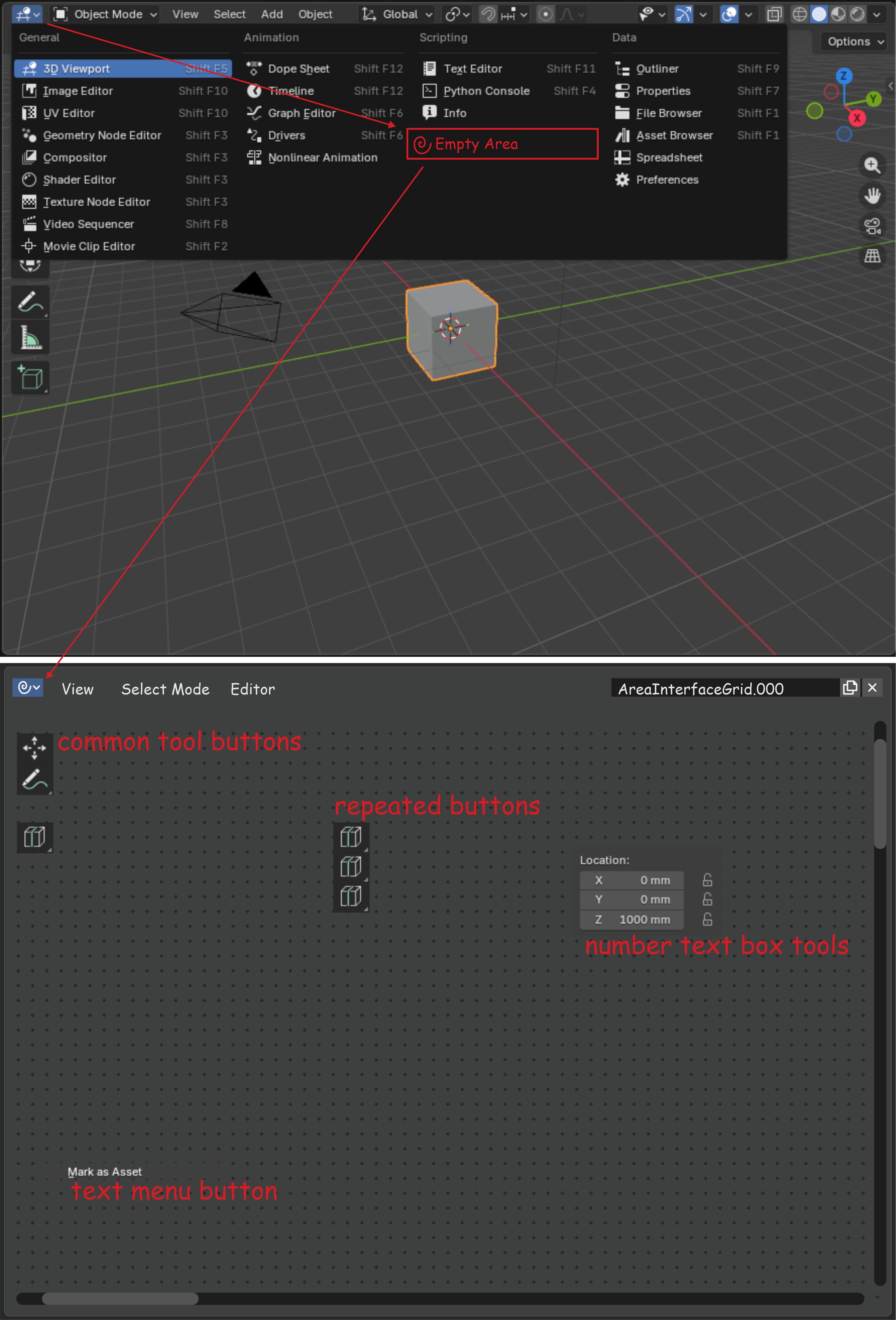
(Image 1: native Area-type menu, highlighting the Empty option, and the resulting window identified as AreaInterfaceGrid.000)
The button that opens the configuration window leads to the
Empty Area Editor
, showing the ID of
AreaInterfaceGrid.000
, with buttons to add and delete tabs, buttons to position tabs on top, bottom, left, or right, and a list containing every button and interface element available to dock onto the Area's grid | which, in theory, would sit right behind the Empty Area Editor window in Blender's interface.
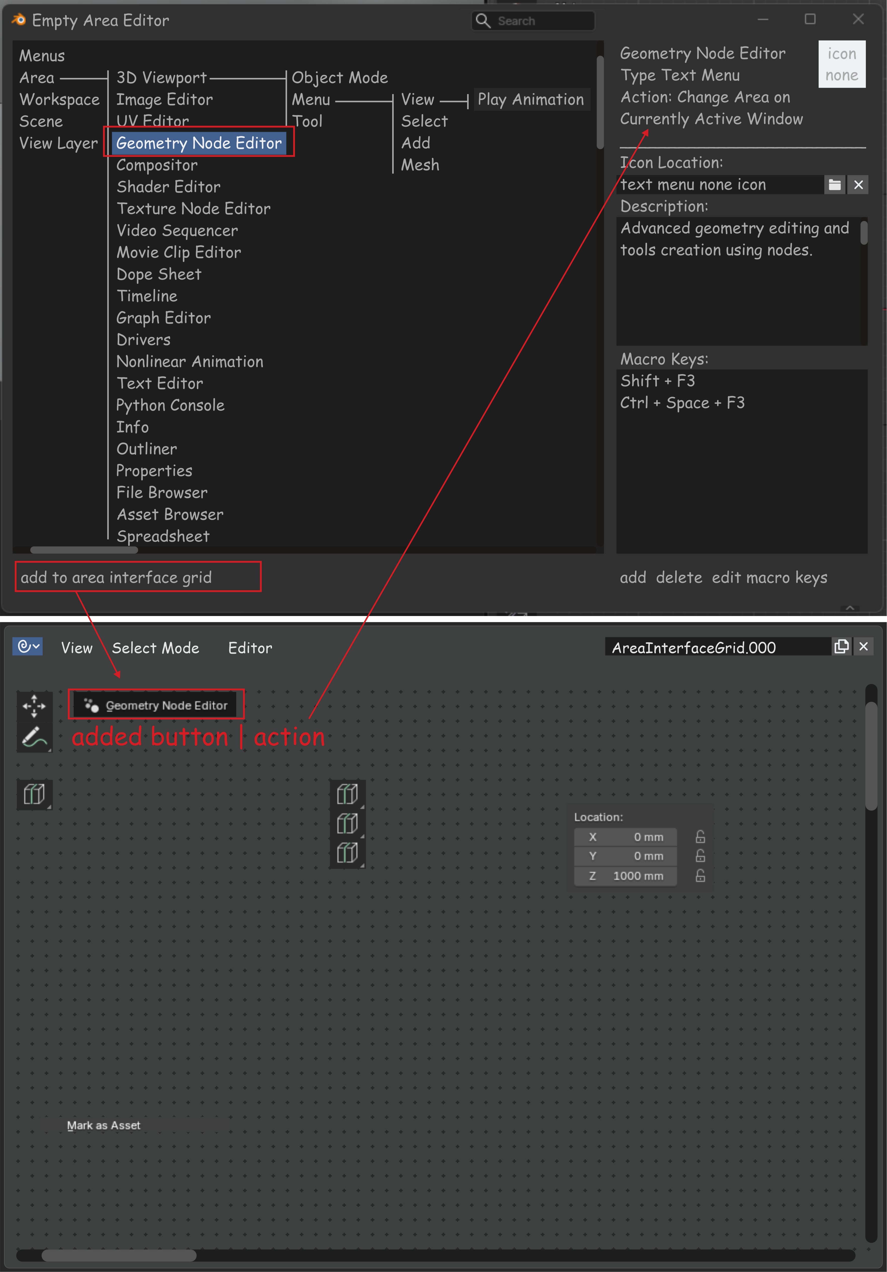
(Image 2: Empty Area Editor window showing the list of available menus/commands, and the result of a command button added to the Area's grid)
Users can add buttons interactively, dragging an item from the list into the Area's window, or simply by clicking the add/remove buttons available in the editor's list. The add/remove button matters more than a simple enable/disable toggle, because allowing duplicates of the same button is tied to intuitive user flows | that is, users need the option to place multiple buttons of the same type on the same interface.
The grid accepts three categories of elements: common command buttons ( common tool buttons ), repeated instances of the same command placed side by side ( repeated buttons , for intentional duplicates), and numeric property fields ( number text box tools , like the Location X/Y/Z fields in the example).
Persistence and Sharing
Each "Custom Area" customization needs to be saved inside the
.blend
file, exactly the way Blender already handles other interface elements today | Workspaces, Screens, and Keymaps, for instance, are already saved as internal datablocks and can be reused via
Append
or
Link
, or set as default through
startup.blend
.
That's precisely why each customized Area has its own ID (like
AreaInterfaceGrid.000
, mentioned above): this ID follows the same datablock identification system Blender already uses internally. In practice, this means a customized interface | with all its buttons, macros, and tabs | can be saved together with the
.blend
file itself and shared the same way as any other Blender asset: by sending the file, using Append/Link in another project, or publishing it as part of a custom startup file. No new export system needs to be invented | Custom Area simply plugs into the data infrastructure that already exists.
Editor Architecture and Button Customization
Right-clicking any button added to the custom grid gives the user full control over its behavior and appearance:
- Function Assignment: Modify the exact command, macro string, or property field bound to that button.
- Cascading (Sequential) Macros: Chain multiple commands into a single button (e.g., create a custom button that runs Subdivide + Shade Smooth + Add Bevel Modifier with a single click).
- Custom Appearance: Change the displayed icon, rewrite the label text, or write a custom description for the tooltip.
- Tab Organization: Group buttons into horizontal or vertical tabs within the Area itself, to isolate, for example, drawing tools from rendering tools.
Macros and Universal Command Standardization
This interface concept didn't come out of nowhere | it comes from comparisons with other vector-based programs. I work with Corel Draw and I'm familiar with the interface of countless other programs in the same space. Corel Draw already has a tool that creates customizable menus and floating windows, but that setup is extremely dated and problematic for the end user | not to mention the numerous conflicts it creates with the program's native interface. That's exactly why this customization tool never gained popularity in Corel Draw. The key point is that Blender already solves, structurally, the problem that held Corel Draw back: Area blocks ( Tiled Areas ) avoid exactly the kind of conflicting floating window that made the competitor's solution unworkable.
Back to Corel Draw: the program organizes practically all of its interface buttons into a single list inside its options. That list of buttons and text fields can be selected for macro editing, where the macro can be deleted, modified, and reassigned to run different commands. The same list also lets the user describe what that button does and change its icon. That's the conceptual starting point for Custom Area's macro mechanic: a universal, editable, redirectable command list that serves as the foundation for any button the user places on the grid.
Identifying Commands by ID
For this list to work reliably | even across fully personalized, user-to-user interfaces | every button or tool needs to be tied to a unique, immutable ID, independent of whatever label, icon, or position the user chooses for it.
In practice, Blender already solves half of this problem on its own: every operator in Blender already has a unique, stable
bl_idname
(like
object.subdivide
or
transform.translate
), used internally by the API itself to identify commands. The proposal doesn't need to reinvent this system | it can simply expose that existing ID as the "function" a button points to. This guarantees the macro is never lost even if the button's label, icon, or description is completely rewritten by the user.
This does imply a second layer of ID, though: since the same command can be added to the grid multiple times (recalling the duplicate requirement above), each placed button needs its own instance ID | distinct from the command's ID itself | so that two buttons both running
object.subdivide
, for example, can have different labels, icons, and tooltips without conflict. In short: one fixed ID identifies
what
the button does (the command/macro), and a second, per-instance ID identifies
that specific button
on the user's grid.
Why This Fits Perfectly Within Blender's Philosophy
- Respects the Tiled Interface: It doesn't break Blender's golden rule against messy floating windows covering the work. It's just another standard Area type that can be saved into Workspaces.
- Extreme Screen Optimization: Lets professionals fully disable cluttered native panels (like the T and N side tabs) and build a single, compact "Control Panel" containing strictly the commands they actually use.
- Code Accessibility (No Programming Required): Creates a friendly bridge between the power of Blender's API and artists who don't know Python but need high productivity.
Addressing Objections
"This fragments teaching and community support | every user will have a different interface."
Yes, this does change the standard teaching flow. But the customized interface is clearly labeled at the top of the Area block as a personalized area (via its ID, e.g.
AreaInterfaceGrid.000
), which already visually signals that space isn't the default. On top of that, whoever is teaching | a professor, tutor, or mentor | is usually already an experienced user who recognizes this scenario quickly and has two simple options: share their own personalized file with the student, or simply teach using Blender's default interface, with no downside either way.
"Too many buttons could hurt performance or crash the interface."
This is a risk Blender users already understand in another context: just like adding too many 3D objects to the same scene makes work harder, an overloaded interface grid could add weight too. The difference is that if the setup causes slowdowns or freezes, the user can simply reset the interface to default | since the customization is tied to a regular
.blend
file. There's no way this customization can break the program itself; at worst, the user loses their custom setup, not Blender's stability.
"The Empty Area Editor is one more thing to learn | doesn't that contradict the goal of simplifying the interface?" The audience that will explore the Empty Area Editor is, by nature, already inclined toward automation and exploration: it's the same type of user who today builds complex setups in Geometry Nodes, an area Blender itself has been actively promoting. This isn't a user who resists learning a new tool | it's someone already comfortable organizing visual logic and automations. The Empty Area Editor's learning curve is, therefore, compatible with the profile of the people who'll benefit from it most.
"Solutions like this already exist, like Pie Menu Editor." Pie Menu Editor (PME) is a paid, unofficial add-on (GPL-licensed, but sold under license), originally created back in 2016 | nearly a decade on the market | and widely used by the community. It offers menu, macro, side-panel, toolbar, and custom-icon editors without programming | which brings it close, on the surface, to this proposal. The relevant differences:
- PME is a clear example of the risk that comes with depending on third-party maintenance: as of early 2026, maintenance of the original PME 1.x line ended, with development moving to a separate paid fork built specifically for newer Blender versions. Custom Area, being native, would follow the software's own official release lifecycle instead of depending on a single independent maintainer.
- PME organizes customization around menus, panels, and pop-ups layered over the existing interface | not a dedicated spatial matrix integrated with the Tiled Areas system, designed specifically to minimize the user's physical movement.
-
PME's persistence depends on the add-on's own export/import system; Custom Area, by inheriting Blender's datablock system, saves and shares exactly like any other
.blendasset, with no extra infrastructure required. - PME doesn't come from a stated ergonomic motivation | it's a general-purpose productivity tool. Custom Area proposes ergonomics (physical proximity, reduced clicking) as a core design criterion, not a side effect.
0 Comments