
2.8 Proposal - Less Girth, More Colour (Dope Sheet)
Some visual adjustments to the dope sheet:
Issue/Problem: Too thick
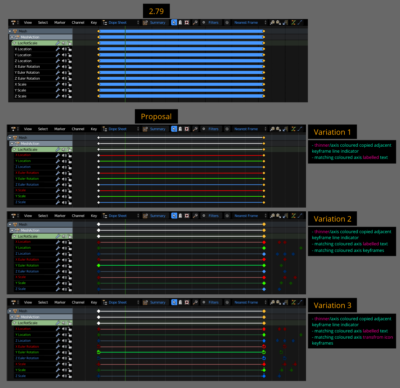
- In 2.79 side by side exact copies of a keyframe generate a thick line inbetween another indicating this occurence. A bit of an eyesore to look at.
Solution/Improvement: Fit Right In
- Simply made it thinner recoloured to match axis colour.
Issue/Problem: 2.79 Is Sooo Last Season
- Axis text labels are a little bland utilizing one colour for inactive/display and one for active selection(s). Clearer clarity and visibility can be improved to quickly identify information.
Solution/Improvement: Fashionista
- Majority of 3d applications use red, green and blue universally for X Y Z axis, why not use these to match?
- Implementing rgb to match xyz.
- Colour coordinated isolated keyframes to match axis.
- Unique transform keyframes to match with axis coordinates/colour.
9 Comments
I'd have to try it, but at first glance I find your proposed variations very difficult to look at. Overall, this doesn't feel like an improvement to me.
@Jason van Gumster: yeah i would say the same, and that would render the colored keyframes useless, but, what i would do is to tint slightly the background of each axis to its corresponding color, so its easier to follow.
@Jason van Gumster: I agree that it seems kinda hard to look at in the mockup, but I think this could be easily fixed by using a better color scheme and maybe fine-tuning the design. I’m a fan, because I also noticed at first glance that I personally find it a lot easier and more intuitive to see which value every bar represents. I think not having to double check and look to the left of the keyframe row you’re editing before you do anything would be pretty awesome and make it a lot easier to use.
The icons in the third variation don’t look very nice right now, but this is also just a matter of design. Maybe there’s another way to differentiate between movement/scale/rotation, like a simple dividing space or a subtle backdrop that would make it easier for your eyes to see which "block" you’re in.
I think that this could be a great improvement, it just has to be designed better than in this simple mockup.
Handy. The alterntative is keeping the keyframes the same colour but change the track background colour based on axis.
@ondraise15: oh just what i was writing above, this would definitelly be an improvement.
I'm not a fan of keyframe icons in var 3. To me it's more confusing, less readable. Plus, Blender have keyframe types, your proposal have to work with that :
However, thin colored lines seem nice.
@loic.dautry: Hmmm, didn't think about the keyframe types. They are simply 100% visual aids correct? The concept of variation 3 was the idea for users to quickly identify axis keyframes without even reading and searching column text via memorizing associating axis colour with matching transform icons. For example, hey I want to to adjust z rotation and y location keyframes at the same time of this object. Variation 3 was to simplify the task to quickly to just look at the keyframes icons only. I can see it being confusing with the current system, but just an idea to throw out to maybe inspire/challenge ways to improve ways to quickly find associating keyframe axis.
I understand why you purposed your var 3, my main issue with it is the icons you've chosen, which are quite detailed and won't be enough readable on certain screens and configs.
why not just take inspiration from the 3D manipulator? It uses cones for grab, circles for rotation and cubes for scale. The keyframes could be Triangle, circle (plain) and square for Loc, Rot & Scale, and keep the diamond shape for any other kind of data.
It should remain really simple and easy to identify even from far away with barely closed eyes.
I agree that the color matched entities are easier to see.