
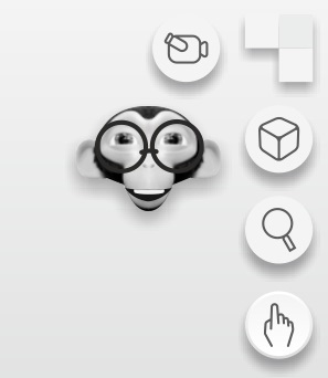
Funny navigation widget and split area widget
This concept can be for users of blender 101 and for users who use touch screens, possibly the user who uses a lot of keyboard shortcuts will surely want to hide it.
Navigation widget:
This is the current:

A cube is perhaps not the best to visually describe the orientation of a view since it has all its sides equal, on the other hand, on the heads and other objects, each of its sides is clearly identified.


Maybe with doubleclick you can go to the opposite side.
Also it can be very funny for new users. You could even put the lowpoly model that you prefer(the blender cube, a logo, head, spacecraft, etc).
Area widget:

With main click, divide or join the area. With secondary click it opens a menu with the different editors to choose. This concept seems more intuitive and simple to understand for new users. You could also hide or decrease the opacity when you do not have the pointer in that area, so it is not so distracting.
The following are some discussions on different parts of the proposal:
Panels, tabs menues and editors
A quick and easy way to change the position of the origin
The used head is by ChameleonScales blendswap.com/blends/view/89338
7 Comments
other proposal:

@zebus3d: I like it but it's very similar to the Autodesk cube
I do not necessarily want to view a Suzanne as the primary navigation icon; although I wouldn't mind an option to use the current geometry or scene as the navigation icon instead of the cube.
i like this suggestion
@manu.kblm: Yes, the monkey is very nice
I think this is a great idea for Blender 101 perhaps, although a Suzanne head looks rather unprofessional and might put off users if it were used for regular Blender. However, I do like the idea that we can customise it to be whatever 3d object we prefer (which should also be the case for the material preview object).
Anyway, the current view cube design is not good, because even the axis indicators do not inform the user of the positive direction of each axis, in addition to the issue you pointed out with a cube being symmetrical, so I hope something is done to improve it.
Ohh, same my ideal, good