
Improved readability of the Status Bar
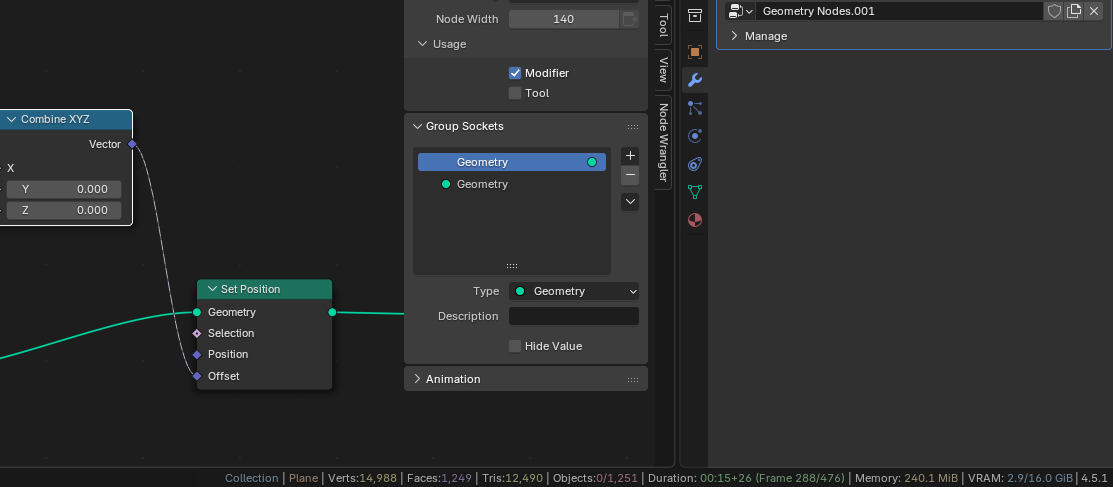
While the (extended) information at the Status Bar is quiet handy, it is expanded in a way that it became not very readable for a quick lookup. You has almost have to read the entire line to obtain the info it needs.
My idea is to make the space between the components larger, or, even better, colorize the different components. This way you can
very quickly
"side-eyeing" the Status Bar for the needed information. Exactly where it was meant for.
4 Comments
Having a rainbow of strings may look good at first but it quickly loses meaning.
Color should be used with purpose. Like red when memory is too high, or yellow for warnings, blue for info, green for success messages.
Perhaps using bold text, or improve spacing.
It could be made optional. The colors are can be any, up to Blender. Even a slight pastel color will do. As it is now (with many more options) it has lost its meaning. Like I wrote: I've to watch relatively long to the entire line, to find what I need. With some color-coding this can be fixed. (Same happened with the Properties panel before, having confusing white icons at some point, while its much better now in the "rainbow"-colorscheme)
I think you both have good points.
At the end of the day, the need is to find ways to visually help people find what they need as fast as possible. We could use many things like spacing, font weight, icons, colors... I think what helps is not only "chunking" bits of data into manageable bits, but also give an "anchor" to visually jump at.
What i mean by the latter: once I learned green is duration, my eyes can jump to it without having to read the whole line ever again. Much like I learned the material icon and now can not only jump my eyesight to it without having to scan the properties' editor's tabs to find it, but i can even click the material icon without looking at it precisely.
An issue with colors is when we have more elements to differentiate than clearly identifiable colors.
Here we have verts and tris too similarly colored to be identifiable. I would argue the object name and the memory too, but them being so far apart helps with that, so maybe that's a thing to consider to help reduce the issue?
Also, maybe not everything needs coloring. Do we need a different color for the collection name and object name? IMHO white would be fine. Do we also need different colors for memory (ram) and vram? IMHO they could be the same color for the whole "memory section", i'd still be a useful chunking of information.
Yes, that's exactly what I meant. It's much easier to jumpp to a certain color you know of, than to "spit through this long line". The colors in my mockup are just an example, but I'd leave this to the Blender UI-ones that have certain rules for color scheme's. Even a slightly pastel color would do the trick. Right now my interface shows 5 different colors of red (nodes, icons, dope sheet), and it never confused me. Same for tints of green.
I agree not al elements have to be colored. Like the Collection and Name could be default, just as VRAM could. Verts, Fraces and Tris could be a combined color. There are ways to solve this, without distraction from the rest.
Cheers!