
Shiny Rare Blender Outlines
Shiny and chrome animated outlines for any new or untouched features or menus in Blender.
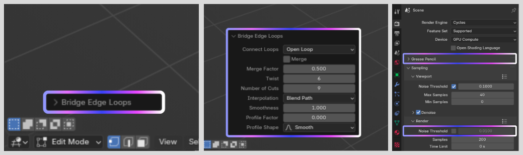
So recently I came across a quick video explaining how the bridge edge loops tool can be used to be both twisty and curvy. Why did this shock me? Because I've been using Blender for over 12 years now and either I missed the update or never noticed this and I use bridge edge loops so much I've got it as '4' as a custom shortcut.
Now this is partly my own fault, I have my UI scale so tiny that it's quite easy to miss the options panel. But I have always been aware that on each Blender update so many things get changed or added that there's a chance no matter how well I read the updates page that I might miss something. Like the screen space feature or the new colour management default or refraction within EEVEE inside the materials options, I could go on.
Now this is obviously inspired by a popular app that has trading cards, but I think that's exactly why it should be shiny and animated. It's eye catching. Sure it could be bright orange to match Blender's style and pulse glow, but having a bold visual cue of 'Hey, here's something new you may have missed' would add a lot of depth to Blender's usability for both new and old users.
Currently I propose that it is used at least for any new or updated features but having the option to display any new change a user makes would also be welcome, in that it could have a gradual fade out over time but stays long enough to remind the user what they've interacted with recently.
It also goes without saying that it would need to have a turn off feature and maybe a duration choice, but I've never heard of someone saying I want my special ultra rare card to have less shine on it.
7 Comments
I like colors, i like animations, i dislike this idea.
it's a productivity software after all, not a fancy little trading cards game
I'm trying to imagine how many hellish highlights and blinking things I'm going to see in the interface, due to features (that i am aware of) and simply never use as it's not something I need to use.
I don't think the problem with discoverability is that the interface doesn't look like a rave.
I like the idea. I disagree with the presentation like others here but I don't think the proposal should be thrown out on that principal. The option to highlight what's changed in a new update would be useful, since I often find myself trying to guess where any new feature in the release notes will show up in the interface. It would need to be more sensible and professional in presentation though.
You can be eye-catching without making it feel like you installed an early 2000s ransomware x)
Maya have such system by default, with just some green labels and brackets overlays:
And at each startup it has a pop up warning about this system, with a checkbox to disable it and another checkbox to not see that popup again.
But that kind of things needs to be limited to its context and not to propagate to its parent. For example, you wouldn't see it on a menu just because it has a new submenu, you'd need to open the menu first to see the new submenu with its highlight. So on. To avoid having half your screen green all the time.
But also, Maya doesn't have many new things to highlight at each update, and I don't think it has as frequent updates cycles either. So I would wonder if it's a good time investment for the devs, unless they somehow have a way to automate it.
In the meantime, looking at release notes, or at least reading/watching content online that summarizes it or focuses on what you are interested in, is a thing.
I like that, I didn't know about what other programmes had so having a differentiation for sub systems definitely improves on the premise.
I used to watch the Blender Today's all the time but stuff like geometry nodes I just gave up keeping up with. Either a name gets changed or something gets removed but it's just not something I want to do is look through release notes to see what the difference is for 100's of small changes. Like an extra thing could be to have a tool tip that tells you the change that was made would be handy and it is matched to the release note info.
And really my main objective is to highlight new things people haven't tried, like a user is going to be looking at release notes for something they don't know about to begin with.
I don't think it helped not having an example animation but I thought it was something fun at least for an actual issue.
custom tooltips definitely sound like a big time sink, it's extra writing to do in tons of places and then remove and redo to new places at each release.