
World and Material icons too similar
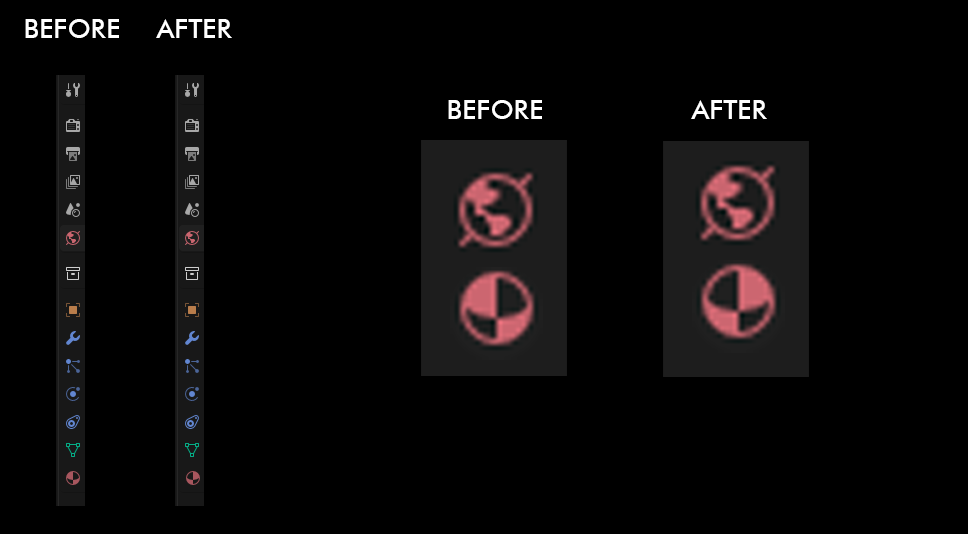
This one may get some hate, but I think the World and Material icons are too similar in their look (notice how the positive and negative spaces are weirdy similar?). I guess having them sharing the same color does not help either (which I assume is due to the fact they both handle shaders).
A new icon would help or even simpler, we could horizontally flip the Material Icon, I think it is already a bit more differentiable.
8 Comments
World could be more of a globe with latitude and longitude lines, like this: thenounproject.com/icon/globe-248/
That's too close to the
SHADING_WIREicon used for the wireframe shading view. Also similar to the globe icon for links/internet.projects.blender.org/blender/blender/pulls/131568
one has axis poles, the other has a texture grid. I don't have issue with it now but maybe later with the upgrades to the icon handling we will have a way to theme the icons for ourselves - I believe that Harley was working on vector svg for this type of thing, though I don't know if we will have access to change sets for ourselves outside of recompile.
They are far apart and the position makes sens (materials depends on the mesh above, world depend on the scene above). So is it really necessary ?
What has changed? 😄
Material rotated, so that the light dark area don't also match the continents.
Personally, I'd go even further and make material a 2x2 checker square.
A checker square would evoke more of a texture than a material imho