
Idea/Question: Locking Timeline range to Graph Editor range
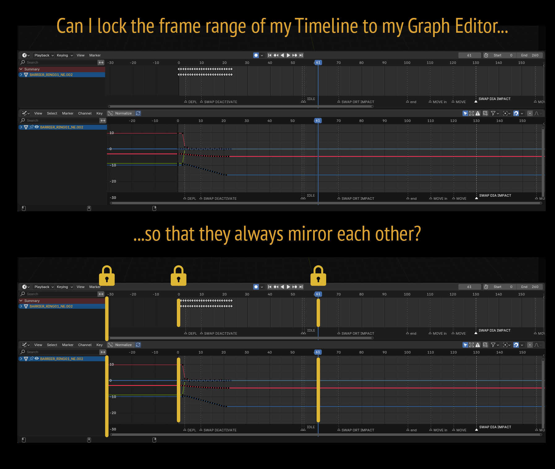
This means that when I move along either the other follows.
Scaling up one also scales up the other.
Pulling out the left column also pulls out the left column of the other one.
I ask this as a questions as well as submitting it as an idea, only because I don't know if it's already possible.
If it's not then there might be a plug-in for it?
Let me know.
UPDATE:
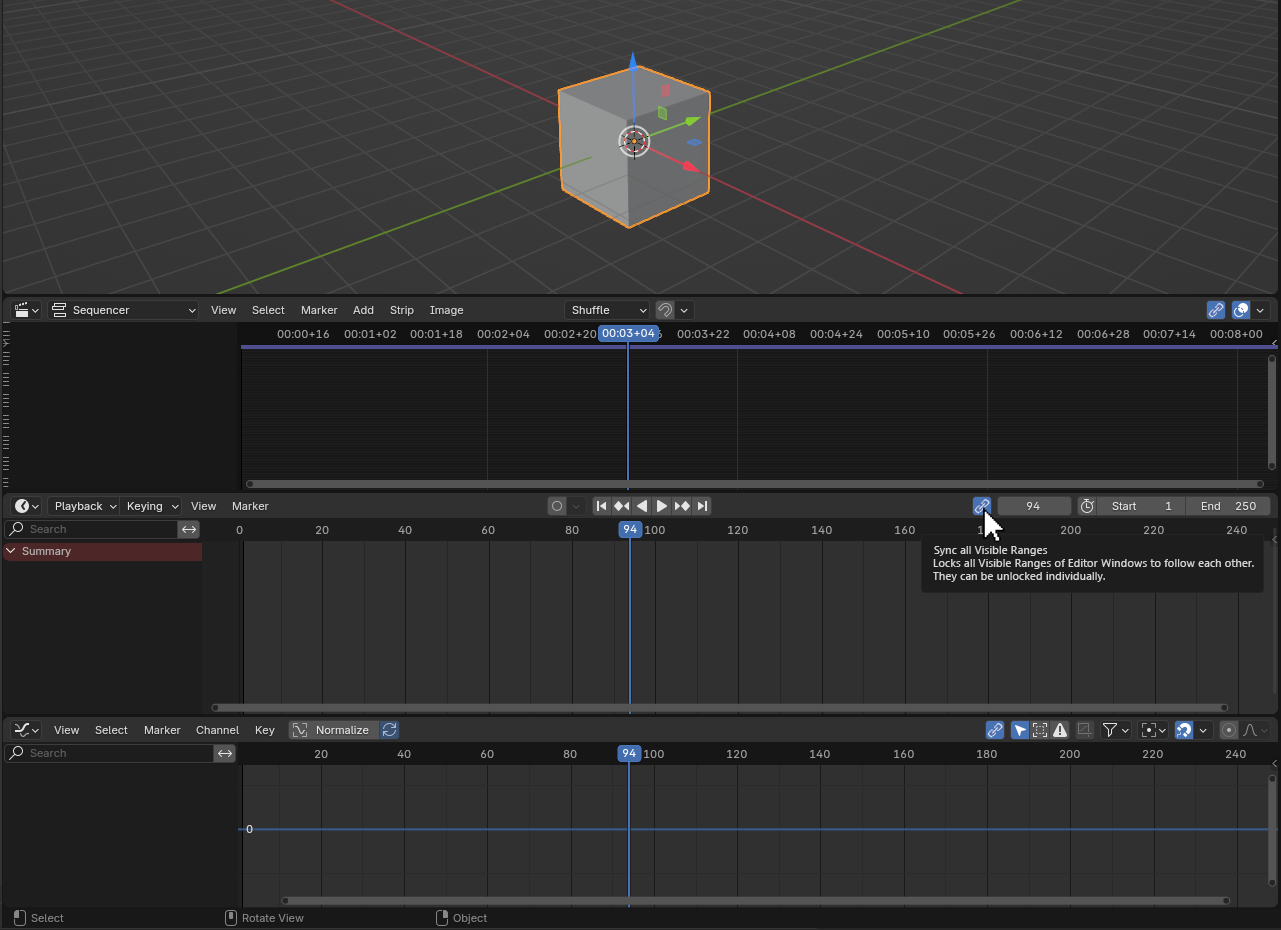
Lauloque has inspired the below mock-up by suggesting that syncing should be on the headers themselves.
9 Comments
That sounds a lot like the Sync Visible Range under the menu View:
The only downside is that it doesn't take the sidebars into account.
Thanks, -L0Lock-!
I suspected there was a feature already in Blender like this. Locking the sidebars is the ideal, but I'm just glad that it gets most of the way there. Much appreciated! :)
I know now why I didn't discover this myself. I assumed checking one box would be enough to sync all the visible ranges, and start this feature. I didn't realise that you had to select this with all the visible ranges for it to work. By clicking one range and seeing that it didn't work, I assumed it wasn't working, or that I did something wrong, or whatever.
It makes sense why it works this way, however perhaps it would be more intuitive if it worked with only one check box (automatically checking the others) and they you can uncheck the one or two ranges that you don't want synced and it won't uncheck the rest. I.e. Syncing requires just one check box, but de-syncing requires the user unchecks each range.
I'm also glad I submitted this idea as a question, and I think it's healthy for Blenderers to do that on Right-Click Select. It feels more like a conversation and not like an episode of Shark Tank, where someone poses an idea and it gets squashed or argued down, etc.
Lastly, I will say that using Sync Visible Range is AMAZING! As a professional animator this has made a huge difference in the small amount of time I've been using it already. Thanks again, -L0Lock-. Keep up the great work.
I'm not sure that having the UI check boxes in other places is a more intuitive solution here, it's not an expected behavior either. But for sure, be a solution to sync all animation editors' ranges in one click sounds interesting and more efficient.
I was thinking maybe some push buttons in the headers would be better:
Feel free to edit your proposal into this if you are interested, otherwise I will post mine, but it would make yet another similar-ish post. Not the best thing for visibility. x)
I'm also an animator that can't work properly without this. I'd also wish all editors had their sidebar backgrounds transparent and not affecting the editors' space, just like in the viewport. It would remove the need to have all sidebars the same for range sinking to work.
Hi Lauloque,
I think you're right when you say that checking one box in a menu when then selects many other hidden boxes in other windows is unintuitive, but I think you're referring to user feedback. When a user does something there should be a confirmation (feedback) that this has happened.
If a Sync symbol was on the header then there would be excellent feedback. We'd see all the "link" icons light up when one was selected. (I've made a mock up of what that would look like above).
I think Blender needs to retain it's simplicity (and its elegance), so in my mock-up I've only chosen to have the link symbol and the refresh symbol to reduce clutter. The heavy lifting is done with the screen prompt (also seen in the mock-up) where it says, "Sync all Visible Ranges". That's a much more informative explanation as to what will happen. The original, "Sync Visible Range" is too vague, and kind of confusing.
Lastly, I have to ask, what is the Refresh symbol for? I've added it in case it's important, but in your mock-up I wasn't sure what it does. What does it do?
You basically did the same mockup as mine x)
I would have reduced it even more, by getting rid of the refresh buttons though. What are they for?
UPDATE: I actually did decide to reduce it. See the updated image above.
I think Blenderers should be able to offset their synced ranges (like they can do now). It may be useful to some people's processes.
IDK which refresh button you talk about. The only buttons I mocked up are the ones described in my first picture, the second picture shows them in situation
The refresh buttons are two arrows looped in a circle. They're on the left of your image next to the word "Sync Range".
It's not a different button, it's the icon of the button that "toggles the sync visible range", which is also labeled "sync range".
Since we don't have an icon to clearly indicate "syncing" and the refresh icon is what's closest, but already used in the graph's header, and I already use the link icons precisely to "link" the syncing state across editors, I used the refresh icon and a label to clearly identify the sync button.