
Colored Icons in "Add," menu
Pretty simple. Now that there are colored icons in the properties panel, I'm surprised that the Shift + A "Add," menu is still monochromatic. It would be nice if there could be some basic colors here too
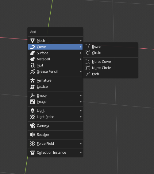
Pretty simple. Now that there are colored icons in the properties panel, I'm surprised that the Shift + A "Add," menu is still monochromatic. It would be nice if there could be some basic colors here too
6 Comments
They used to have color until a few months ago. I miss the colors.
the only place the icons should have an option to not be coloured is on the main UI on the Properties tab. Otherwise in the outliner and in the menus like that one they should be coloured by default. I dont want colored icons on my UI all the time and the fact that this is controled only globally bugs me. Now that I see they decided to removed color on places where you have to do selections from a list like in this case Add menu that is not permanently visible on the UI Im even more frustrated
So far the colours are based on the group the tab belongs to.
Since objects are only orange, every entry would be orange again (so monochrom again).
Or did you think about multiple colours?
* @Delta * Based on data types actually: {attachment opera_2019-05-25_13-48-26png}
* @Delta * Yeah, that was the one hangup. I was going to make a mockup but then realized that if I went off the color scheme blender already implemented they would pretty much all just be orange or green.
I like the Idea for new flatter icons, but I wish there were multiple colors in some of them. At the very least multiple shades of the same color.
* @Zach Hixson * you mean like Max teal. grey and yellow scheme: All grey when the icon is very basic, Combine with bits of yellow when is a bit more complex and with the teal when it have to be be even more descriptive with its function.
but yeah the fact that the color is controled on a data types basis and not on UI location basis is defeating the idea of customability