
Show/Merge playback controls in Header instead of Footer
Playback controls can be flip to top, which can save vertical space rather than leaving too much white space both in the header and footer.
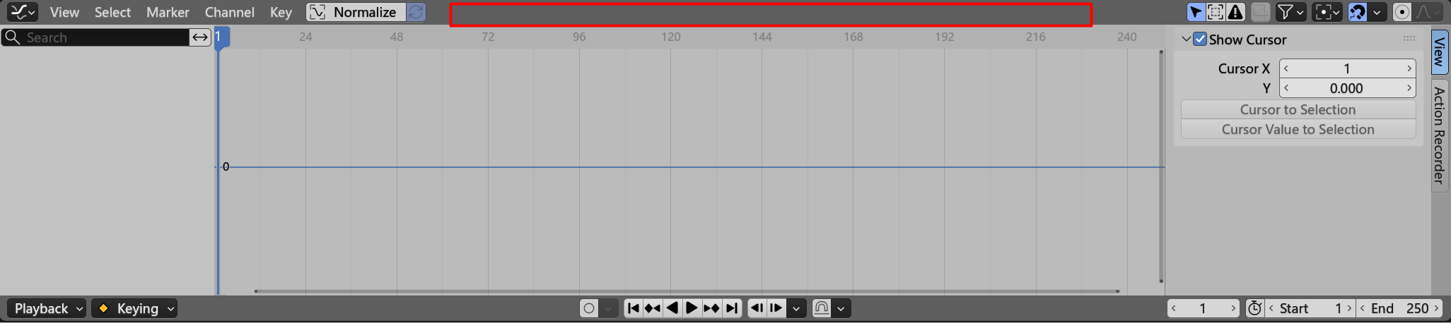
Playback controls can be flip to top, which can save vertical space rather than leaving too much white space both in the header and footer.
7 Comments
Try making a mockup, it will get very noisy very quickly. It gets tight in the header.
It's an intriguing context. I was thinking...
Maybe, one possibility, for reorganizing these utilities on the top within the Header Region, would be adding a Tool Settings Region (but could that be hidden on-demand on occasions to save vertical space, as the feature of the current Footer Region?).
Another approach, that might be considered (although I believe it would end up being cluttered, noisy as you have observed, thus not so nice) might be stacking these content at the top Header Region, as the original proposition, but taking off the texts "Playback" and "Keying" from their respective Popover Menu Buttons, and exchanging them for... just original Icons? Their respective texts would still appear once their Popover Menu is open, and also in the Tooptips for the Buttons themselves, if hovering over them.
PS: It seems there's a current mockup, Pablo, accessible on that Github link, from "jason0" in the comments; I don't know why the name is not "jazonz"; the profile image seems the same though; I'm still confused about that.😆
It's a trade‑off, some people may prefer a compact and efficient layout.
ok but why
Fundamental question.
Long-story short, I believe it's a question of which features are highest in priority to usual Workflows.
I can't answer for the author; but as an Animator, I thing the current state is just unsetting; although it was a good attempt, historically, and a step forward, at solving the more overarching Timeline issue.
Addressing the question of what should be priority to have, at the most 'stable' (because it can't be Collapsed as simply as the other ones) of the 4 surrounding Regions (i.e., the Header Region), in an assumed majority of different Workflows using suchs Timeline-related Editors. For instance, I believe the best case would be these settings: "Frame", "Start", "End"; in my understanding, they should always be at highest priority; not just swapped towards the top (an actual UI user possibility I guess), but includingly re-located to the more 'stable' Header Region itself, because of priority in Workflows [if I'm not wrong, something like that is already planned in Blender 5.2 LTS, isn't it?].
Which can save vertical space rather than leaving too much white space both in the header and footer.
Implement: github.com/actforjason/timeline-buttons