
Easy to read Preferences Window UI/UX
Anyone else think the preferences window is getting a bit overwhelming? Made a quick mockup with subcategories (Interface > Display, Editors, Language, etc.) to organize things better.
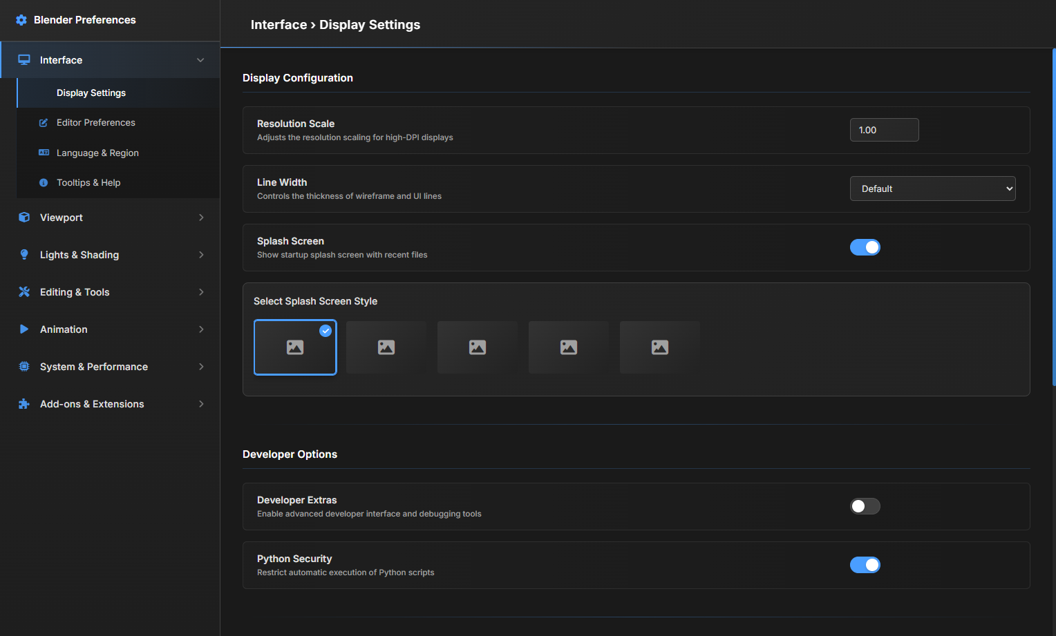
Anyone else think the preferences window is getting a bit overwhelming? Made a quick mockup with subcategories (Interface > Display, Editors, Language, etc.) to organize things better.
7 Comments
We don’t really need this, it’s just a waste of development time and money with no real benefit. Even if it looks nice, Blender has many more important things to improve Right now Preferences on blender seem easy and useful compared to Maya, Cinema 4D, Houdini, and other DCC.
A search is realy needed, but I dont see why this proposal would make anything better. It just adds a bunch of padding and has nothing to do with Blenders UI desing language. It just looks awfully like Microsofts design. Subpanels in the sidebar is something I could see, but the rest not. But Theme and keymap need an overhaul.
This was mainly to show the idea of adding subcategories for better organization not a full redesign of Blenders UI style
Any sort of compartment categorization is a benefit. And this is already helpful! Turning this from a forever scroll to a few secs of scrolling. Also reminds me there are plenty of similar names so I've trouble knowing if the preferences is referring to the right sector of things without having to scroll up till I see a header to reference where I am.
But the preferences are already categorized and compartmented, if anything this proposal is just making everything take more space so it adds more scrolling.
No if you have subcategory showing then you dont even need to scroll, for example just click the subcategory Pie menu to change the pie menu settings without scrolling down in Interface setting.
With the amount of settings blender has, this amount of padding would just lead you to scroll endlessly to find anything. However I like the idea of extending the left sidebar with sub-categories that make it easier to drill down to the setting you're looking for.
These pretty enum select image buttons would be quite nice for some options but should be reserved for common / important settings
One feature I'd LOVE to see is a search bar. Jetbrains IDEs are the golden standard of settings menus in my opinion. Good sidebar with drilldown and an awesome search box that can find you anything