
Menu Search dyslexia options
A dyslexic friend mentioned how difficult the new version of the menu search is to read, as the text jumps all over the place when they used to be neatly in line. Looking at it, yeah, I understood exactly what they meant. The best match is even worse because it doesn't even have the gray toning present.
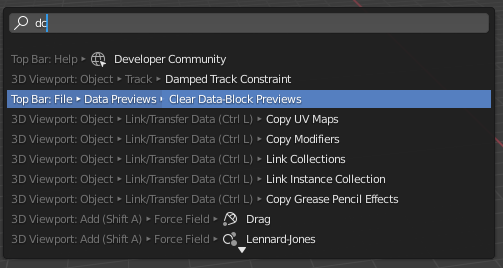
An option to either hide the menu path, or move it to come after the command name might make the software more usable for some.
3 Comments
IMHO the function should be displayed first, location second.
You are searching something in the first place, make it appear first and in the clearest readable way. Extra infos should come afterwards
I suspect they did it this way to give room to the shortcuts, but I'd rather have a larger searchbar with both location and shortcut on the right and function on the left
I was wondering which "dc" Blender found on your screenshot - all except of first one (dc - Developer Community) has no sense at all. Then I tried "dcz" or so.... It seems like issue is not in dyslexia )) Blender trying so hard to find at least something that as a result, if you not search for exact correct word, if return most of time some bullshit irrelevant stuff. Looks like it just broken...
It was just a random pair of letters to get a screenshot of the problem, actually.